Download
1 / 6
60 likes | 316 Vues
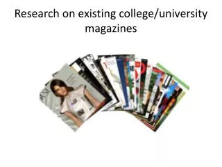
Analysing Existing Magazines Double Page Spread. By Angela Kennedy- Macfoy. The drop cap makes the beginning of the story interesting as the first letter is bold, attracting reader’s attention.

E N D
Analysing Existing MagazinesDouble Page Spread By Angela Kennedy-Macfoy
The drop cap makes the beginning of the story interesting as the first letter is bold, attracting reader’s attention As this is a Gospel Magazine directed for young people, I really would like the layout of my double page spread to be similar to this, as it is within my specific target audience of Christians, young people and the Gospel music genre The heading has been put into a large font so that it will attract the reader’s attention straightaway. The colour red also makes it attractive because of its brightness and the fact that there is not a lot of red on the page There is a lot more text than there are pictures in this double page spread, which may put off young people as according to my survey, most people within my age range said that they preferred pictures rather than text, so I will make sure that I have more pictures to keep my audience interested in my article rather than a large amount of text The sidebar is still to do with the artist and is promoting the artist, e.g. with the album launch and record label, giving the reader more advanced notices of the artist, instead of it being about a completely different topic The pull Quote’s background is also in red, making it as important as the title as they are in the same colour The main body text is in a simple font and the colour of the font is in black, a regular colour that is easy to read because the colour is not confusing to read
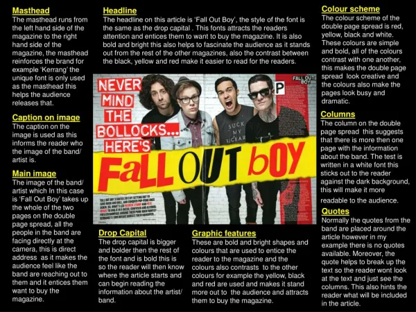
The drop cap used here is large and is in a red colour so that it will direct the audience to the main story The colours used here are black, white and red, colours that are usually associated with the genre of rock, heavy metal, punk, etc. The magazine allows its audience to feel more at home and that it was made for their specific genre of music because of the choice of colour scheme The pull quote immediately draws the attention of the audience because it is a statement that will make readers want to know why the statement was made. A short pull quote has been used to focus the audience's attention The large font of the pull quote and the difference in colour really grabs attention, especially because the font used is different to the subheading underneath, which is smaller and in white. The slant of the sub heading font gives it an edgy look, which is what the magazine is trying to go for because of its chosen genre The choice of black and white for photography emphasise the low key style of the page and gives the page a distinctive mood The pictures used are all band members singing and performing, matching the theme of the spread There are more images on the page than there is text filling up the space on the page, possibly indicating the audience as they may only be able to read a certain amount The spread is eye catching because of the use of the aggressive colour red to bring out the classic and bold colours of black and white on the rest of the page
This double page spread has a large picture on one side of the page. By this, you can tell that the audience is older as there is a lot more text than the last spread, indicating that they can read a lot more and stay engaged for longer, without having to rely on many pictures The darkness of the shot creates an eerie atmosphere and darkens the mood of the magazine. This may make readers want to read more as it looks intriguing The name of the artist is put in an odd place as people usually read from left to right, breaking conventions of the usual place to start text The image of the model shows that the artist is possibly quite mysterious because of her closed eyes and the position of her hand to her neck, also her parted lips indicate that she is seductive The layout of this spread is quite plain and simple, indicating at a sophisticated audience The large drop cap is very interesting because it is very different to most magazines, due to the large size of the letter, normally it is not this big The close up image indicates that the main focus is on the celebrity shown
The pictures on this spread are pasted onto the page, instead of it being a large single image on one side, as the previous one. The different images taken of the artist show different points of the artist’s life. I would like my spread to have images put up like this, as it makes the page more interesting because the images are randomly put up, structure has not been taken too seriously here, which is the type of feel that I want to give to my spread The pull quote at the beginning of the main body text enables the reader to have an idea of what the main text will be about because it is not in the middle of the body text, but before the text starts Within my own spread, I would like to have a lot more colour added to the page, so that it has a more ‘in your face’ look, because my genre of music includes r‘n’b, which can be a fierce type of music, I also want it to look like this because I am appealing to young people The pages do not seem to have a particular theme to it, but it makes the page stand out because the lack of coordinated colours, gives it a funky and young look, which is what I want to achieve in the production of my own double page spread There is a large amount of text used here, but I will not have as much text because my audience is young people, who tend to get bored quickly if there is too much writing, and I want people to read all of the article without getting bored or losing any interest
The pink writing indicates that the audience is female because pink is a colour widely used to represent females. Also, the curly font. The smaller font next to the larger font puts more importance on the word ‘girl’ and the contrasting colours and font make the texts look interesting and appealing to the reader The pull quote draws attention to the reader’s eye because it is pink, making it stand out amongst the main text and indicating the female audience. It also shows people what the main topic is about, without the audience having to read the whole text The pink text right underneath the title indicates that it links to the title The bold text at the beginning of the interview , gives the audience an introduction into what the interview will be about The image of the model shows that she is confident and strong, especially because of her strong pose, with her hands on her hips Although there is a large amount of text, it is broken up by the images and boxes used, making it easier for the audience to use The clothing that the model is wearing ties in with the colour scheme of the magazine, which is white, pink and black The shadows used within the magazine pages helps to create a 3 dimensional feature to the page, making it look more realistic The hot pink text box makes the page look less boring and makes it interesting because it gives the readers something else to look at