Download
1 / 19
190 likes | 324 Vues
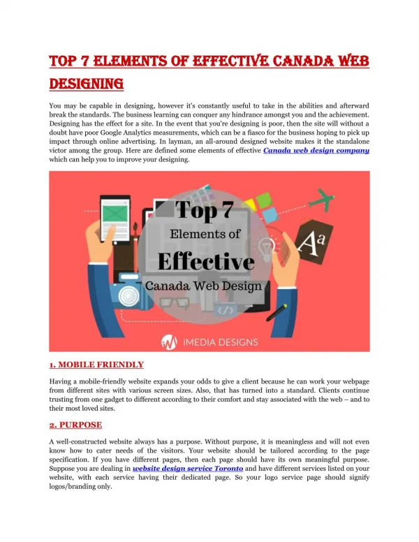
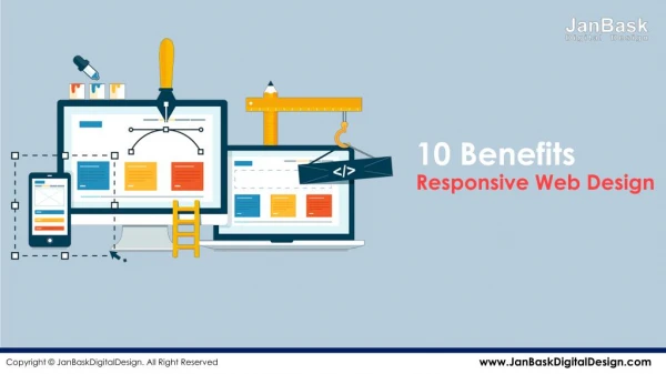
Top 10 elements of Effective Web Design. 10 –Use p roper spelling and grammar. Always use a spelling and grammar check tool before publishing a page! Proper communication gives integrity to a website :

E N D
10 –Use proper spelling and grammar • Always use a spelling and grammar check tool before publishing a page! • Proper communication gives integrity to a website : • nuthin will scare away a perspective brauser, reeder or byer then wrong grammer, poor speling, and when theirs wrong word choice.
A major exception is that it is common for sites with a specific target audience or subject matter to use non-standard words or grammar. It is assumed that the audience will understand or appreciate these terms. For example: • Initialisms like LOL (Laughing Out Loud), IMHO (In My Humble Opinion), AFK (Away From Keyboard) etc. are acceptable on pages where users know what they mean, and where the attitude is informal. • Genre-specific language like aggro, frag, camper or griefer would be acceptable only on video gaming pages. • Non-dictionary terms like swish, trifecta, and double-double would not belong anywhere except a sports website.
9 – Avoid orphan pages • All pages in a website should be linked to at least one other page of that site. • Don’t put links where they’re hard to find (in pictures, bottom of the page, etc.) Make it obvious where your links are. • TIP: An easy way to avoid linking diffuculties is to create a navigation menu that appears on all pages.
8 – Avoid blind links • Links should always tell you where they’re sending you – page visitors will become frustrated if a link sends them somewhere unexpected. INCORRECT:Why not CLICK HERE?CORRECT:VISIT OUR ONLINE STORE.
7 – Decide : “what is the purpose for my website?” • I.e. is your site just for yourself, or is it offering information or some sort of product to the world? • Emphasize what your site offers that is of unique or special value • Tell this to your visitors in a visible location of your page, as well as in the page title. • Then make it easy for visitors to find what they’re looking for. Special
…remember the three general purposes of websites: • Information oriented – these websites are used to provide information to the public. They could be a personal web site, government information, publicity or other type of informative space.An example: http://www.recycle.nrcan.gc.ca/default_e.htm(A government of Canada recycling information site) • Operational – these are e-business websites that allow users to purchase product and services.An example: www.futureshop.ca(A Canadian electronics retailer) • Campaign - these types of websites will promote a specific cause or publicity campaign.An example: http://www.madd.ca/(Mothers Against Drunk Driving Canada)
6 – For more information… • Professionally done pages need to have an area where the page owner and/or designer can be contacted. • NOTE : While it’s typically a good idea to state on a page that you’re the author, it’s typically a bad idea (as a non-professional designer) to include your email address on a page. • Having your email address on a page will often result in getting spam (junk) email. If you need to let visitors write something to you, add a “guestbook” where they can leave comments on one of your pages.
5 – Format content for the web • Every form of media has a type of communication that works best. Writing on the web is typically much different than writing in a newspaper, magazine or novel. • Use bullet lists when possible. Point form gets your point across faster. • Keep pages relatively short. Long pages can be discouraging.
4 - Avoid needless use of graphics • Graphics should be used to reinforce or clarify the content of your page – not just to glitz things up. Every picture needs to have a purpose. • A few examples of things that will scare away your site’s visitors:…
Anything that looks like an ad… New studies are showing that veteran web-surfers subconsciously ignore pictures on the web that look like advertisements. Make sure your legitimate pictures or links aren’t mistaken for ads.Be particularly careful with animated pictures.
… or too many pictures in general. • These three things will make • Your website look tacky and amateurish • Your webpages load slowly • Your site’s visitors annoyed. If there are other sites that your visitors can use instead, they will not give your site another chance!
3 – Format images properly • Resize pictures with Dreamweaver or resample them in an image editor (such as Adobe Photoshop Elements or Macromedia Fireworks) to make them smaller. You should not have to scroll around to see the whole picture. Note: The average browser window is 800 X 600. (Large - BAD) (Resampled - GOOD)
A quick note on common image formats: • JPEG has become a universal standard for graphics. You can never go wrong with using JPEGs: they have a small file size, and they can show photo-realistic detail. • BMP (bitmap) files are the most detailed, but they take an enormous amount of file space. It is generally a bad idea to use BMP pictures; your webpages will take too long to load. • GIF have the lowest quality of the three. Sometimes GIFs are used if a picture doesn’t have many colours, ie, cartoons.
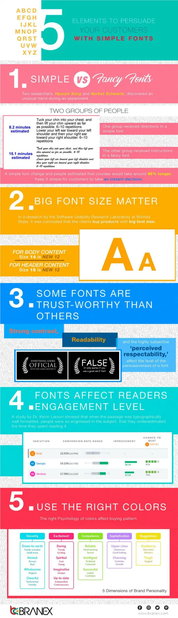
2 – Font size & readability • Fonts should never be sized smaller than 12pt, or HTML size 3. Unusual or specialty fonts often need to be even larger. • Bernard condensed font – size 20 • Gloucester MT – size 20 • Edwardian script – size 20 • Haettenschweiler – size 20 • Times New Roman – size 20 • Arial – Size 20
1 – Beware of low contrast • When you are designing a web page, it is crucial to make sure that the content (text) of your page is in high contrast with your background colour or picture. • Low contrasts make the content difficult to read. • You may opt to naturally choose a colour scheme that has contrasting layers, but if you have access to an image editing program (like Photoshop), you have another option: washouts and darkwashes.
THE TEXT IS THE SAME ON BOTH SIDES THE TEXT IS THE SAME ON BOTH SIDES Untouched vs. Washout Washing out an image reduces its intensity so that you can put dark writing on top of it. You can do the opposite, a darkwash, to darken an image so that you can put bright or pastel-coloured writing on it.
THE END Make sure to follow these 10 guidelines when creating your own pages!This will make your pages easier to use, which will make your visitors want to come back again and again! Good luck, and good web designing!