Download
1 / 23
240 likes | 627 Vues
The Design Principles. The overall flavour the ingredients create. The Design Principles. Design Principles refer to the use and creative positioning of the Design Elements. They tie up all of the elements and allow for the page to take on a certain style. The Design Principles.

E N D
The Design Principles The overall flavour the ingredients create.
The Design Principles Design Principles refer to the use and creative positioning of the Design Elements. They tie up all of the elements and allow for the page to take on a certain style.
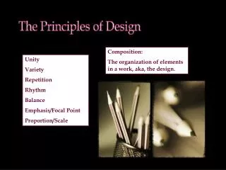
The Design Principles Design Principles refer to the use and creative positioning of the Design Elements. They tie up all of the elements and allow for the page to take on a certain style. • Alignment • Balance • Contrast • Dominance/Emphasis • Flow • Unity • Whitespace
Use of the Design Principles • In your DTP work. • The layouts should have been evaluated based against the Design Principles. • In the exam. • Knowledge of the Design Principles and how the effective use of Design Elements can create them.
Alignment When all the features on a page are lined up in a specific way they allow the readers eye to move across the page easily.
Alignment When all the features on a page are lined up in a specific way they allow the readers eye to move across the page easily. This is due to the page having a neat and structured look aligning can achieve.
Alignment When all the features on a page are lined up in a specific way they allow the readers eye to move across the page easily. This is due to the page having a neat and structured look aligning can achieve. 4 ways of ALIGNING a page.
Alignment 4 ways of ALIGNING a page. Dr P Clark M.D A+ Medical Practice Baltimore 01735 879 901 A+ Medical offer a great care for their patients. We offer dental packages as well as optical options and a great monthly payment plan. Dr P Clark M.D A+ Medical Practice Baltimore 01735 879 901 Dr P Clark M.D A+ Medical Practice Baltimore 01735 879 901
Alignment 4 ways of ALIGNING a page. Dr P Clark M.D A+ Medical Practice Baltimore 01735 879 901 A+ Medical offer a great care for their patients. We offer dental packages as well as optical options and a great monthly payment plan. Dr P Clark M.D A+ Medical Practice Baltimore 01735 879 901 Dr P Clark M.D A+ Medical Practice Baltimore 01735 879 901 Left Aligned Right Aligned Centre Aligned Justified
Balance Balance can be found in Symmetrical, Asymmetrical and Radial forms. However they all give off different feelings and moods. What type of balance would you expect to use in the following designs: Formal and Corporate Fun and Relaxed
Balance Balance can be found in Symmetrical, Asymmetrical and Radial forms. However they all give off different feelings and moods. To discuss Balance you have to discuss the position and size of the Design Elements on the page.
Balance Symmetrical Balance A- Symetrical Balance Radial Balance
Contrast Contrast can come in a variety of different ways through colour, shape and fonts. Contrast can be eye-catching however when it is over used it can look messy and detract from the message.
Contrast Font: Architecture is a structured sans serif font which is modern however the fun font used underneath contrasts with this and allows the reader to know its going to get interesting. Shape: The modern curves of the car contrast against the straight and linear columns and photo graphs. Colour: The lack of colours is striking. Only Black and White is used to create a dramatic look.
Dominance and Emphasis The size, colour and tones all contribute to the amount of focus a feature can create in a page. Generally this is found more in Headings and Subheadings but as you can see her Images can control the users focus.
Flow The layout of graphical items should allow a readers eye to glide over the page and take in each piece of information with the correct amount of attention. The amount of Dominance has to be correct to allow this to work.
Unity The spacing of items, the colour, the shape of items allows us to understand if items are connected. Items close together/overlapping tend to be related however something that is on its own helps create independence.
Unity The spacing of items, the colour, the shape of items allows us to understand if items are connected. Items close together/overlapping tend to be related An item that is on its own helps create independence.
Unity The spacing of items, the colour, the shape of items allows us to understand if items are connected. Items close together/overlapping tend to be related An item that is on its own helps create independence.
Whitespace An empty area on the page it should have no text or imagery, allowing the eye to rest.
Exam Question On the following page explain how the following Design Principles have been used? • Unity • Balance • Contrast • Alignment