Download
1 / 21
220 likes | 431 Vues
Sign and language. an introduction in the mind’s eye. Semiotics. Semiotics is a science concerning semantics and visual perception of signs and symbols. In semiotics scientists assume people think in signs, which makes rather disputable.

E N D
Sign and language an introduction in the mind’s eye
Semiotics • Semiotics is a science concerning semantics and visual perception of signs and symbols. • In semiotics scientists assume people think in signs, which makes rather disputable. • However it does hand us a way of looking at understanding how our brain handles the perception images. In semiotics we draw distinction between three sorts of functions. Despite of this distinction, each individual image can contain all of these three, depending on the context it been viewed.
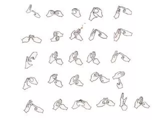
Semiotics An image can function as • an icon shows what it is. No more than that. • an index refers to something invisible. It could be something that occurred or is about to happen as well. • a symbol contains information which is agreed upon. E.g. laws, religion, (unwritten) rules. symbol icon index ! Note that the meaning of the word icon in this setting differs from the one, you might know from the desktop of your computer or any other daily device. Icon used in connection to daily devices, has become the collective noun for all three terms as mentioned above.
Testing of Pictograms The first serious tests in naming pictures are done by Snodgrass & Vanderwart, in 1980. Subjects were asked to name the pictures shown in one of the tests. The other test let subjects give the answer to the question which picture resembled a noun most. The pictures used were visualizations of objects. Nouns such as ‘thought’ or ‘wind’ weren’t tested. One of their main findings in relation to form was: ‘The intricate detail in a complex picture (e.g. motorcycle) or the utter lack of it in a simple picture (e.g. star) may function to make a stimulus novel and thus more recognizable than medium complex pictures.’
Testing of Pictograms Snodgrass & Vanderwart test methods are still used for testing pictograms by e.g. Prof. Zwaga *.He says there are three kinds of pictograms: - public symbols, - pictograms for consumer products, and - pictograms for professional products. Zwaga makes two distinctions in clarity in form within pictograms: The contrast principle shows a sort of ‘cause and consequence’. The generalization principle refers to the similarity of two or more objects to pass through the message. *(representative for the Netherlands for the international standardization organization ISO)
Testing of Pictograms Percentages show results from clarity tests Other findings by Zwaga show that: - subjects in the age of 20-35 years show a remarkable better comprehension than subjects over 65 years of age; - elderly subjects are less efficient in processing information; - elderly subjects have far more difficulty in combining different sources of information; - earlier experiences can decrease the speed of comprehension when the object is put in a new context.
Colour A contradiction in colour and text decreases the speed of comprehension. This so called Stroop effect proofs that the human brain makes a connection between form and meaning. REDBLUEBROWN ORANGEREDBLUE In daily life colour can change the intention of a message completely, if it is not used in the correct way.
Detail Snodgrass & Vanderwart already pointed at the role of detail within a picture. Detail itself is a good key to recognize from memory. In the following example the usage of detail works even extra, because of the rich contrast with the environment. Travelers have their minds set on catching their plane or pick up somebody. Overall the information given at the airport is given in quite low detailed signs.
Detail The more detail, the more time you need to read. Note the second ‘g’ from the left; it is the screen version from the regular print version. On the screen this is the best you can get.
Priming and Association An environment is part of the communication context. It allows a designer to make some assumptions in favour of sparing detail, or even leave visual information. In extreme situations, such as professional environments, a completely different array of symbols could even work better than the ones used in general public. In this case the environment is ‘daily traffic’. All users, assumed they know some basic rules, understand the meaning of the colour red. The environment primes the road-user how to interpret the pictograms in their total form.
Priming and Association Cutting in detail and referring to a specialized environment, when your target group is the average computer- or copy machine-user, is due to fail. Without the use of words, these pictograms are hard to understand. They were found on a box DATACOPY A4-format paper.
Priming and Association Symbols used in printing.
Priming and Recognition Another way of priming is one you can apply consciously, but may pop up unconsciously as well. Consciously a subject is asked to concentrate on one specific word, while he or she views a piece of text briefly - not in close detail. When the mind is being set into recognizing this word, it can be found quite easy, without having to have read the whole text word by word. Unconsciously one specific word can pop up out of a whole page of text as well. In this case hidden attention recognizes something familiar to the long term memory of the brain.
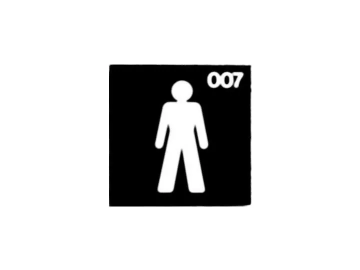
Negation Different ways of saying NO!
Variations an illustration for an article about Scandinavian design
Variations Instructions on how to behave at the railway platform.
Variations Routing signs for the Dutch railways. Obviously they were not too sure whether they were clear enough using just symbols.
Variations What do these symbols mean? From left to right: Stop! Take a closer look, New, Informative, Interesting Guest, Hardware, Software, Service. These symbols were designed for routing a designers meeting.
Variations When in Tokyo, travelling by tube, little girls should ask a guard for help if they dropped something beside the tracks. The doors do not close more carefully for those who bring their cats along.
Source list Semiotics Lubbe, J.C.A. van der, en Zoest, 1997, Tekens en betekenis Testing of Pictograms Ruisch, P. en E. Theys, 1998, Pictogrammen en Iconen Snodgrass, J.G., and M. Vanderwart, 1980, Norm for picture stimuli (art. Journal of Experimental Psychology) Colour, Detail, Priming and Association/Recognition Posner, M.I., and M.E. Raichle, 1994, Images of Mind Illustrations Dreyfuss, H., 1972, Symbol Sourcebook Ruisch, P. en E. Theys, 1998, Pictogrammen en Iconen CAP&Design, iss. 1997 - 2001.