Download
1 / 18
180 likes | 188 Vues
Presentations: Posters and Talks. Vanessa Couldridge. BCB 703: Scientific Methodology. Please note: AUDIO required for one slide. Scientific Presentations. Presentations can take one of two formats: Poster presentation Less intimidating

E N D
Presentations: Posters and Talks Vanessa Couldridge BCB 703: Scientific Methodology Please note: AUDIO required for one slide
Scientific Presentations Presentations can take one of two formats: • Poster presentation • Less intimidating • Allows for personal interaction at an individual level • Oral presentation • Guaranteed captive audience • More people are exposed to your work
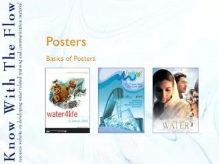
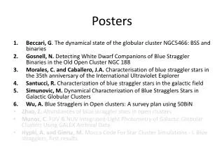
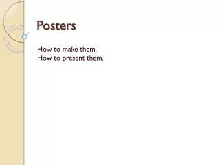
Posters A poster needs to be: • Visually attractive • Eye-catching and attention-grabbing • Informative • Scientifically accurate • Simple and uncluttered
Posters – Preparation • Conference organizers often impose a size limitation on posters – make sure yours complies • Before you start, plan where everything (title, text, pictures, etc.) will be placed • It may be helpful to create a dummy poster and play around with different layouts • A landscape format is easier to read • Order information under headings • Make sure there are no large empty spaces • Ask other people for their opinions
Posters – General Points • Should NOT simply be a paper stuck up on a wall • Keep text to an absolute minimum – if people want a more detailed explanation, they can ask you for one • However, bear in mind that a poster must still be able to stand alone • Use pictures and graphs for visual impact, but try to avoid tables, especially large ones • A4 sized handouts can be useful to take to a conference
Posters – Colour • Make use of bright colours (but don’t overdo it!) • Use a background colour or image that contrasts sufficiently with your text and does not distract peoples’ attention • Good colour combinations include: blue/yellow; blue/orange; red/white; green/white; black/orange • Avoid red and green colour combinations as 10% of the male population is colour-blind
Posters – Text • Title should be concise and should be large enough to be read at a distance of 5-7m • Include the names of all authors, as well as their affiliations, near the title • Can be helpful to also include a small (passport sized) photograph of yourself next to your name • Main text must be sufficiently large to be easily read at a distance of 1m • Use a font that is easy to read (e.g. Arial) and be consistent throughout
Posters Bad poster: • Too much text • Too busy • Title too long • Title too small • Author names too small • Poor quality graphics • Background is distracting http://tos.org/resources/publications/sci_speaking.html
Posters Good poster: • Minimal text • Simple and uncluttered • Title short • Title large • Author names stand out • High quality graphics • Good contrast http://tos.org/resources/publications/sci_speaking.html
Posters – Create with PowerPoint • Open a new presentation in PowerPoint • Under the File menu, select Page Setup • Select Custom size and set the size of the poster – use A0, or 90x120cm, or 36x48inches • Decide on the layout and colour scheme • Use at least a 96 font size for the title • Names and affiliations should be larger than the main text, and names larger than affiliations • Use an 18 or larger font size for the main text
Talks • Talking to an audience can be an inefficient means of communication • Far less detail can be presented than in a written format • Pitch your talk at the right level for the audience you are likely to have • Present information simply and clearly • Try not to use too much technical jargon • Take the time to prepare good visual aids
Talk - Slides • PowerPoint slides are the most commonly used visual aids • Slides should be kept simple, with minimal text • Plan an average of one slide per minute that you will be talking, e.g. for a 15 minute talk, you will need approximately 15 slides • Only include information on the slide that is relevant to what you are saying • Don’t use invisible colour combinations • Don’t use small text – at least 18 point font size
Talks Bad slide: • Heading too small • Too much text • Text too small • Text does not explain figure • Figure too small • Background colour dominates and is distracting http://tos.org/resources/publications/sci_speaking.html
Talks Good slide: • Heading large • No irrelevant text • Large figures • Source of figure acknowledged • White background provides good contrast http://tos.org/resources/publications/sci_speaking.html
Talks – Content • On the first slide, provide a brief and informative title and the names and affiliations of all authors • Introduction – places your topic in context • Start with more general issues and then gradually narrow focus • Methods should be as brief as possible • It may be helpful to include a few words above a figure to summarise the main point • Figure labels and axes should be clearly visible • Don’t use abbreviations without defining them
Talks – Content • If the same information is needed more than once, create multiple copies of that slide instead of back-tracking through several slides • Your talk should tell a story, rather than summarise a collection of facts • Try not to stray from the main focus or topic • Don’t overwhelm your audience with too much information • End with a summary slide of the main points or take-home message
Talks - Delivery • Rehearse your talk • Make sure you won’t exceed the allotted time • Speak loudly and slowly • Don’t speak with your back to the audience • Don’t read your presentation • Make eye-contact with your audience • Don’t fidget or say “um” a lot • RELAX, SMILE AND BE ENTHUSIASTIC!!!
Further Resources “Scientifically speaking: Tips for preparing and delivering scientific talks and using visual aids” Published by: The Oceanographic Society http://tos.org/resources/publications/sci_speaking.html