Download
1 / 5
0 likes | 9 Vues
Pink Turtle is Best Website Design Company in Pune. As endured web advisers in Pune, <br> we help brands, to engage, and inspire their guests through a diapason of online services <br> and creative designs. From small enterprises to large enterprises. We, offer all almost <br> everything that comes under the name of advertising.

E N D
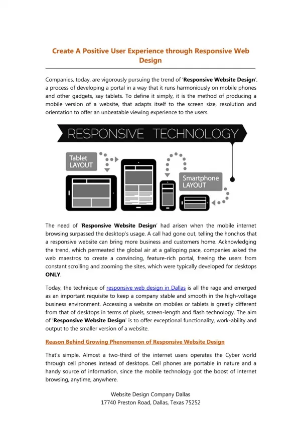
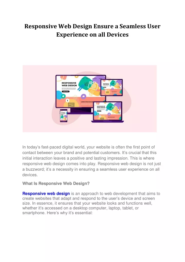
Responsive Web Design Ensure a Seamless User Experience on all Devices In today’s fast-paced digital world, your website is often the first point of contact between your brand and potential customers. It’s crucial that this initial interaction leaves a positive and lasting impression. This is where responsive web design comes into play. Responsive web design is not just a buzzword; it’s a necessity in ensuring a seamless user experience on all devices. What Is Responsive Web Design? Responsive web design is an approach to web development that aims to create websites that adapt and respond to the user’s device and screen size. In essence, it ensures that your website looks and functions well, whether it’s accessed on a desktop computer, laptop, tablet, or smartphone. Here’s why it’s essential:
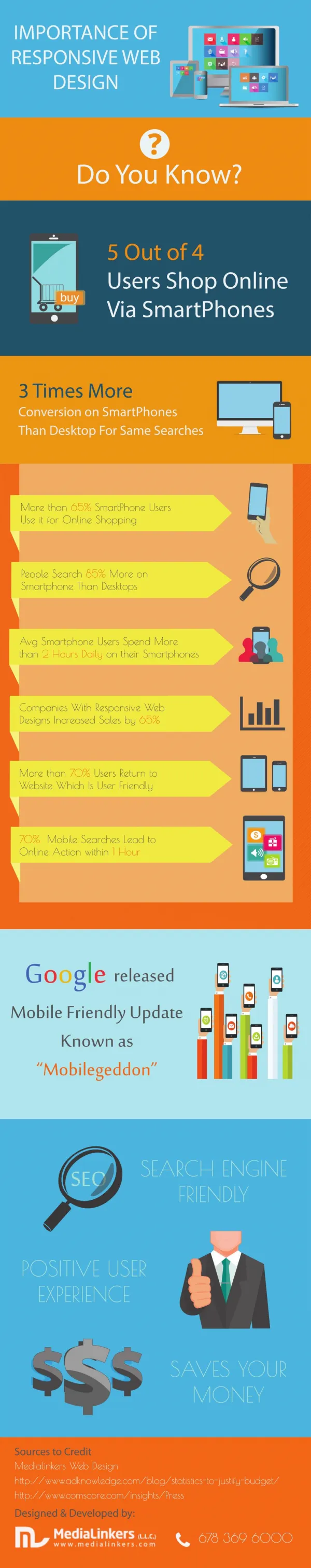
1. Enhanced User Experience The primary goal of responsive web design is to provide a consistent and enjoyable user experience across all devices. No one likes to pinch and zoom to read tiny text or scroll endlessly to find information on a non- responsive site. With responsive design, your website adjusts seamlessly, providing an optimal viewing and interaction experience for your visitors.
2. Mobile-First Indexing Search engines like Google now prioritize mobile-first indexing. This means that Google primarily uses the mobile version of a website for ranking and indexing. If your website isn’t responsive, it may suffer in search engine rankings, resulting in decreased visibility and fewer organic visitors. 3. Cost-Effective Maintaining multiple versions of your website for different devices can be time-consuming and costly. Responsive web design streamlines the process by creating a single website that adapts to all screen sizes. This approach reduces development and maintenance expenses in the long run.
4. Improved Loading Speed Responsive websites are often faster to load on mobile devices due to optimized code and content. Faster loading times lead to lower bounce rates, higher user engagement, and better SEO rankings. 5. Increased Conversion Rates A responsive website ensures that visitors have a smooth and consistent experience, regardless of the device they use. This consistency can boost user trust and confidence in your brand, ultimately leading to higher conversion rates. 6. Future-Proofing The digital landscape is constantly evolving, with new devices and screen sizes regularly hitting the market. Responsive web design is adaptable, making it a future-proof solution that ensures your website remains relevant and functional as technology advances. Key Features of Responsive Web Design Fluid grids: Design elements are sized in relative units (percentages) rather than fixed units (pixels), allowing content to adapt to different screen sizes. Flexible images and media: Images and videos scale and reposition to fit various screen sizes without distorting or overflowing the layout. Media queries: CSS media queries are used to apply different styles and layouts based on the user’s device characteristics, such as screen width. Responsive web design is no longer optional, it’s a fundamental requirement for any website aiming to succeed in today’s digital landscape. It’s not just about making your website look good on different devices, it’s about delivering an exceptional user experience that drives engagement, conversions, and brand loyalty. At Pink Turtle Designing Agency, we specialize in creating stunning and responsive websites that cater to all your users, regardless of the device they use. Our team of experienced designers and developers understands the importance of responsive web design in today’s mobile-centric world. Contact us today to ensure your website stands out and provides an exceptional user experience across all devices.