Download
1 / 39
390 likes | 512 Vues
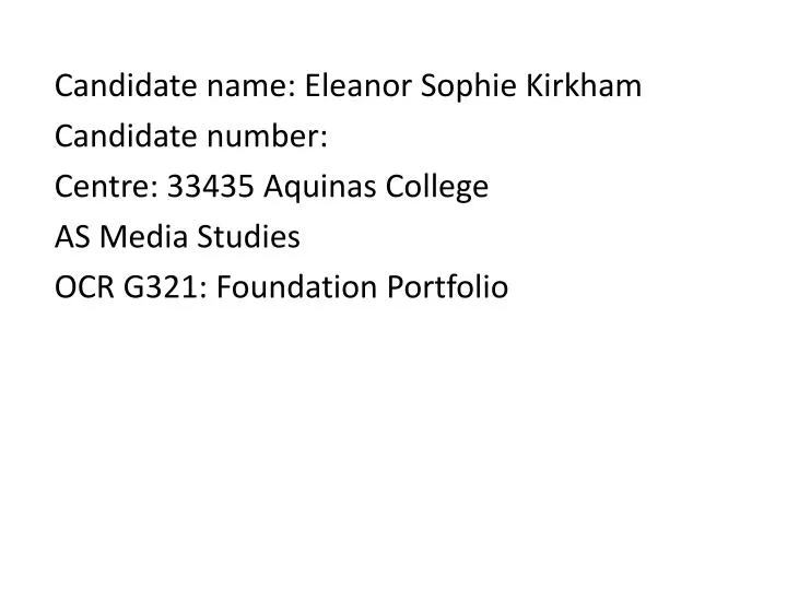
Candidate name: Eleanor Sophie Kirkham Candidate number: Centre: 33435 Aquinas College AS Media Studies OCR G321: Foundation Portfolio. 1. Who would be the audience for your media product?. Question 1:

E N D
Candidate name: Eleanor Sophie Kirkham Candidate number: Centre: 33435 Aquinas College AS Media Studies OCR G321: Foundation Portfolio
Question 1: To aid my success in achieving a magazine that ticks the boxes of my desired genre, which is Indie/alternative, I conducted audience research in order to make sure all audience needs and demands are met when making my magazine. The survey was completely by hand around the college, because the demographic I am angling for is a younger age base. I aimed for no specific gender when conducting my research, as I believe this magazine to be reasonably adaptable to either gender in terms of it’s content. However, the audience research was conducted among students as this is the age group I feel most suits my magazine.
The survey achieved a variety of results, ones that helped me to work out my colour scheme etc. The first question I asked was: Which of the options below do you feel is the best colour scheme for the magazine? • Blacks and reds • Oranges, reds and yellows • Blues, purples and blacks • Simple black and white The response I received was the majority opting for the third option – blues, purples and blacks. So, to take this on board I drafted my magazine cover on the basis that this would be the case. Despite a few tweaks here and there, I believe I satisfied this mass demand by including these colours in the scheme of my cover.
The next question I asked was regarding what they would like to see in my magazine in terms of what to put on my double page spread. The majority vote landed with an interview with an artist of the moment. Styling a friend into the role of a musical ‘it girl’, I conducted an interview regarding ‘Lola’s’ upcoming album and tour dates. I believe I presented the interview in a professional fashion suited to these type of magazine interviews, as well as tying the colour scheme into the photograph. The interview included questions that I felt readers might want to ask, which resulted in answers that the target audience would want to hear. This means the most popular/in demand feature was used and presented in a way that my target audience would appreciate the most.
Another question I asked consulted what they would like to see offered in the magazine – the choices consisted of a few, examples being a competition or free posters. The results I got back saw a competition and posters coming evenly head to head, therefore I addressed the fact that these are both popular with the audiences in a way that would satisfy both demands. As you can see below, I took both into account therefore addressed the popular demand of my target audience successfully.
For my media product the genre I was aiming for was the indie/alternative genre. This can be seen clearly within the industry with the likes of NME as an example. The indie/alternative genre is commonly stereotyped as having a young generation audience wise, however there are plenty of 18+ that may view this type of magazine. So, in terms of my audience’s age, I would describe it as somewhat wide spread yet still veering toward the young individual, as the fresh, modern angle of my magazine fits that demographic. The artists/activities/images I have shown are ones that I would expect my ideal audience to be interested in. This helps my to categorise my audience and identify the demographic that I am angling my product for more easily. I made a mood board to determine the ideal reader for my magazine. In this process, I worked out colours that might suit the magazine and also artists that serve as good examples of what genre my magazine is intended to be.
There are lots of aspects to my demographic which are explored below: • Gender – My magazine is not specific to any one gender and is able to appeal to any individual of either gender that is interested in the genre of music explored. This broadens my audience as it is not limited to either female or male. • Age– The age my magazine is angled at would be toward the younger age bracket/student area, an example of this scope being 15-20. However, since my magazine combines new, upcoming artists with older classics of the genre, it could also appeal to the adults that will remember these greats, giving my magazine an incredibly broadly spanned audience as there is no real limit to the age I’m aiming at. • Ethnicity – my magazine is not off limits to any ethnicity as I would hope none should be – Vinyl Divide does not promote any religion or belief over another or ethnic stereotypes, which further widens my audience.
2. How does your media product represent particular social groups?
Question 2 The main social group that Vinyl Divide, my magazine, represents is linked with my ideal audience, which is younger people or students. This is as a result of coverage of new artists, however old artists are still features which link in with the theme of the magazine – music that you might find on Vinyl records. In my magazine I have included several things that would interest my target social group (indie/alternative youth), including: • Arctic Monkeys • The Courteeners • Festival tickets competition • Band posters free inside These are all common things that appear on indie magazines such as NME, so from this I have gathered that this social group may find my magazine up their street.
The colours used on this cover are all sticking to the same scheme – bold and vibrant. This is a colourful and lively spread of tones that will appeal to a younger demographic as it seems fun and modern, steering away from boring blacks and whites. The photo I used was intended to add some glamour to the cover. On magazine covers such as NME, the female artists are always overly stylized and done up – an example being Florence and the Machine or MIA below. This fits into the genre as it is a typical representation of a female artist in this industry. The ‘exclusive band posters inside’ sticker is a way of engaging the demographic I am aiming at (primarily students) as younger people tend to have posters up on their wall. Also, since students don’t tend to have that high a budget for things such as posters, it allows them to enjoy and display their musical preferences without having to spend any money. This is a way that I appeal to my social group particularly effectively in my opinion.
Reference to artists such as Morrissey of the Smiths tie my magazine in with the demographic I’m angling for – The Smiths are a classic example of Post Punk or Indie music and are seen as an iconic example of older music – Vinyl Divide in it’s concept was intended to combine the classics of the record days with newer discoveries , something that NME successfully combines. Incorporating mention of a Festival fits in with the social group I’m angling toward – Indie/alternative youths will clearly be enthusiastic advocates for Festival attendance, so this checks another box The over the shoulder, gazing off into the distance pose sets the feel of enigma and mystery – something that represents the Indie and even Rock genre well.
3. What kind of media institution might distribute your media product and why?
Question 3 When considering a media institution to publish and distribute my magazine, I have come to the realisation that ideally I am looking for companies that do this for magazines of a similar sub-genre to my own, for example: • NME is published by IPC Media • Q Magazine is published by Bauer Media Group In order to satisfy the legacy of either of these institutions, clearly my magazine would have to maintain a respected image within the industry by meeting criteria for these two publishing companies: my magazine would have to remain up to date and fresh in terms of it’s news, events and music; continue to satisfy my audience to a satisfactory level and reinforce the genre rather than neglecting to make it clear. When reviewing the success of their current magazines, as earlier mentioned, Q and NME, these two would definitely be the leading candidates for distributing and publishing my magazine.
A variety of ways could be explored in terms of how either Bauer or IPC Media could approach the distribution of my magazine, the different means of which are explored below: • A traditional approach could be taken, in which issues are simply sold in store for a standard fee • Apps for your phone could be introduced so that on-the-go reading of the magazine could take place – this is important in a modern business world, as most companies are introducing apps in order to keep up with the times and remain fresh and up to date • Radio is a method that could be explored, in which records fitting to the magazine could be played – this would serve as a great promotion for the magazine, as people would be able to read up on the songs that were played in this months radio time. Or, an established radio station such as XFM could be used to advertise the magazine, as demographic XFM angles their music to would also cooperate with my magazine’s target audience • My target market for the magazine is indie/alternative youth – a key component of the business industry considering my market would be the internet, since a younger generation spends most of their free time on their. If I were to open a website for my magazine they would be able to access articles, news, etc on there which serves as a great promotion within a technology savvy audience • Festivals such as Leeds festival, that link in with my genre, could be sponsored by my magazine in order to further branch the brand out and promote it
4. In what ways does your media product use, develop or challenge form and conventions of real media products?
Front covers Question 4 This is one of the many front covers of NME magazine, a magazine that matches my own in terms of genre. My genre of music magazine is indie/alternative, something that mirrors NME’s. NME uses a dominant image where the subjects are maintaining eye contact, something that I have made sure I have achieved on my cover, as this is a generic convention of not just music magazines, but magazines in general, usually creating a feeling of involvement with the reader. A clear colour palette is also used to set the scheme for the magazine, making it look more rounded and professional – as you can see with the first example of a cover, reds, whites, blacks and the occasional yellow is used. Pull quotes can also be seen in all three of the examples below – these are used to set the theme for the main article and entice the reader to want to know more, as they are usually eye-catching and shocking, e.g. Lana Del Rey’s “I’m a psycho!” statement is hardly something you’d usually say, readers will want to find out why she might have said this. The masthead on each example of music magazine below is clear and eye catching, positioned at the top left as this is the first place a reader tends to look, since people read from left to right, from the top. All magazines have made the celebrities that will be featured in their magazines clear and bright, attracting the fans of said celebrity since if they saw their favourite artists name, they’ll want to know more about it. Most magazines tend to use stickers, as seen in two of the three below, usually used to announce an article within the magazine or something the reader can gain e.g. a contest or poster that is inside the magazine, again, used to attract readers by offering them that little something extra. Occasionally a strip of colour is used at the top as a background for extra information, which can be seen in the first image below this. This is used to draw attention to the information and make it stand out to the reader.
How my front cover compares The masthead used is eye-catching but doesn’t take away from the dominant image and the name relates to the ‘Indie’ genre as it is a reference to older music I have used a different colour for the article headlines in order to make them stand out to the reader and make them look eye catching. Then, underneath, I have provided a little information in a less evasive font and colour so that if the reader is intrigued by the headline, they can find out what the article is about briefly in order to entice them further to read it. This is a generic convention of music magazines as it allows a small introduction to an article you may be interested in. I have used a dominant image where the subject is maintaining eye contact, which is a generic convention of music magazines used to establish a connection with the reader and make them feel involved in the magazine. I have also used two stickers to introduce festival tickets available to win and posters inside – this provides the reader with another reason to read inside if they find out that something inside is free or available to be won and is another convention I have used on my cover. A pull quote can be seen here which is eye-catching and grabs the readers attention – this is a commonly used generic convention among music magazines of all genres as it lures the reader in to investigate the article. I think that as an improvement to my magazine cover I could have stuck to a more obvious colour scheme so that it looked like a more professionally rounded product.
Contents pages The three contents pages shown below demonstrate many generic conventions of the music magazine genre. My sub genre is indie/alternative as earlier mentioned, which the magazines below also match. On contents pages the masthead is usually repeated so that it remains strong in the readers mind what magazine it is that they are reading. This is also a form of advertising the magazine within it, as it will help the reader to remember the magazine title. A colour scheme is also a convention of contents pages, which below popularly seems to be red, however it can differ between any magazine depending on the house colour of that magazine e.g. NME’s house colour is red. Page numbers are usually in a different colour to grab your attention and help it to stick in your mind where the article is, and the article headlines, much like the front page, are usually in a different colour to capture the readers attention. There is also usually an editors note, something the magazines below seem to contradict, however this is a known convention of any magazine’s contents page. Images are also used to entice the reader to the articles, for example, below, there is an image of Lana Del Rey with nothing other than a number – the image tends to speak for itself on these occasions or this is used on the article that is the cover article, so the reader has already been detailed of what it involves. Stickers/pop-ups can also be used just like on the front – to grab the readers attention and offer something a little interesting to look at. An example of this below would be the two NME contents pages with the arrows at the bottom. An issue number is also a convention of music magazines as it establishes a prestige to the magazine if it is long running. The date is also always mentioned as a convention of contents pages.
How my contents page compares I have repeated the masthead from the front cover in the same font but a different colour, the use of the title of the magazine is a common convention that is intended to make the reader remember the name of the magazine clearly. I have placed the date in not too much of an eye catching place, yet so that the reader is able to notice it. This is a use of convention that could perhaps be improved if I were to make it clearer and easier to read. I have used a colour scheme of pinks, blues and purples for the contents page in order to make it look neat and professional, which is a generic convention of music magazine contents pages as it creates a cleaner cut product. In order to improve on this I could have looked at the front cover and matched the schemes more successfully, but independent from the cover I believe that this achieves the intended convention. I have used an image linking to the cover article with simply the page numbers, as the reader will already be aware of the article given the heavy focus it had on the front cover. This meets the generic convention of how most music magazines present their cover article in the contents. The editor’s note is another generic convention of music magazine contents pages that I have met. I have used a popup/sticker to give the contents page a more interesting dynamic, and this is a feature that I noted on during the previous slide, a generic convention of magazine contents pages. I have also included the issue number, as mentioned earlier, to give the reader an idea of the prestige or legacy the magazine has. This is commonly used on contents pages. I have used a bolder font for the article titles and a less intrusive font for the descriptions, a generic convention intended to let the reader focus on the headlines and have a brief synopsis in contents pages. I have also made the page numbers a different, eye-catching colour so that it sticks in their heads, which a technique generally used by all music magazines of my genre.
Double page spreads Double page spreads in music magazines will never be found without a dominant image that is used to introduce the subject of the article – usually a well known celebrity, however in some smaller magazines this may differ. The image usually tends to convey a message – for the first image below, it is depicted that Pete Doherty is a man of high spirits that often is immersed in the party lifestyle, for the second image we see that Lana Del Rey is rather stylized and glamorised and in the third we see that Liam Gallagher isn’t very stylized or posy at all, which illustrates him as a simple guy that doesn’t buy into that kind of thing. All kinds of messages could be read from the images, but the point is that this is deliberate, the images are intended to evoke ideas in the readers mind that match the theme of the article. Drop caps are also a generic convention of double page spreads as they break up the text, so instead of looking rather blocky and like there’s a huge amount to read, it gives a little interesting spin on the monotonous black and white. Pull quotes are also usually used as they entice the reader even more into the article, fulfilling the same purpose they serve on the front cover. A colour scheme is also abided by as this gives a more professional and neat look to the articles – below, the first image is a clear example, as well as the last in that they both use a colour scheme that they stick to throughout. Sometimes a secondary image is used, however conventionally double page spreads tend to have just one image as the dominant image on one of the two pages. Rarely, yet not often, stickers/pop-ups are used to advertise other articles that the magazine has to offer, yet this is seen as a little uncommon among music magazines as they want the main focus to be the article that the readers are currently on. Also, the name of the artist is usually mentioned somewhere, as the article in itself tends to be an advertisement for their music.
How my double page spread compares I have placed the name of the artist here in an eye-catching font and colour in order to serve as an advertisement for the artist, something that is conventionally used in music magazines. Here I have used two pull quotes to entice the reader in to read the article, which is a generic convention of double page spreads as it serves as an advertisement or preview for the article along-side it. Here I have used different colour text to represent the switch in speaker, as well as documenting the speech with a ‘L:’ or ‘I:’ beside it to indicate which person is speaking. A drop cap has been used to boldly introduce the content of the article. This is an absolute essential of double page spreads. I have also used a small box at the bottom to advertise what was mentioned throughout the article, as the artists album is upcoming and that is the reason for the interview. This is commonly seen in music magazines and is a generic convention used to promote the artist. The model uses direct eye contact as a way of engaging the reader.
Question five Vinyl Divide is a name that links in with the genre of music I am angling this magazine toward. My magazine centres around the Indie verging on Post-punk genre and some iconic examples of that are bands that may not be around in present day and were at the height of their fame in the years where Vinyl Records were the method of music. The ‘Divide’ aspect of the brand name recognizes that this genre is divided between archived songs and songs yet to come – there are plenty of up and coming music acts that slot into this genre and do it’s name proud. This satisfies the genre of my magazine as well as being bold and mellifluous. I have also represented the genre in a number of different ways in a bid to attract my desired audience, as shown on the next few slides...
Colour scheme: Throughout my magazine a different message can be conveyed through the different use of colour. Bright colours are used to convey something bold and lively, linking in with the fact that my audience is younger and will appreciate the fun and animation in these tones. Neutral, earthy tones give the magazine something rustic and really help to demonstrate that there’s a note of sophistication in there along with the youth – helping to convey the combination of young and old music joined together.
Typography: The font used on projects can also be used to demonstrate the kind of feeling or tone you wish to convey to your audience. Cursive, traditional and almost hand written looking fonts give that feel of sophistication that I feel needs to be demonstrated here since the magazine handles such iconic music as well as juggling an older audience with a young one. Blockier fonts that appear bold and jump out to the reader link in with the more modern feel I wish my magazine to possess. While I am dealing with a younger audience, I still want a feel of sophistication, something that this gives. This font gives the feel of a youthful vibrancy – the colour stands out and gives it a flair of 3D aspect, something that will tick many boxes with a younger demographic.
Front cover: On my front cover I included an image that is rather stylized and posed as this is how many female singers in the industry today are presented – this is a generic convention of this genre in terms of representation that I have satisfied. I have also included an arrow pointing that there are free ‘exclusive band posters inside’, which typically would appear to a teenage audience, one that the magazine is desired to aim toward. Teenagers stereotypically like to cover their walls with band posters, therefore this directly appeals to them. Another addition to my front cover that appeals to my audience is mention of bands relevant to the genre that I have kept current throughout my product.
Contents page: The image on my contents page relates to the leading article of the magazine, tying in the front cover and double page spread and making the general product seem believable. The off-into-the-distance stare gives a feel of enigma that would appeal to my desired audience. I have also included article references that are intended to entice the reader into wanting to explore what the rest of the article contains – the small snippets are angled with the hopes that the reader will read them and be desperate to fill in the blank of what the story is about. Visually, I have made my contents page look rather bright and bold in order to give the impression my magazine is lively, energetic and generally fun.
Double page spread: The image I used for my double page spread is complimented by the text and colour scheme on the rest of the page – the colour of the flower and her lips is immediately drawn to the readers attention and the fact that direct eye contact is used addresses the reader. The headline is just a simple ‘Lola’ which is rather mysterious – this in itself draws in the readers attention as they want to know who Lola is and why she is being covered in the article in such an important fashion. The quotation is placed separately from the interview in order to draw attention to the fact that ‘Lana Del Rey is such an inspiration’ to the singer. Lana Del Rey is a female artist that appeals to many among the Indie genre, therefore this would influence them to read about Lola since she is similar to that type of music.
6. What have you learnt about technologies from the process of constructing this product?
To begin with when starting this project, it appeared a little daunting as I only really grasped the very basics of programs such as Photoshop. However, since Photoshop was a core part of this project in that we had to design our front cover, contents page and double spread on it – I feel I have begun to grasp the necessary tools within Photoshop to aid me on further projects that might go forward in Media Studies. Over the next few slides will be some examples of ways in which Photoshop tools have benefitted my project.
The first time that I believed Photoshop to be useful is when using the Lasso tool, that is pictured below. This tool is essentially a tool designed for you to be able to cut things out from the image. Should you circle a portion of image and click delete, the part you circled would be filled in white – aka that part of your image deleted. I found this tool particularly useful when dealing with preparing my image for use within my product. When having a dominant image for your cover, you want something that is eye-catching and professional looking. However, since I didn’t have access to a studio with a white screen, the photos I took were all based within the garden of my house as well as inside, as you can see below with the cover image as an example. Therefore, without the use of this tool on my images, I don’t feel my product would come across as professional as it might. It is a handy tool that I am now able to use thanks to this project.
I also used the brightness/contrast tool on a couple of occasions in able to brighten the image I was using. When using an image for your product, you don’t want it to look unprofessional as though the photo wasn’t taken in great lighting, or just generally gloomy. If this was the case for some of the images, it was great to be able to brighten them up and make them look like a much more polished product. An example of this is on my double page spread. The image I used for my double page spread was one that I definitely knew I wanted to include in my magazine as I liked the colour scheme on the image, however the light in my garden was fading a little and as a result, the photo appeared rather gloomy and a little more dull than it should be. Although the difference is minor, I felt that the change in brightness and contrast really made all the difference to my product – making the image clearer and bolder.
A vital tool in the creation of my magazine was changing the colour of numerous different elements. This can clearly be seen in use when referring to all three components of my product – front cover, contents and double page spread. On the double page spread, the colour scheme was oranges, reds, blacks and whites. I achieved this by being able to toggle with the colours of different things, mainly text in this instance but also the box so that I could have an inverted scheme – white font on a black background. Being able to alter the colours just meant that my product could work together nicely, all colours complimenting one another. Changing colours is especially important on my contents page. As you can see, there are lots of different colours on this section of my product – blues, purples, pinks, blacks and whites. As you can see, there is a whole range of colours used on this section of my product.
Changing font was also a vital component of Photoshop tools that I used often when working on my product. When making a magazine, you need to remember to stick to a certain number of fonts otherwise it looks cluttered and unprofessional – I tended to try to use the same fonts on each section of my magazine. I used ‘Impact’ for my headings or things I wanted to draw attention to – an example on the double page spread being the small box with the date announcement for an album. I also used Times new roman, which has quite an old feel to it – in keeping with the ‘retro’ feel to my magazine. On the double page spread I went for quite cursive, old styled font so that it had an artistic look to the article, as well as hinting at femininity given the female vocalist being interviewed. This is an absolutely vital tool when making magazines I have found, since you can’t stick to just one font – it would simply be boring if you did so.
7. Looking back at your preliminary task (Aquinas College magazine), what do you feel you have learnt in the progression to the full product?
Question seven In my personal opinion, the differences/progress from my Aquinas Magazine to my finished product are extremely noticeable. Within the next few slides, these differences are what I will be exploring.One of the first most important differences between these two products is the software used to produce them. While the Aquinas Magazine was made on Microsoft Publisher, Vinyl Divide was created on Photoshop. Photoshop struck me as a product intended to create much more professional, rounded and in depth products most simply due to the incredible range of tools that you have access to. The fonts and tools on Publisher are much more limited and amateur compared.
Many differences can be noted on between the style of the mastheads for my two magazines. For the first, the font is rather unprofessional due to the fact that anybody can use it – it is available on all of the Microsoft publications. However, the font I used on Photoshop – Impact – is also a supposedly low budget font, yet I feel it has much more of a professional feel to it as it looks much neater and bolder than the prior. Another thing to comment on would be the fact that with my Aquinas Magazine, the background was rather cluttered – the photo was taken outside on a sunny day to achieve good lighting, however I feel the product didn’t satisfy it’s full potential due to not being able to properly read the text. The text is somewhat lost within the background and doesn’t stand out. However, as you can see, with my next magazine project (Vinyl Divide), I used a Photoshop tool called ‘lasso’ to cut the model out from the background. I feel this gave the product a much more rounded, professional feel as now you can clearly read the font and you aren’t distracted from the model by a cluttered background.
The next point of discussion is the differences in my contents page, from Aquinas Magazine to Vinyl Divide. The points to be made generally mirror that to be said of the front cover, however I feel it important to reinforce. The fonts used on Aquinas’ contents page were rather amateur again in comparison, as well as the images used on the page in terms of professional quality. However, to break apart from repeating my observations for the cover – it seems that the structure of the contents for my Aquinas magazine lacks the organisation and general composed effect of Vinyl Divide’s contents. In my opinion, the contents of my latest project appears much more neat and effective as a convincing product.