Download
1 / 49
490 likes | 595 Vues
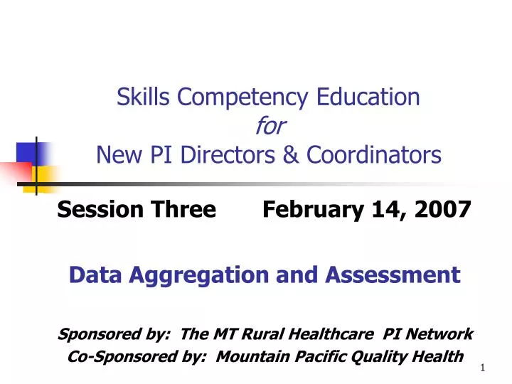
Skills Competency Education for New PI Directors & Coordinators. Session Three February 14, 2007 Data Aggregation and Assessment Sponsored by: The MT Rural Healthcare PI Network Co-Sponsored by: Mountain Pacific Quality Health. Today’s Session . Recap Session 2: Data Collection

E N D
Skills Competency Education forNew PI Directors & Coordinators Session Three February 14, 2007 Data Aggregation and Assessment Sponsored by: The MT Rural Healthcare PI Network Co-Sponsored by: Mountain Pacific Quality Health
Today’s Session • Recap Session 2: Data Collection • Turning Data into Useful Information • Step one: aggregate • Step two: assess • Step three: data quality issues • Tools • Questions
Why Aggregate & Assess Data? • To increase the usefulness of data • To help make it ‘actionable’ • To identify areas where other or more data needs to be collected • To identify mistakes, poor quality data
Why Aggregate & Assess Data? • To provide objective information as the foundation of objective decision-making • Always end with a decision about how to go forward • Ultimately, supports the organization in achieving its mission, vision
A Little Background… Statistics • The science of probability • Can become very complex • We are not statisticians • We don’t need to be; someone else has done that work for us • PI uses basic statistical methods and tools to scientifically, objectively support improvement efforts • It is a scientifically sound approach • It is improvement, not research
Step One: Aggregate the data • Group like-kinds of data together • Called a data set • Can start this process during collection • Aggregation tools • Log sheets • Table (matrix) • Dot plot
Simple Log Sheet:Group one kind of data together • Data set name • Data label • Data bit label • Data bit
Data Aggregation Limits • What do we know so far about the value or importance of the data we’ve collected? • Can we determine if the variation present is “significant”? • Can we draw overall conclusions from it? • Can we take constructive action based on it?
Data Aggregation Limits • If our data represents a sample, what can we say, or infer, about the rest of the group (“population”) based on our aggregated data? • Making valid statements of this kind is the work of ‘inferential statistics’ • Example: reviewing 10% of closed records
Assessment Techniques • Calculate measures and/or rates • Construct charts and graphs • Look for trends and relationships • Evaluate the variation: is it… • Normal or an outlier? • Common cause or special cause?
Assessment: Calculations • Frequency • Relative Frequency • Percent, percentage • Range • Average (mean) • Median (middle) • Quartile • Decile
Calculations: Frequency “Count” data: how often something happened or was observed
Calculations: Relative Frequency Relative Frequency (RF) = x / n
Calculations: Percent Percent (%) = RF x 100 or ((x/n) * 100)
Calculations: Range Subtract the lowest value from the highest value
Calculations: Average, mean Sum of all values / n
Assessment: Charts, Graphs • Construct charts and graphs • Add limits for evaluation • Control limits: upper, lower • Threshold: point we will intervene • Benchmark: internal or external • Look for trends and relationships
Charts and Graphs • Help us understand and identify normal variation in systems and processes and leave it alone • Range of normal body temperatures, pulse rates and blood pressures • Record but leave it alone
Charts and Graphs • Help us understand and identify variation that is not normal within a system or process and take corrective action that will reduce orremove it. • Ice pack to reduce extreme fever • Medication to reduce elevated blood pressure or heart rate
Charts and Graphs: What’s Normal? The Standard Normal Curve +/- 1 SD = 68.2 % area +/- 2 SD = 95.4 % +/- 3 SD = 99.8 %; upper and lower control limits 34.1 % 34.1 % 13.6 % 13.6 % 0.1 % 0.1 % 2.2 % 2.2 % - 3 SD - 2 SD - 1 SD Mean + 1 SD + 2 SD + 3 SD
Charts & Graphs:Add Control Limits Upper Control Limit, + 3SD Lower Control Limit, - 3SD Mean, average Source: mathematical calculations, internal or external
Charts & Graphs:Add Threshold for Intervention Threshold: a predetermined point at which action will be taken Source: internal discussions
Charts & Graphs:Add Benchmarks Benchmark: a pre-determined level of desired performance Source: internal or external
Charts & Graphs:Look for Trends, Relationships More falls: why? Fewer falls: why?
Evaluate Variation • If know what ‘normal’ looks like, you are • Able to identify outliers: unusual, unexpected process/system events • Able to evaluate relative severity or importance when multiple factors contribute • Able to identify improvement and work to maintain gains
Evaluate Variation • Common Cause Variation • The expected variation inherent in any process due to the normal interaction of the process variables. • Special Cause Variation • Unexpected variation in the process due to a specific reason or cause.
Evaluate Variation: The Standard Normal Curve +/- 1 SD = 68.2 % area +/- 2 SD = 95.4 % +/- 3 SD = 99.8 %; upper and lower control limits 34.1 % 34.1 % 13.6 % 13.6 % 0.1 % 0.1 % 2.2 % 2.2 % - 3 SD - 2 SD - 1 SD Mean + 1 SD + 2 SD + 3 SD
Normal Distribution Even and varied distribution of points on both sides of the mean, all within control limits; common cause variation; the process is said to be ‘in control’ and/or ‘stable’.
1 Point Outside Control Limits 2-2SD Rule 4SD Rule 1-3SD Warning 6 point trend 7 + point trend Sawtooth Evaluate Variation:Westgard Rules for Control Charts Source: http://www.westgard.com/mltirule.htm
1 Point Outside Control Limits 1 point exceeding the upper or lower control limit is special cause variation
2-2SD Rule 2 consecutive points greater than or less than 2 SD; special cause variation
1:4SD Rule Change of 4SD up or down is special cause variation
3 SD Warning Change of 3SD; special cause variation may be present; investigate
6 Points on One Side of Mean 6 consecutive points on one side of the mean is special cause variation
7 Ascending, Descending Points 7 consecutive ascending or descending points is special cause variation
Sawtooth A sawtooth pattern is not normal, it is special cause variation
Practice Assessment Are the reductions in immunization failure rate below ‘significant’? Standing orders Discharge order sheet 24 hour review Hint: think about how the Westgard 3SD and 4SD rules looked
Data Quality: Validity • Is the data itself valid? • Are your conclusions valid? • Is the data accurate • Is the data reliable
Valid Data • Accuracy • Precision: how close is the measured value to the true value? • Confidence intervals: how confident can you be that they are the true value?
Valid Data • Reliability: do repeated measurements produce the same results? • Sample size • Confidence intervals
30 data points approximates the normal curve no less than 10 data points unless it is 100% 10% of a large population 100% of a small population Valid Data: Sample Size For PI, the data just needs to be valid and actionable!
Questions? Next Time: Performance Reports Wed, March 14 1pm
PI Ed Session 3 References • Handbook For Improvement, 3rd Edition; Healthcare Management Directions, Inc.; 2002. • Norman, G. and Streiner, D; Biostatistics The Bare Essentials; Mosby-Year Book Inc; 1994. • http://www.westgard.com/mltirule.htm • www.mtpin.org