Download
1 / 61
610 likes | 797 Vues
Exploring Data. G oals of the day: Develop an understanding of NGSS & CCSS as it relates to data and data analysis Work with the data literacy framework Discuss ways to we can work together as a k-12 team to support students and each other to use data regularly and effectively. Problem:

E N D
Exploring Data Goals of the day: • Develop an understanding of NGSS & CCSS as it relates to data and data analysis • Work with the data literacy framework • Discuss ways to we can work together as a k-12 team to support students and each other to use data regularly and effectively.
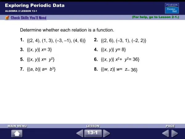
Problem: If you are a Park Ranger stationed at Old Faithful in Yellowstone National Park, how would you answer Park visitors when they arrive at Old Faithful and ask you "How long until the next eruption?" What could you tell visitors hoping to watch the geyser erupt to help them decide whether to wait or to go visit the restroom or get lunch first? To see if the time between eruptions follows a predictable pattern, graduate students observed Old Faithful around the clock for two weeks in August, 1990, and measured the time in minutes between every eruption. The table presents the minutes they recorded for each 24-hour period during the two weeks. How would you use these data to give Park visitors a useful answer to their question?
Let’s remind outselves of the • Principles of the Framework (and NGSS) • Children are born investigators • The focus is on core ideas and practices and crosscutting concepts. • Understanding develops over time • Science and engineering require both knowledge and practice. • Ideas have to connect to students’ interests and experiences • We must promote equity
The Acadia LearningData Literacy ProjectA framework for using data in science classrooms Dr. Molly Schauffler, University of Maine Climate Change Institute, Dept. of Earth and Climate Sciences, and Center for Research in STEM Education Hannah Webber, Education Program Manager, Schoodic Institute Dr. Sarah Nelson, University of Maine Sen. George Mitchell Center for Environmental &Watershed Research and Dept. of Plant, Soil, and Environmental Sciences Ryan Weatherbee, Research Associate, University of Maine School of Marine Sciences; Graduate student, Center for Research in STEM Education Bill Zoellick, Director of Education Research, SchoodicInstitute A varied team of grade 6- 12 classroom teacher leaders
Why Data Literacy is Hard The word “Data” is plural
How tall is this boy? He is 180 cm tall (that is a “fact”!)
How tall is this group of children? Now we have “data” (and a more complicated answer) 180 cm 152 cm 146 cm 140 cm
Which boy is taller? … a pretty easy question to answer
Which group is taller? … a more complicated question to answer
1. Visualize variability: How data are distributed (dot plot, box and whisker plot, histogram) 2. Describe variability in the data using statistical language (distribution range, shape, measure of center) 3. Display, describe, and interpret the data in the context of a question 4. Explain how the evidence supports the interpretation,accounting for variability in the data
1. Visualize variability: How data are distributed (dot plot, box and whisker plot, histogram)
The powerful thing about frequency graphs is that they provide a way to show all separate facts in a group of data in a single picture. • Graphs are a visuallanguagefor telling stories about data. • Success in making sense of data depends on learning to use the “picture language” of graphs. Visualize Variability (Each dot represents a state)
"How long until the next eruption?" Visualize Data
2. Describe variability in the data using statistical language (distribution range, shape, measure of center)
"Hurricanes in 2012 had wind speeds between 80 and 115 knots. There were 10 hurricanes in 2012, and their average wind speed was 97 knots. Within the range they were spread out, not very clumped." Describe Variability
Describing Words K-2 Compare, more, less, how many, total, 3-5 Difference, middle, spread out, clumped 6-8 Mean, median, mode, center, range, spread, shape, variability, pattern, sample, random, outlier, frequency, probability, bivariate, scattered, clustering, positive or negative correlation, linear relationship,nonlinear relationship, slope, closeness to line, categorical, numerical, shifted,biased, even, slightly 9-12 Distribution related to center (mean, median), spread (interquartile range, standard deviation), normal, skewed, correlation coefficient, correlation vs. causation, bi-modal How do these words describe and what do they say about the data?
In the first years of this project … we learned that although many students had learned some of the elements of this language … they did not know how to understand it or “speak” it.
Example: Compare two groups Do rocky streams have more dragonflies in them than mucky streams do?
Example: Show and discuss relationship between two variables Is mercury concentration correlated with fish weight?
Example: Interpret a scatter plot Is there a correlation between fish weight and mercury concentration in fish tissue? “Their hypothesis is wrong because all the points don’t fall on the line”.Ninth grader
The Data Literacy Project has found that some teachers are not fluent in “graph language.” Many teachers • Have not really thought about variability in data • Don’t tend to critique students’ graphs but focus on mechanics • Don’t think about linking the graph to a question • Do not know how to use graphing & spreadsheet software • Are eager to improve their own understanding & skill
3. Display, describe, and interpret the data in the context of a question
Three important ideas: Scientists and engineers make observations and collect data with a question in mind. They collect data from more than one example – from as many examples as is feasible. When measuring many examples, scientists and engineers expect that the data they collect will vary. When answering their question, they have to come to understand why the data vary.
Scientists make observations and measurements (collect data) with a question in mind. • Which chemical is most lethal to fish? • Is the number of registered cell phones correlated with gross national income? • Has monthly household electricity use in our town decreased over the last year? • ? • ?
There are THREE kinds of questions that students are most likely to encounter in high school and college science courses! Compare two or more groups in a single variable Correlation: See how strongly two variables are correlated with each other Time series: See how a measurement changes through time Variability is often forgotten!
What kind of question is each of the following? • Compares groups • Correlation • Time series • Variability • Not a statistical question • Which car manufacturer makes the most fuel-efficient fleet of vehicles, Chevrolet or Toyota? • Has Penobscot Bay warmed over the last 10 years? • Which beam shape supports the most weight? • How deep are the lakes in Maine? • How tall is this tree? • Is there a relationship between wind speed and air pressure?
Answers to: What kind of question is each of the following? • Which car manufacturer makes the most fuel-efficient fleet of vehicles, Chevrolet or Toyota? Compares two groups of cars in mpg rating. • Has Penobscot Bay warmed over the last 10 years? Time series, (how water temperature (e.g. mean annual or mean monthly temp) changed through time). • Which beam shape supports the most weight? Compares groups. An engineer would test several beams of each type. Beam shape is categorical data (e.g. I-beam, or flat beam, or a round beam), and is not continuous numeric data (e.g. 1,2,3, etc.), so it can’t be about a correlation between two numeric factors. • How deep are the lakes in Maine? variability • How tall is this tree? Not a statistical question • Is there a relationship between wind speed and air pressure? Correlation; both wind speed and air pressure are numeric factors.
For PRACTICE! What kind of question is each of the following? • Compares groups • Correlation • Time series • Variability • Not a statistical question • How did the heights of the bean plants change over the last two weeks? • What was the score of the Red Sox game? • Is mercury content in fish related to fish weight? • Do cats and dogs have the same resting pulse rate? • Which region has the most severe earthquakes, Japan or Alaska?
Write one question of each type that is about something that interests you. Variability: how one variable varies Compare two or more groups in a single variable Correlation: See how strongly two variables are correlated with each other Time series: See how a measurement changes through time (What measurements would you need to investigate each of your questions?)
The best kind of graph to use • depends on what kind of question you are asking. • 1. Variability within a group? • frequency plot • 2. Compare groups? • 2 frequency plots or 1 bar graph • Correlation between two variables? scatter plot • 4. Change through time? • line graph
1. Variability within a group • FREQUENCY PLOTS (dot plot, histogram, box & whisker) • How much rainfall does Bangor get during the month of July? Bar graph Dot plot Data source: http://www.ncdc.noaa.gov/oa/climate/stationlocator.html
FREQUENCY PLOTS • Dot plot, histogram, box & whisker plot • How much rainfall does Bangor get during the month of July? (NOTE: Y-axis = counts)
2. Compare groups in a single variable • Two FREQUENCY PLOTS or a BAR GRAPH • During which month does Bangor receive more precipitation, July or September?
3. Are two variables correlated? • SCATTER PLOTS • Is the mileage (miles per gallon) a car gets related to its weight? Data source: US Environmental Protection Agency, epa.gov
4. Change through time • LINE GRAPHS • How has the rate of Chlamydia infections in Maine changed through time? Data source: US Center for Disease Control from http://wonder.cdc.gov/wonder/help/stdm.html
5. How something is divided into parts • PIE CHART or STACKED BAR GRAPH • How much of Maine’s electricity is generated by renewable fuels? Sources of fuel for electricity generation in Maine (2010) Data source: US Energy Information Agency (eia.gov)
Pedagogy • Frame a question prior to graphing • Chose graph type based on the question • Begin with Hand drawn graphs • The task does not end with making the graph. Tell the story of the graph Students need language for describing graphs and variability and for making argument based on evidence • Students and teachers puzzle over data and graphs routinely (> once a week) • Check students’ skills frequently • Really scrutinize students’ graphs to understand their thinking. • Talk about it.
Trouble spots (Teacher comments) “They always just make a bar graph” “My students would not be able to put these numbers on the axis.” (e.g. 2.5, 2.05) “Throw out the outlier!” “They won’t like it if the point doesn’t fall on the grid line” Can’t distinguish between categorical & numerical data Students think of the graph as the endpoint (rather than as a tool for telling a story about how things relate)
4. Explain how the evidence supports the interpretation,accounting for variability in the data
I’ll pause for a moment so you can let this information sink in.”
Assessing Student’s Graphing Skills The Rubric