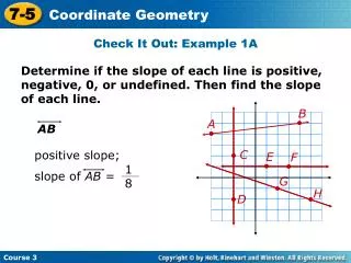
Download
1 / 26
270 likes | 416 Vues
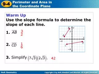
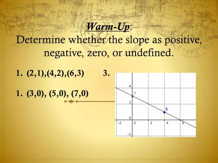
Warm-Up : Determine whether the slope as positive, negative, zero, or undefined. (2,1),(4,2),(6,3) 3. (3,0), (5,0), (7,0). Warm-Up : Determine whether the slope as positive, negative, zero,or undefined. (2,1),(4,2),(6,3) 3. Positive 2. (3,0), (5,0), (7,0) No slope Negative.

E N D
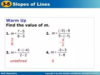
Warm-Up:Determine whether the slope as positive, negative, zero, or undefined. (2,1),(4,2),(6,3) 3. (3,0), (5,0), (7,0)
Warm-Up:Determine whether the slope as positive, negative, zero,or undefined. (2,1),(4,2),(6,3) 3. Positive 2. (3,0), (5,0), (7,0) No slope Negative
Gathering Data “The bigger the better?” Today we will discover if the size of your hand affects the number of centimeter cubes you can grab and hold. Take a moment to observe the length of your hand. Estimate the number of cm cubes you can hold. Write that number on your data collection sheet. Now use the tape measure to measure your hand from the tip of your 3rdfinger to the bottom of your hand(meets the wrist). Write that number using centimeters.
Use the picture to make sure you measure correctly. *Reminder-Record your answers in centimeters.
“Scatter Plots and Correlation” Standard(s): MAFS.8.SP.1.1 Today we will be learning about scatter plots and what they tell us about how 2 variables are related to one another.
“Scatter Plots” Graphs of data pairs for a real-world situation rarely fall in straight line. The arrangement of data can suggest a relationship (correlation) to help us draw conclusions about the situation.
Scatter Plots A scatter plot is a type of graph that relates 2 data sets by plotting the data as ordered pairs. They are used to determine the strength of a relationship, or correlation, between 2 sets of data. There are 3 general types of correlation that can be determined using a scatter plot.
There are 3 types of correlations. Positive, negative, or no correlation. Can you tell the difference? How?
Positive Correlation In a data set with a positive correlation, you note that as the domain increases, so does the range. Basically, we see that as the x-values increase, so does the y-value.
www.medizinfo.de This scatter plot shows a positive correlation between players height and weight, because generally as the weight increases so does the height.
This data shows that as the number of hours worked increases, so does the amount of earnings. We can surmise that the time worked determines our pay.
Negative Correlation In a data set with a negative correlation, you note that as the domain increases, the range decreases.
www www.economistsview.typepad.com This scatter plots shows a negative correlation between the unemployment rate and the GDP. This suggests that as the GDP increases the unemployment rate decreases.
“Negative Correlation” This scatter plot shows the relationship between the amount of money left after a day of shopping and the number of hours spent shopping.
“Negative Correlations” This is the same data from the previous slide in the form of a 2-column input-output table. Once it’s organized, we can interpret what that data means.
“Correlations” At this time, talk with your neighbor about what we learned so far. Then use your whiteboards and markers to write down 1 real-world scenario that has a positive correlation and 1 real-world scenario with a negative correlation. Identify the independent variable and the dependent variable.
“No Correlation” A scatter plot with no correlation is one in which a change in one data set has no effect on the other. This type of graph has no recognizable pattern.
www.education.com This scatter plot appears to have no correlation at all. There is no pattern in how the x- and y-values behave. Therefore, we can conclude that there is no correlation.
“No Correlation” Some items with no correlation include: Age and number of A’s earned Earnings and distance lived from workplace Weight and hair length Height and nail length Number of siblings and number of friends
Gathering “More” Data Task We will conduct an experiment to determine if there is a correlation between the number of cm cubes that can be grabbed from a bucket and the length of the hand.
Directions Take turns(one at a time) attempting to grab as many centimeter cubes from the bucket of cubes in your group. You may not use any other body part(s) to assist you. If a cube falls, it cannot be counted in that trial. Repeat 9 times, recording the number of cubes on your data collection sheet grabbed each time. After you complete a total of 10 trials, find the mean, mode, and range of your data. The mean will serve as your dependent variable(y) .
Get Ready… When prompted, you are going to “report out” one by one. Everyone’s data will be recorded on the board for you to copy on your paper. Make sure you have as many data points as there are people in the class.
Analyzing the Data What similarities do you notice about the creation of the graphs? What are the common differences evident in the scatter plots in your group? Do those similarities or differences change the correlations in the data? Why? Or Why Not?
“Lesson Summary” In this lesson, we’ve looked at how useful scatter plots are in helping us to determine correlations in 2 sets(bivariate) data. We understand that a set of data may imply a positive correlation, negative correlation, or no correlation at all. We further understand how the correlations help us draw conclusions about the data to further deepen our understanding of related versus unrelated data sets. We can use this data to help us make predictions about values not readily evident in a table of values or a set of ordered pairs.
Ticket Out!!! Write positive, negative, or no correlation for the following scenarios. Age of car and value of the car Baseball players batting average and shoe size Years of post-secondary education and earnings Hours worked and exhaustion level Hours of TV watched and quiz grades Size of meal and caloric intake