Download
1 / 20
220 likes | 236 Vues
Histograms, Box and Whisker Plots, and Dot Plots. Histogram. A histogram is a bar graph used to display the frequency of data divided into equal intervals. The bars must be of equal width and should touch, but not overlap. Histograms vs. Bar Graphs.

E N D
Histogram • A histogram is a bar graph used to display the frequency of data divided into equal intervals. The bars must be of equal width and should touch, but not overlap.
Histograms vs. Bar Graphs • Many people confuse histograms with a bar graph. • A histogram looks very similar to a bar graph. There are two big differences between a histogram and a bar graph. • A bar graph compares items in categories while a histogram displays one category broken down into intervals. For example: • A bar graph would compare…the number of apples, to the number of oranges, to the number of bananas at a grocery store. • A histogram would compare…the number of people who eat 0-4 apples a week, to the number that eat 5-9, to the number who eat 10-14.
Histograms vs. Bar Graphs • The bars on a histogram touch. The bars found on a bar graph do not touch. • Why do you think that the bars will touch on a histogram? • It will make intervals of data easier to compare.
Frequency Chart • A Frequency Chart is a table that breaks data down into equal intervals and then counts the amount data in each interval. • A Frequency Chart is often used to sort a list of data to make a Histogram. • Make a Frequency Chart to display the data below: 90, 85, 78, 55, 64, 94, 68, 83, 84, 71, 74, 75, 99, 52, 98, 84, 73, 96, 81, 58, 97, 75, 80, 78 6 7 2 3 6
Creating a Histogram Don’t forget little things…like labels and equal intervals! 10 Math Test Scores 8 6 Number of Students 4 2 90-99 80-89 50-59 70-79 60-69 100-109 Test Scores
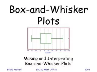
Box-and-Whisker Plots SOL 6.18
Box-and-Whisker Plots A box encloses the middle half of the data and whiskers extend to the minimum and maximum data values
Step 1 – Order Numbers 1. Order the set of numbers from least to greatest
Step 2 – Find the Median 2. Find the median. The median is the middle number. If the data has two middle numbers, find the mean of the two numbers. What is the median?
Step 3 – Upper & Lower Quartiles 3. Find the lower and upper medians or quartiles. These are the middle numbers on each side of the median. What are they?
Step 4 – Draw a Number Line Now you are ready to construct the actual box & whisker graph. First you will need to draw an ordinary number line that extends far enough in both directions to include all the numbers in your data:
Step 5 – Draw the Parts Locate the main median12 using a vertical line just above your number line:
Step 5 – Draw the Parts Locate the lower median8.5 and the upper median14 with similar vertical lines:
Step 5 – Draw the Parts • Next, draw a box using the lower and upper median lines as endpoints:
Step 5 – Draw the Parts Finally, the whiskers extend out to the data's smallest number 5 and largest number 20:
Review – Parts of the Box and Whisker Plot Lower Quartile Median Upper Quartile Lower Extreme 3 1 2 Upper Extreme 4 5 Name the parts of a Box-and-Whisker Plot
DOT PLOTS • Step 1: Label your axis and title your graph. Draw a horizontal line and label it with the variable. Title your graph • Step 2: Scale the axis based on the values of the variable • Step 3:Mark a dot above the number on the horizontal axis corresponding to each data value.
5 0 1 0 7 2 1 0 4 0 3 0 2 0 3 1 5 0 3 0 1 0 1 0 2 0 3 The number of goals scored by each team in the first round of the California Southern Section Division V high school soccer playoffs is shown in the following table.
Standard • S.ID.1 Represent data with plots on the real number line (dot plots, histograms, and box plots).