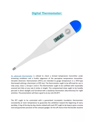
Download
1 / 11
110 likes | 251 Vues
Safety Thermometer Data. A guide to understanding and analysing your data Key Information for Teams. What do I need to do to get started with interpreting data?. Have a measurement plan Understand the type of measures you can use to measure improvement

E N D
Safety Thermometer Data A guide to understanding and analysing your data Key Information for Teams
What do I need to do to get started with interpreting data? • Have a measurement plan • Understand the type of measures you can use to measure improvement • Use the Safety thermometer instrument to produce some graphs • Understand your baseline data • Know what to look out for in your data • Trouble shoot as a team • Understand whether you are improving (interpreting Special cause signals) and learn from your experience
Understand the type of measures you can use to measure improvement The Safety Thermometer is used to measure outcomes
Click one of the buttons on the left to create a chart For detailed guidance on how to use the analyser function please see the ‘How to use the Safety Thermometer’ guide
Click here to swap between percentages and numbers of patients Click here to copy or print
Understand your baseline data • A baseline usually consists of 6 or more data points. But you can still start interpreting your data over this period. Why do we need a baseline? • To understand where you are starting from, the current process and common cause variation • To understand what improvements you can make and predict and measure improvement • To draw a line - the median point Your data will not be the same for each data point, there will always be some variation The median is a benchmark from which you can spot changes, make predictions and understand if you are improving . You should draw the median on to your charts
Knowing what to look for The three run chart rules
Trouble Shooting • Have a look at your chart and see if you can spot any of the run chart rules • Annotate your chart and discuss as a team The Safety Thermometer allows you to copy and paste or print your chart, just click on the print or copy box in the right hand corner of the chart tab Top Tip! – Keep a Measurement Scrap Book Have a look on the Safety Express website for an example measurement scrap book
Understand whether you are improving and learn from your improvement