Download
1 / 18

E N D
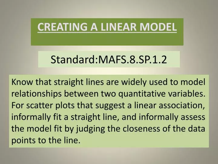
Standard:MAFS.8.SP.1.2 Know that straight lines are widely used to model relationships between two quantitative variables. For scatter plots that suggest a linear association, informally fit a straight line, and informally assess the model fit by judging the closeness of the data points to the line. CREATING A LINEAR MODEL
Warm Up • (6, 15) • (6, 9) • (8, 12) • (9, 7) • (10, 12) • (12, 15) Graph the following points on the coordinate grid
Vocabulary • Scatter Plot • Positive and Negative Correlation • Line of Best Fit
Scatter Plot • A scatter plot is a graph of a collection of ordered pairs. • The graph looks like a bunch of points. • The points show the relationship between two sets of data. • The points on the graph can move in a general direction.
Positive Correlation • We call it a positive correlation when both the x-coordinates and the y-coordinates increase simultaneously.
Positive Correlation The more hours the person worked , the higher the income. Both x and y are increasing simultaneously.
Negative Correlation • We have a Negative Correlation when one variable is increasing and the other is decreasing. • In this case the graph goes downhill.
No Correlation • The points are scattered. • There is no pattern. • The points are not related • There is no correlation
Recap 1 2 _____________ Identify the correlation below. Label as positive, negative or no correlation. 3
Line of Best Fit The line of best fit • is the straight line that best represents the data on a scatter plot. • may pass through all of the points, some of the points, or none of the points. • can be used to make predictions as to what can happen if the trend continues. • represents a relationship between two quantities.
Independent Practice • Label the x and y axis • List the ordered pairs • Plot the ordered pairs • Is there a correlation in the data? • Is it positive or negative or no correlation • Draw the line of best fit
Independent Practice • (0,60), (1,65), (2,70), (3,75), (4,80), (5,90) • The more time spent on activities, the higher the test scores. • It is a positive correlation.