Download
1 / 19
200 likes | 346 Vues
7.1 Visual Representations of Data. Statistics Frequency Table Graphical Representations Bar Chart, Pie Chart, and Histogram Median and Quartiles Box Plots Interquartile Range and Five-Number Summary. Statistics.

E N D
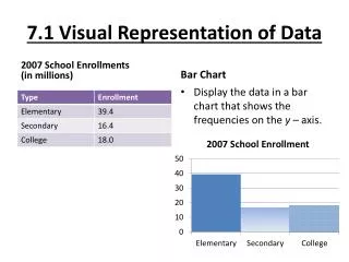
7.1 Visual Representations of Data • Statistics • Frequency Table • Graphical Representations • Bar Chart, Pie Chart, and Histogram • Median and Quartiles • Box Plots • Interquartile Range and Five-Number Summary
Statistics • Statistics is the branch of mathematics that deals with data: their collection, description, analysis, and use in prediction. • Data can be presented in raw form or organized and displayed in tables or charts.
Frequency Table • A table like the one below is called a frequency table since it presents the frequency with which each response occurs.
Bar Chart • This graph shows the same data as the previous example as a bar chart.
Pie Charts • The pie chart consists of a circle subdivided into sectors, where each sector corresponds to a category. The area of each sector is proportional to the percentage of items in that category. This is accomplished by making the central angle of each sector equal to 360 times the percentage associated with the segment.
Pie Charts (2) • The pie chart of the data of the previous example is:
Histogram • When the data is numeric data, then it can be represented by a histogram which is similar to a bar chart but there is no space between the bars.
Example Frequency Table & Histogram The grades for the first quiz in a class of 25 students are 8 7 6 10 5 10 7 1 8 0 10 5 9 3 8 6 10 4 9 10 7 0 9 5 8. (a) Organize the data into a frequency table. (b) Create a histogram for the data.
Median and Quartiles • The median of a set of numerical data is the data point that divides the bottom 50% of the data from the top 50%. To find the median of a set of N numbers, first arrange the numbers in increasing or decreasing order. The median is the middle number if N is odd and the average of the two middle numbers if N is even. • The quartiles are the medians of the sets of data below and above the median.
Example Median and Quartiles For the grade data given, (a) find the median; (b) find the quartiles.
Example Median and Quartiles (2) N = 25 so median is the 13th grade: 7. There are 12 grades in the lower and upper halves. The upper quartile is the average of the 19th and 20th grade: Q3 = (9 + 9)/2 = 9. The lower quartile is the average of the 6th and 7th grade: Q1 = (5 + 5)/2 = 5.
Box Plot • Graphing calculators can display a picture, called a box plot, that analyzes a set of data and shows not only the median, but also the quartiles, lowest data point (min) and largest data point (max).
0 5 7 9 10 Example Box Plot For the grade data given, find the box plot.
Interquartile Range & Five-Number Summary • The length of the rectangular part of the box plot, which is Q3 - Q1, is called the interquartile range. • The five pieces of information, min, max, Q2 = median, Q1 and Q3 are called the five-number summary.
0 5 7 9 10 Example Box Plot For the grade data from the previous example, list the five-number summary and the interquartile range. min = 0, Q1 = 5, Q2 = median = 7, Q3 = 9, max = 10 Interquartile range is Q3 - Q1 = 9 - 5 = 4.
Summary Section 7.1 - Part 1 • Bar charts, pie charts, histograms, and box plots help us turn raw data into visual forms that often allow us to see patterns in the data quickly. • The median of an ordered list of data is a number with the property that the same number of data items lie above it as below it. For an ordered list of N numbers, it is the middle number when N is odd, and the average of the two middle numbers when N is even.
Summary Section 7.1 - Part 2 • For an ordered list of data, the first quartile Q1 is the median of the list of data items below the median, and the third quartile Q3 is the median of the list of data items above the median. The difference of the third and first quartiles is called the interquartile range. The sequence of numbers consisting of the lowest number, Q1, the median, Q3, and the highest number is called the five-number summary.