Download
1 / 42
420 likes | 440 Vues
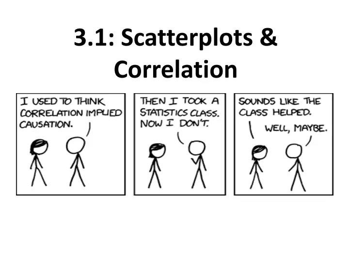
3.1: Scatterplots & Correlation. Section 3.1 Scatterplots and Correlation. After this section, you should be able to… IDENTIFY explanatory and response variables CONSTRUCT scatterplots to display relationships INTERPRET scatterplots MEASURE linear association using correlation

E N D
Section 3.1Scatterplots and Correlation After this section, you should be able to… • IDENTIFY explanatory and response variables • CONSTRUCT scatterplots to display relationships • INTERPRET scatterplots • MEASURE linear association using correlation • INTERPRET correlation
Scatterplots • A scatterplot shows the relationship between two quantitative variables measured on the same individuals. • The values of one variable appear on the horizontal axis, and the values of the other variable appear on the vertical axis. • Each individual in the data appears as a point on the graph.
Scatterplots • Decide which variable should go on each axis. • Remember, the eXplanatory variable goes on the X-axis! • Label and scale your axes. • Plot individual data values.
Scatterplots Make a scatterplot of the relationship between body weight and pack weight. Body weight is our eXplanatory variable.
http://www.economist.com/blogs/graphicdetail/2016/06/daily-chart-20http://www.economist.com/blogs/graphicdetail/2016/06/daily-chart-20
Enter x values into list 1 and enter y values into list 2. • Label each column. Label column x : weight and column y: bpack. • Press HOME/On, click Add Data & Statistics Constructing a Scatterplot: TI-Nspire
4. Move the cursor to the bottom of the screen and “click to add variable”. Select weight. 5. Move the cursor to the left of the screen and “click to add variable”. Select bpack. Constructing a Scatterplot: TI-Nspire
Describing Scatterplots • As in any graph of data, look for the overall pattern and for striking departures from that pattern. • You can describe the overall pattern of a scatterplot by the direction, form, and strength of the relationship. • An important kind of departure is an outlier, an individual value that falls outside the overall pattern of the relationship. • Also, clustering.
Direction (slope) • Positive or Negative • Form • Linear, quadratic, cubic, exponential, curved, non-linear, etc. • Strength • Strong, weak, somewhat strong, very weak, moderately strong, etc. Words That Describe…
Strength refers to how tightly grouped the points are in a particular pattern. • Later on we use describe strength as “correlation” More on Strength…
Interpret….tell what the data suggests in real world terms. • Example: The data suggests that the more hours a student studied for Mrs. Daniel’s AP Stats test the higher grade the student earned. There is a positive relationship between hours studied and grade earned. Interpreting a Scatterplot
Describe and interpret the scatterplot below. The y-axis refers to backpack weight in pounds and the x-axis refers to body weight in pounds.
Describe and interpret the scatterplot below. The y-axis refers to backpack weight in pounds and the x-axis refers to body weight in pounds. Sample Answer: There is a moderately strong, positive, linear relationship between body weight and pack weight. There is one possible outlier, the hiker with the body weight of 187 pounds seems to be carrying relatively less weight than are the other group members. It appears that lighter students are carrying lighter backpacks
Describe and interpret the scatterplot below. The y-axis refer to a school’s mean SAT math score. The x-axis refers to the percentage of students at a school taking the SAT.
Describe and interpret the scatterplot below. The y-axis refer to a school’s mean SAT math score. The x-axis refers to the percentage of students at a school taking the SAT. Sample Answer: There is a moderately strong, negative, curved relationship between the percent of students in a state who take the SAT and the mean SAT math score. Further, there are two distinct clusters of states and at least one possible outliers that falls outside the overall pattern.
A mathematical value that describes the strength of a linear relationship between two quantitative variables. • Correlation values are between -1 and 1. • Correlation is abbreviated: r • The strength of the linear relationship increases as r moves away from 0 towards -1 or 1. What is Correlation?
Correlation describes what percent of variation in y is ‘explained’ by x. • Notice that the formula is the sum of the z-scores of x multiplied by the z-scores of y. What does “r” tell us?!
0.235 • -0.456 • 0.975 • -0.784 How strong is the correlation? Is it positive or negative?
Describe and interpret the scatterplot below. Be sure to estimate the correlation.
Sample Answer: As the number of boats registered in Florida increases so does the number of manatees killed by boats. This relationship is evidenced in the scatterplot by a strong, positive linear relationship. The estimated correlation is approximately r =0.85. **Answers between 0.75-0.95 would be acceptable.
Describe and interpret the scatterplot below. Be sure to estimate the correlation.
Sample Answer: As the number of predicted storms increases, so does the number of observed storms, but the relationship is somewhat weak. The relationship evidenced in the scatterplot is a fairly weak positive linear relationship. The estimated correlation is approximately r = 0.35. There is one outlier at (15, 28); very active storm year. **Answers between 0.15 and 0.55 would be acceptable.
Calculate Correlation: TI-Nspire • Enter x values in list 1 and y values in list 2. • Press MENU, then 4: Statistics • Option 1: Stat Calculations • Option 3: Linear Regression mx + b • X: a[] , Y: b[] , ENTER • Correlation = r Correlation should be 0.79
Find the Correlation R = 0.97 See Chapter 3: Correlation Transformation Investigation WS.
Facts about Correlation Correlation requires that both variables be quantitative. Correlation does not describe curved relationships between variables, no matter how strong the relationship is. Correlation is not resistant. r is strongly affected by a few outlying observations. Correlation makes no distinction between explanatory and response variables. r does not change when we change the units of measurement of x, y, or both. r does not change when we add or subtract a constant to either x, y or both. The correlation r itself has no unit of measurement.
Why?! • Since r is calculated using standardized values (z-scores), the correlation value will not change if the units of measure are changed (feet to inches, etc.) • Adding a constant to either x or y or both will not change the correlation because neither the standard deviation nor distance from the mean will be impacted.
Correlation Formula: Suppose that we have data on variables x and y for n individuals. The values for the first individual are x1 and y1, the values for the second individual are x2 and y2, and so on. The means and standard deviations of the two variables are x-bar and sx for the x-values and y-bar and sy for the y-values. The correlation r between x and y is:
Check Your Understanding: The following scatterplot shows the arm span (in centimeters) and height (in centimeters) for a random sample of 19 twelfth graders. The correlation is r = 0.902. (a) Explain why it is incorrect to say that the correlation is 0.902 centimeter. (b) What would happen to the correlation if height was measured in inches instead of centimeters? Explain your answer. (c) What would happen to the correlation if height was used as the explanatory variable and arm span was used as the response variable?
Check Your Understanding: (a) Explain why it is incorrect to say that the correlation is 0.902 centimeter. Correlation is a standardized measurement and therefore has no units. (b) What would happen to the correlation if height was measured in inches instead of centimeters? Explain your answer. There would be no change in the correlation because it is a standardized measurement. Changes in units do not change the relative relationship. (c) What would happen to the correlation if height was used as the explanatory variable and arm span was used as the response variable? There would be no change. The correlation formula multiplies the x values by the y values, so flipping the x values and the y values will not change the product/the correlation.