Download
1 / 14
140 likes | 148 Vues

E N D
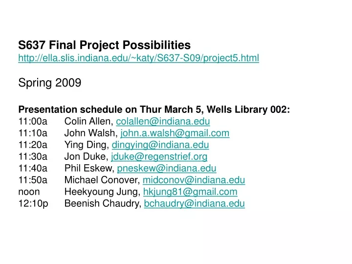
S637 Final Project Possibilitieshttp://ella.slis.indiana.edu/~katy/S637-S09/project5.htmlSpring 2009Presentation schedule on Thur March 5, Wells Library 002:11:00a Colin Allen, colallen@indiana.edu11:10a John Walsh, john.a.walsh@gmail.com11:20a Ying Ding, dingying@indiana.edu11:30a Jon Duke, jduke@regenstrief.org11:40a Phil Eskew, pneskew@indiana.edu11:50a Michael Conover, midconov@indiana.edunoon Heekyoung Jung, hkjung81@gmail.com12:10p Beenish Chaudry, bchaudry@indiana.edu
InPhO: The Indiana Philosophy Ontology http://inpho.cogs.indiana.edu/ Client: Colin Allen The project goal is InPhO visualization, see http://inpho.cogs.indiana.edu/ The InPhO project uses a mixture of software and human feedback techniques to build both a network of terms and thinkers, leading to a hierarchically structured representation of the entire discipline of philosophy. The InPhO database is derived primarily from the Stanford Encyclopedia of Philosophy (http://plato.stanford.edu/), with additional use of other online resources. The SEP is the first effort by the members of any academic discipline to collaboratively build a representation of the entire discipline. It is a dynamic encyclopedia, always changing, making it necessary to build software that enables discovery and visualization of the new relationships that are always emerging as the content of the SEP changes. Visualization of the InPhO would be of value for a variety of groups: (a) for the authors and editors of the SEP who might use it to understand the distribution of topics in the SEP as whole; (b) for academic researchers trying to discover relationships among ideas; (c) for students and laypersons trying to find an introduction to key ideas and figures the field; (d) for historians and philosophers of science, and for science policy makers, who are interested in the historically very important two-way relationship between philosophy and the sciences. A map of the SEP coverage of science that could be compared to more general science maps would be an interesting example of the kind of visualization that we are seeking. Colin’s slides are at http://inpho.cogs.indiana.edu:16080/Slides/S637/
Project Title: Mapping Literature in Space and Time Name of Client: John Walsh Brief description of project goal and value:Setting is one of the basic characteristics of literature. Novels, short stories, dramas, and much poetry—especially narrative poetry—typically have an identifiable setting in both space and time. Victor Hugo's Notre Dame de Paris, for instance, is set in Paris in the year 1482, and was published in 1831. Victorian Hellenism and Victorian medievalism are two frequently discussed phenomena in Victorian poetry and literature. Many Victorian poets were fascinated by the literature, history, and culture of ancient and classical Greece and medieval Europe and the literary traditions inspired by those periods. The major canonical Victorian poets, including Tennyson, Browning, Arnold, Swinburne, and Rossetti, provide a rich variety of representations of Greece and the medieval world. But what does the quantifiable literary data reveal about these phenomena? Of the total number of published works and lines of verse from this period, how many treat classical or medieval subjects? How many occur in contemporary settings? How many in other periods, such as the Renaissance, with which Browning was so fascinated? After explicitly documenting (in XML code, a database, or other structure) the temporal and spatial settings of individual poems and works for an author or group of authors, one could visualize the distribution of text settings across historical periods and geographic space, and perhaps compare these data to other information, such as year of publication and year of composition. The visualization would provide a useful illustration of the literary phenomena of Victorian Hellenism and medievalism, and it may reinforce or undercut current understandings of these phenomena. By comparing the temporal and geographical maps of canonical authors with other writers, one may discover additional trends and avenues for further exploration. And the maps could provide a very useful navigational tool for researchers and students exploring these texts.
Project Title: Visualization of Social Tagging Data Name of Client: Ying Ding Brief description of project goal and value: Based on the crawled tag data from popular social tagging website (delicious, flickr and youtube), to visualize the timeline of the tagging behavior, the evolving of tag vocabulary and the profile of the social web. Reference: Y. Ding, E. Jacob, J. Caverlee, M. Fried and Z. Zhang (2009). Profiling Social Networks: A Social Tagging Perspective. D-Lib, March/April, 2009.
Project Title: Visualization of Data Flow in the Indiana Network for Patient Care Name of Client: Regenstrief Institute, Inc. Description of Project Goals: The Indiana Network for Patient Care (INPC) is a regional health information exchange serving the state of Indiana. It processes over 350,000 messages a day from more than 100 clinics, hospitals, and imaging centers across the state. Messages include patient demographics, laboratory data, and emergency, inpatient, and outpatient encounter data. With over 13 million messages arriving every month, monitoring the flow of information can be a challenging task. Yet it is vital that hospitals, public health officials, and network administrators be able to detect immediately any failure in the system or loss of data flow. The goal for this project is to create a network monitoring visualization tool which will allow users to view incoming data in numerous ways, including by healthcare system, individual facility, message type, patient type, and other parameters. Users must be able to visualize data patterns at a high level as well as drill down to a more detailed view. Depending on technical background and interests, students may contribute design concepts, create graphical models, or engage in actual coding of the application. Please note, all data in this project will be in aggregate form. There will be no personally identifiable health information involved in this project. Also, as Regenstrief is based in Indianapolis, students will need to come up at least a few times during the semester, though much of the work can be done virtually. If interested, please contact Dr. Jon Duke at jduke@regenstrief.org.
Monroe County Public Library Client: Sara Laughlin & Phil Eskew Description of Project & Goals: The Board of the Monroe County Public Library recently approved the library’s 2009-2011 Strategic Plan. One goal of this plan is to investigate the feasibility of a new branch. Of relevance, the library is interested in determining the ideal location for this branch. The library’s ILS contains a wealth of information about collection use and the location of our patron base. MCPL would like to provide access to a sample of our ILS data. The project would involve an analysis could be made correlating items currently checked out to the county’s 14 ZIP codes and the items’ corresponding patron. The library could provide a representative sample of data or the entire data set of current checkouts. Alternative #1: Visualization of collection use at the library’s two branches and the Bookmobile. Alternative #2: Visualization of online resource usage including databases, the library website, and the MCPL catalog.
Project Title: Job market Visualization Name of Client: Michael Conover Brief description of project goal and value: A scientometrics project, we're creating a set of paired dynamic visualizations to help policy makers understand the intellectual and geographical landscape of the academic / research-oriented job market over time. I've collected thousands of full-text, location-specific, timestamped job postings from Nature Jobs and Science Careers, and this data is currently being used to power an AJAX-driven Google Maps mashup that illuminates the density of employment opportunities in a different parts of the world. Briefly, I've geocoded the location strings from the job posts into latitude/longitude coordinates, and used k-means clustering on these points to situate aggregate representations of employment density. The correlated visualization, and what I'd like to work on for the final project, involves using text mining techniques to associate particular job posts with specific nodes from the Map of Science. (If you're interested we can discuss the specifics of how this will be accomplished offline.) This then gives us a density value for employment opportunities in each field in the Map of Science network, which can in turn be used to drive the visualization. The specifics of this visualization are still being fleshed out, and we'd need to consult with Dr. Borner for more detail, but this is the goal in broad strokes. In terms of technical detail, we're using Javascript and the Google Maps API for the presentation, and pulling data through ajax calls to a Python script that takes care of database queries and clustering. There are probably more than a few ways to go about tackling the Science Maps visualization, the only real qualifier is that it be able to make calls to a remote script that will provide it with data. It's a moderately technical project, and so solid programming skills would probably come in handy.
S637 Final Project Proposal | Design Map | Heekyoung Jung • Title: Genealogy of Digital Device/ Design Map (tentative title) • Goal: Understand how digital devices have changed overtime in relation with technologies, design theories, user behaviors, etc. • Value: Provide an overview of design trend for design researchers and strategists • Related projects or articles: • http://www.moma.org/exhibitions/2008/elasticmind/ • http://seedmagazine.com/news/2008/04/design_and_the_elastic_mind.php • http://portal.acm.org/citation.cfm?id=1240624.1240772 (use of tags to understand user responses to a certain technology or device) • http://eniac.hopto.org/~jung5/portfolio_mobile%20interaction.html (simple version of mobile phone map)
S637 Final Project Proposal | Design Map | Heekyoung Jung • Details: • Product images mapped along the timeline to see how specific types of product has been evolved in terms of their design and technology. • Tags from personal blogs or keywords from technology/product review sites (i.e. http://www.engadget.com/) can be retrieved as additional information for each product. • This visualization can be used as a design database to understand and predict the design trend of digital products. • Concept Sketch: Tag Cloud Tag Cloud: product information, keywords retrieved from blogs or review, technology, company, brand, price, etc. If a certain keyword is selected, all relevant products (in the main map) are highlight. Product Map: A collection of products are mapped according to their relations to each other (in terms of similar features, advanced version, etc.) along the timeline. Information: Information window pops up to display all relevant product images or keywords around the selected keyword as a network diagram. Product Map Information
S637 Final Project Proposal | Design Map | Heekyoung Jung http://informationarchitects.jp/web-trend-map-3-get-it/
Project Title: Personal Nutrition Intake Monitor Name of Client: Beenish Chaudry, bchaudry@indiana.edu Brief description of project goal and value: This project is a part of Dr. Connelly’s existing research project on assisting people in monitoring their health issues using technology. Dr. Connelly has the authority to allocate resources for this project and she will also be mentoring me. A small academic research group consisting of nurses, informatician, biostatisticians and computer scientists is involved in this project. Depending on how the project will turn out, it will help me towards my dissertation. This project is motivated towards helping a chronically ill diabetic population which has very strict dietary requirements. Currently, we are in the process of starting a six-week long study which is related to finding out how much technology can help diabetic population self-monitor their dietary intake. At the end of this study, a huge amount of data will be collected which will tell us what patients were eating, at what times and the nutritional content everything that they were eating. Although this PDA application will help the patients monitor their day to day nutritional intake, it is still questionable whether it can help the patients make any long terms changes in their dietary intake. However, it is believed that patients will actually benefit more from `the reflections on their nutritional intake. The purpose of this project will be to design an interface which will allow patients to visualize their intake over time using different views and methods of displaying data in a readable fashion. The existing PDA application will interact with the proposed system and will collect data from the patients for the backend database.