Download

1 / 39
390 likes | 489 Vues
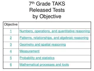
LSP 120: Quantitative Reasoning and Technological Literacy. Topic 1: Introduction to Quantitative Reasoning and Linear Models. Foundations. Data: numbers with a context Cell: each data point is recorded in a cell Observation: each row of cells form an observation for a subject/individual

E N D
LSP 120: Quantitative Reasoning and Technological Literacy Topic 1: Introduction to Quantitative Reasoning and Linear Models Prepared by Ozlem Elgun
Foundations • Data: numbers with a context • Cell: each data point is recorded in a cell • Observation: each row of cells form an observation for a subject/individual • Variable: any characteristic of an individual Prepared by Ozlem Elgun
Why Data? 1) Data beat anecdotes “Belief is no substitute for arithmetic.” Henry Spencer Data are more reliable than anecdotes, because they systematically describe an overall picture rather than focus on a few incidents . Prepared by Ozlem Elgun
Why Data? 2. Where the data come from is important. “Figures won’t lie, but liars will figure.” Gen. Charles H. Grosvenor (1833-1917), Ohio Rep. Prepared by Ozlem Elgun
Familiarizing with Data • Open Excel • Collect data: • Ask 5 classmates the approximate # of text messages they send per day • Record the data on Excel spreadsheet • Calculate average using the Average function on Excel. (There are many functions such as sum, count, slope, intercept etc. that we will use in this class) Prepared by Ozlem Elgun
What is a linear function? • Most people would say it is a straight line or that it fits the equation y = mx + b. • They are correct, but what is true about a function that when graphed yields a straight line? • What is the relationship between the variables in a linear function? • A linear function indicates a relationship between x and y that has a fixed or constant rate of change. Prepared by Ozlem Elgun
Is the relationship between x and y is linear? The first thing we want to do is be able to determine whether a table of values for 2 variables represents a linear function. In order to do that we use the formula below: Prepared by Ozlem Elgun
To determine if a relationship is linear in Excel, add a column in which you calculate the rate of change. You must translate the definition of “change in y over change is x” to a formula using cell references. Entering a formula using cell references allows you to repeat a certain calculation down a column or across a row. Once you enter the formula, you can drag it down to apply it to subsequent cells. This is a cell reference Prepared by Ozlem Elgun
Note that we entered the formula for rate of change not next to the first set of values but next to the second. This is because we are finding the change from the first to the second. Then fill the column and check whether the values are constant. To fill a column, either put the cursor on the corner of the cell with the formula and double click or (if the column is not unbroken) put the cursor on the corner and click and drag down. If the rate of change values are constant then the relationship is a linear function. • So this example does represent a linear function. Rate of change is 2.5 and it is constant. This means that that when the x value increases by 1, the y value increases by 2.5. Prepared by Ozlem Elgun
How to Write a Linear Equation Next step is to write the equation for this function. y = mx + b. y and x are the variables m is the slope (rate of change) b is the y-intercept (the initial value when x=0) We know x, y, and m, we need to calculate b: Using the first set of values (x=3 and y=11) and 2.5 for "m“ (slope): 11=2.5*3 + b. Solving: 11=7.5 + b 3.5 = b. The equation for this function is : y = 2.5 x + 3.5 Another way to find the equation is to use Excel’s intercept function. Next step is to write the equation for this function. y = mx + b. y and x are the variables m is the slope (rate of change) b is the y-intercept (the initial value when x=0) We know x, y, and m, we need to calculate b: Using the first set of values (x=3 and y=11) and 2.5 for "m“ (slope): 11=2.5*3 + b. Solving: 11=7.5 + b 3.5 = b. The equation for this function is : y = 2.5 x + 3.5 Another way to find the equation is to use Excel’s intercept function. Prepared by Ozlem Elgun
Practice: For the following, determine whether the function is linear and if so, write the equation for the function. On the class website- click on Rate of change calculations.xlsx Prepared by Ozlem Elgun
"Real world" example of a linear function: • Studies of the metabolism of alcohol consistently show that blood alcohol content (BAC), after rising rapidly after ingesting alcohol, declines linearly. For example, in one study, BAC in a fasting person rose to about 0.018 % after a single drink. After an hour the level had dropped to 0.010 %. Assuming that BAC continues to decline linearly (meaning at a constant rate of change), approximately when will BAC drop to 0.002%? • In order to answer the question, you must express the relationship as an equation and then use to equation. First, define the variables in the function and create a table in excel. • The two variables are time and BAC. • Calculate the rate of change. Prepared by Ozlem Elgun
This rate of change means when the time increases by 1, the BAC decreases (since rate of change is negative) by .008. In other words, the BAC % is decreasing .008 every hour. Since we are told that BAC declines linearly, we can assume that figure stays constant. Now write the equation with Y representing BAC and X the time in hours. Y = -.008x + .018. This equation can be used to make predictions. The question is "when will the BAC reach .002%?" Plug in .002 for Y and solve for X. .002 = -.008x + .018 -.016 = -.008x x = 2 Therefore the BAC will reach .002% after 2 hours. Prepared by Ozlem Elgun
Warning: Not all graphs that look like lines represent linear functions The graph of a linear function is a line. However, a graph of a function can look like a line even thought the function is not linear. Graph the following data where t is years and P is the population of Mexico (in millions): • What does the graph look like? • Now, calculate the rate of change for each set of data points (as we learned under Does the data represent a linear function?) Is it constant? Prepared by Ozlem Elgun
What if you were given the population for every ten years? Would the graph no longer appear to be linear? Graph the following data. • Does this data (derived from the same equation as the table above) appear to be linear? Both of these tables represent an exponential model (which we will be discussing shortly). The important thing to note is that exponential data can appear to be linear depending on how many data points are graphed. The only way to determine if a data set is linear is to calculate the rate of change (slope) and verify that it is constant. Prepared by Ozlem Elgun
Linear Modeling-Trendlines • The Problem - To date, we have studied linear equations (models) where the data is perfectly linear. By using the slope-intercept formula, we derived linear equation/models. In the “real world” most data is not perfectly linear. How do we handle this type of data? • The Solution - We use trendlines (also known as line of best fit and least squares line). • Why - If we find a trendline that is a good fit, we can use the equation to make predictions. Generally we predict into the future (and occasionally into the past) which is called extrapolation. Constructing points between existing points is referred to as interpolation. Prepared by Ozlem Elgun
Is the trendline a good fit for the data? • There are five guidelines to answer this question: • Guideline 1: Do you have at least 7 data points? • Guideline 2: Does the R-squared value indicate a relationship? • Guideline 3: Verify that your trendline fits the shape of your graph. • Guideline 4: Look for outliers. • Guideline 5: Practical Knowledge, Common Sense Prepared by Ozlem Elgun
Guideline 1: Do you have at least 7 data points? • For the datasets that we use in this class, you should use at least 7 of the most recent data points available. • If there are more data points, you will also want to include them (unless your data fails one of the guidelines below). Prepared by Ozlem Elgun
Guideline 2: Does the R-squared value indicate a relationship? • R2 is a standard measure of how well the line fits the data. (Tells us how linear the relationship between x and y is) • In statistical terms, R2 is the percentage of variance of y that is explained by our trendline. • It is more useful in the negative sense: if R2 is very low, it tells us the model is not very good and probably shouldn't be used. • If R2 is high, we should also look at other guidelines to determine whether our trendline is a good fit for the data, and whether we can have confidence in our predictions. Prepared by Ozlem Elgun
More on R-squared… • If the R2 = 1, then there is a perfect match between the line and the data points. • If the R2 = 0, then there is no relationship between n the x and y values. • If the R2 value is between .7 and 1.0, there is a strong linear relationship and if the data meets all the other guidelines, you can use it to make predictions. • If the R2 value is between .4 and .7, there is a moderate linear relationship and the data can most likely be used to make predictions. • If the R2 value is below .4, the relationship is weak and you should not use this data to make predictions. Prepared by Ozlem Elgun
Even more on R-squared… • The coefficient of determination, r 2,is useful because it gives the proportion of the variance (fluctuation) of one variable that is predictable from the other variable. • It is a measure that allows us to determine how certain one can be, in making predictions from a certain model/graph. • The coefficient of determination is the ratio of the explained variation to the total variation. • The coefficient of determination is such that 0 <r 2< 1, and denotes the strength of the linear association between x and y. • The coefficient of determination represents the percent of the data that is the closest to the line of best fit. For example, if r = 0.922, then r 2 = 0.850, which means that 85% of the total variation in y can be explained by the linear relationship between x and y (as described by the regression equation). The other 15% of the total variation in y remains unexplained. • The coefficient of determination is a measure of how well the regression line represents the data. If the regression line passes exactly through every point on the scatter plot, it would be able to explain all of the variation. The further the line is away from the points, the less it is able to explain. Prepared by Ozlem Elgun
NOW BACK TO OUR GUIDELINES FOR DETERMINING WHETHER A TRENDLINE IS A GOOD FIT FOR THE DATA... Prepared by Ozlem Elgun
Guideline 3: Verify that your trendline fits the shape of your graph. • For example, if your trendline continues upward, but the data makes a downward turn during the last few years, verify that the “higher” prediction makes sense (see practical knowledge). • In some cases it is obvious that you have a localized trend. Localized trends will be discussed at a later date. Prepared by Ozlem Elgun
Guideline 4: Look for outliers: • Outliers should be investigated carefully. Often they contain valuable information about the process under investigation or the data gathering and recording process. Before considering the possible elimination of these points from the data, try to understand why they appeared and whether it is likely similar values will continue to appear. Of course, outliers are often bad data points. If the data was entered incorrectly, it is important to find the right information and update it. • In some cases, the data is correct and an anomaly occurred that partial year. The outlier can be removed if it is justified. It must also be documented. Prepared by Ozlem Elgun
Guideline 5: Practical Knowledge, Common Sense • How many years out can we predict? • Based on what you know about the topic, does it make sense to go ahead with the prediction? • Use your subject knowledge, not your mathematical knowledge to address this guideline. Prepared by Ozlem Elgun
Adding a Trendline Using Excel • Open the file: MileRecordsUpdate.xls and calculate the slope (rate of change) in column C. • Is this women’s data perfectly linear? • No, there is not a constant rate of change. (See table below.) Prepared by Ozlem Elgun
Calculating rate of change Graphing the data produces the following graph which confirms that the data is not perfectly linear. To graph data, highlight the data you want to graph (not headers or empty cells). Choose a chart type: Under the Insert tab click on Scatter located under the Charts group. Under Scatter, choose Scatter with only Markers (the first option). A simple graph is created. Prepared by Ozlem Elgun
We can clearly see that the data is not linear but we can use a linear model to approximate the data. You will need to add a title, axis labels and trendline (including the equation and r-squared value). First click on the graph to activate the Chart Tools menu and then choose the Design tab. Under the Charts Layout group, select #9. (Click on the "more" arrow to display all eleven layouts. Slide over each layout until you locate #9.) Your graph should look like this: Prepared by Ozlem Elgun
Click on the Chart Title and add a descriptive title (consider who, what, where and when). Click on each Axis Title and label both your x-axis (horizontal axis) and your y-axis (vertical axis). If you are graphing only one series of data, always be certain to remove the legend (just click on the legend and use either the delete or backspace button). To move the equation/r-squared value slide on the text box containing both the equation/r-squared value. Once your cursor changes to "cross-hairs" press on the left mouse button and slide the text box to a location on the graph where it is easier to read. • It is suggested that you remove the minor axis gridline by changing them to the same color as your background. Right-click on the y-axis (vertical axis), choose Format Minor Gridlines then Solid Line. Change the color of the line to match your background (currently your background is white). • It is important to add a text box stating the data source used to create the graph. Under the Insert tab choose text box under the Text group. Draw a text box on your chart and then type in "Source:" followed by the data source. If no data source is listed, type "Unknown". Prepared by Ozlem Elgun
In the preceding graph… • The black trendline is the line that “best fits” the data. It is a line that comes as close the all the data points as possible. • The R2 value indicates how linear the data actually is. The R2 value will be a decimal between 0 and 1. The closer it is to one, the closer the data is to linear. The smaller the R2 value, the less linear the data. We can see here that the R2 value for the women’s mile record is .9342 which is very close to one, so the data is very close to linear. • The equation is the equation of the trendline in y = mx + b form. We can see that the slope or the rate of change of the trendline is -.929 which means that according to the trendline, the mile record is decreasing by just under 1 second every year. Prepared by Ozlem Elgun
Use excel functions, not the equation given in the graph to calculate future predictions You learned in class to use the =slope() and +intercept() functions. You should use the slope and intercept functions when you are modeling and calculating predictions because the equation that Excel puts on the graph is often rounded to only a few decimal places. Using the equation that Excel puts on the graph can lead to aberrant results because of this rounding. Prepared by Ozlem Elgun
Why do we add a trendline and how do we use it? • Since the trendline is an approximation what is happening with data, we can use it to make predictions about the data. • For example, to predict what the mile record was in 1999, use the equation of the trendline. First identify the variables. X is year and Y is record in seconds. Calculate slope and intercept on Excel. Then plug 1999 in for X in the linear equation and solve for Y. Prepared by Ozlem Elgun
Five guidelines to see if the trendline a good fit for the data • Guideline 1: Do you have at least 7 data points? • Guideline 2: Does the R2 value indicate a relationship? Reminder: R2 is the percentage of variance of y that is explained by our trendline. It is a standard measure of how well the trendline fits the data. • Guideline 3: Verify that your trendline fits the shape of your graph. • Guideline 4: Look for outliers • Guideline 5: Use practical knowledge/ common sense to evaluate your findings Prepared by Ozlem Elgun
Justifying your prediction in words Once we calculate the answer to the question, we cannot simply report the numbers. We need to present them in meaningful sentences that explain their meaning in their contexts. SAMPLE LEAD SENTENCES “If the trend established from 1967- 1996 persists, we expect the Women’s world record to be ----------- seconds in 1998. “ SUPPORTING SENTENCES “We are confident in our prediction because the r-squared value of ---------- shows that the data has a strong/ moderate/weak linear relationship. Even though in the long term we expect the rate of change in women’s mile records to decrease and not stay constant, we expect that in the very near future the linear trend should continue, giving us confidence in our prediction. ITEMS THAT MUST BE POINTED OUT WHEN APPLICABLE Reason for using less than 7 data points. Omitting any single data point. Focusing on a localized linear trend. Continuing to predict a higher amount when they trend actually decreases (or the opposite). Olympic Record Evolution for Women’s 1500m Olympic race. Prepared by Ozlem Elgun
Adding a Trendline(in Excel 2007) • Open the file: MileRecordsUpdate.xls and calculate the slope (average rate of change) in column H for Men’s World records in the Mile Run. • Is this men’s data perfectly linear? • Can you use a linear model to describe the data? (Hint: Graph the data in a simple scatter plot) • Create a graph with a trendline, title your graph appropriately. • What would the men’s world record be in the year 2000? (Hint: in your calculations you need to use the SLOPE and INTERCEPT Excel functions, and use the linear equation.) • Check you answer by extending the trendline to year 2000. (right click on trendline, under forecast, increase it forward by number of units you need to, to reach 2000). Does your trendline show a similar number as your prediction. • Once you calculate your answers write your answers our in meaningful sentences, justifying your prediction in words. (Hint: report your prediction, the R-squared value, and any possible caveats.) Prepared by Ozlem Elgun