Download
1 / 47
500 likes | 1.43k Vues
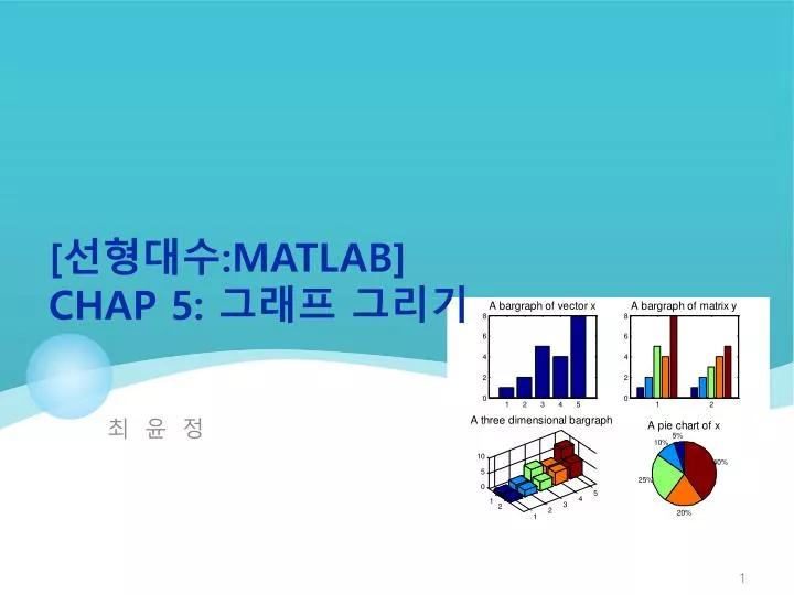
최 윤 정. [ 선형대수 : Matlab ] Ch ap 5: 그래프 그리기. 학습내용. 2 차원 그래프 다중그래프 여러가지 2 차원 그래프 3 차원 그래프 그래프 저장하고 편집하기. 5.1 2 차원 그래프. x-y plot : 공학에서 가장 많이 사용하는 그래 독립변수 ( The independent variable) is usually called x – 수평축 종속변수 (The dependent variable) is usually called y - 수직축.

E N D
최 윤 정 [선형대수:Matlab]Chap 5: 그래프 그리기
학습내용 • 2차원 그래프 • 다중그래프 • 여러가지2차원 그래프 • 3차원 그래프 • 그래프 저장하고 편집하기
5.1 2 차원그래프 • x-y plot : 공학에서 가장 많이 사용하는 그래 • 독립변수(The independent variable) is usually called x – 수평축 • 종속변수(The dependent variable) is usually called y - 수직축 time is the independent variable distance is the dependent variable
x 와 y를 정의한후 plot 함수를 부른다. Engineers always add … Title, X axis label, Y axis label, Often it is useful to add a grid
일반적인 그래프 그리기 • 그래프는 보관되지 않는다. • 먼저 그린 그래프가 지워지지 않게 하려면 • figure(2) . 2번째 창을 열고 그려준다. • holdon : 현재 그래프를 유지시키므로 나중에 그린 그래프를 겹쳐서 그려낸다. 그래프의 선 색은 같다. • hold off : 겹쳐 그리기 취소 • plot(x1,y1, x2, y2) 순서쌍마다 선을 그리고 색깔도 다르다.
variation • Plot() 명령의 입력에 행렬 1개만 넣으면 • 행렬의 인덱스 번호를 X축으로 하여 그린다. • 이런 경우에는 막대그래프를 사용한다 • Linegraph / bar graph
If you want to create multiple plots, all with the same x value • Use alternating sets of ordered pairs • plot(x, y1, x,y2, x,y3, x,y4) // x,y의 순서쌍을 만들어 번갈아 입력 • group the y values into a matrix • X= [0:pi100: 2*pi] • Y1 = cos(X) * 1; • Y2 = cos(X) * 2;……Z =[y1,y2,y3,y4] // 하나의행렬로 결합.
The peaks(100) function creates a 100x100 array of values. Since this is a plot of a single variable, we get 100 different line plots
Plots of Complex Arrays(복소수) • plot()명령어의 입력으로 복소수 배열 한 개를 입력하면 • 실수성분은 X축 • 허수성분은 Y축으로 그린다. • plot()명령어의 입력으로 복소수 배열 두 개를 입력하면 • 두 배열에서 허수성분의 값은 무시된다.! • 첫번째 배열의 실수성분은 X축 • 두번째 배열의 실수성분은 Y축
Line, Color and Mark Style • You can change the appearance of your plots by selecting user defined • line styles • color • mark styles >> help plot // for a list of available styles • Defualt설정 : linestyle – 실선, 마크 없고, 색을 파랑. • Axis scale : 축의 크기는 자동으로 설정 • 사용자가 정하고 싶을 땐 • axis([xmin,xmax,ymin,ymax])
그리기 : Plot(), Axis(), … • 문자열형식으로 지정한다. • plot(x,y,':ok') • ‘:ok’에서 • ‘: ‘ : dotted line(실선) • ‘o’ : 마크는 circle • ‘k’ : 색은 black (b 는 blue) • 여러 선에 대해 적용하려면 순서대로 • plot(x,y,':ok‘, x,y*2,‘--xr') dotted line circles black
축의 크기 조정 여러 개의 선에 대해선,마크,색상종류를 각각 순서대로 써준다.
Annotating Your Plots • We should always add • Title(체목) • Axis labels(축 이름) • We canalso add • Legends(범례) • Textbox(글상자) • 특수문자나 기호를 넣을 때는 • back슬래시 • title(‘\alpha \beta \gamma’) α β γ • title(‘x^{2}’) x2 • 참고 : Tex Markup language를 사용하면 • 더 복잡한 수식이나 문자열을 만들수 있어요. • Help tex해보기~
5.2 Subplots : 다중그래프 • Subplot : 그래프 창을 m*n개으로 된 격자로 나누어준다. • subplot(m,n,p) • subplot(2,2,1) rows columns location 2 columns 2 1 2 rows 3 4
5.3 2-D plotting • Polar Plots(극좌표) • Logarithmic Plots • Bar Graphs • Pie Charts • Histograms • X-Y graphs with 2 y axes(y축이 두개) • Function Plots
Polar Plots • Some functions are easier to specify using polar coordinates than by using rectangular coordinates • For example the equation of a circle is • y=sin(x) in polar coordinates
Polar(theta, r) ! 힌트 theta = [0: 0.01*pi:2*pi]1. r = 5*cos(4*theta) 2 r = 4*cos(6*theta) //위 그래프에서 hold on 후 3. r = 5-5*sin(theta) 4. r=sqrt(5^2*cos(2*theta) 5. theta = [pi/2 : 4/5*pi : 4.8*pi]; 이 때 r= [1,1,1,1,1,1] //6개의 원소가 모두 1인 배열 실습문제 5.3 • Try these exercises to create some interesting shapes
Logarithmic Plots • Base가 10인 로그눈금을 사용하면 • 넓은 범위의 수, 즉 아주 작은 수에서 큰 수까지의 수를 표시할 때 눈금을 작게 만들지 않고도 한 축에 표시할 수 있다. • 지수형태로 변하는 데이터를 표시할 때도 편리하다. • plot : uses a linear scale on both axes • semilogy: uses a log10 scale on the y axis //y 축만 로그눈금 • semilogx: uses a log10 scale on the x axis //x 축만 로그눈금 • loglog: use a log10 scale on both axes //x,y축 둘다 로그눈금
Bar Graphs and Pie Charts • 매트랩에 들어있는 막대그래프와 파이그래프의 종류 • (엑셀 화면 참고하세요) • bar(x) – vertical bar graph(수직막대) • barh(x) – horizontal bar graph(수평막대) • bar3(x) – 3-D vertical bar graph(3차원수직) • bar3h(x) – 3-D horizontal bar graph(3차원수평) • pie(x) – pie chart • pie3(x) – 3-D pie chart
Histogram • A histogram is a plot showing the distribution of a set of values • 기본구간은 10 • Hist(x, n) • n개의 구간으로설정 Defaults to 10 bins
X-Y Graphs with Two Y Axes • X-Y 그래프를 겹쳐서 그리는 것이 유용할 때가 있다. • 그러나 y축 크기의 차이가 많이 나면 모습을 알아보기가 어렵다. The plotyy() allows you to use two scales on a single graph
Function Plots • Function plots allow you to use a function as input to a plot command, instead of a set of ordered pairs of x-y values fplot('sin(x)',[-2*pi,2*pi]) 함수는문자열로.!! range of the independent variable(여기서는 x)
5.4 3-D Plotting • Line plots • Surface plots(면 그래프) • Contour plots(등치선 그래프)
The z-axis is labeled the same way the x and y axes are labeled 3-Dimensional Line Plots • Plot3( ) : • Input: a set of order triples ( x-y-z values)!
Just for fun • draws the graph in an animation sequence • comet3(x,y,z) • If your animation draws too slowly, add more data points • For 2-D line graphs use the comet function • comet2(x,y) • 앞 장의 그래프를 애니메이션으로 그려보세요.!
Surface Plots • Represent x-y-z data as a surface • mesh - meshplot(그물눈그래프) • surf – surface plot(서프그래프) • Bothmesh() & surf() can be used to good effect with a single two dimensional matrix • 한 개의입력: 입력된 행렬의 인덱스번호가 X,Y축 값으로 사용됨 • 세 개의 입력: 행렬 z를 구성하는 원소와, 각 원소에 대응하는 (x,y)를 알고있는 경우, 행렬의 인덱스번호대신 (x,y)값에 대해 z를 그래프로 그린다. • Mesh 와 Surf plot의사용법은 비슷하다. 단, surf는 그물모양의 면 대신에 색을 칠한다.
Shading • There are several shading options • shading interp • shading flat • faceted flat is the default • colormap function : we adjust the color scheme
Contour Plots(등치선그래프) • Contour plots use the same input syntax as mesh and surf plots • They create graphs that look like the familiar contour maps used by hikers • P. 231 그림 5.30 그려보기
To demonstrate these functions lets use a more interesting example • A more complicated surface can be created by calculating the values of z, instead of just defining them. • X,Y를 이용하여 Z 만들기 • Meshgrid()으로 2-D 행렬을 만들고, • 이에 대해 Z 행렬을 만든다.
Pseudo Color Plots • Similar to contour plots • 윤곽선을 사용하는 대신, 2차원 색상지도를 그린다. • Uses the same syntax The following example uses the built-in MATLAB demonstration function peaks
5.5 Editing Plots from the Menu Bar • We can also edit a plot once you’ve created it using the menu bar • Built-in demonstration function sphere • In this piture, the insert menu has been selected • We can use it to add labels, legends, a title and other annotations • If you adjust a figure interactively, you’ll lose your improvements when you rerun your program~!
Select Edit-> Axis Properties Change the Aspect Ratio(가로세로비율) Select Inspector from the Property Editor 특성편집창(Property editor)에서 값을 바꾸어가며 조정할 수 있다.
Creating plots from the workspace MATLAB will suggest plotting options and create the plot for you
Saving your plots • write M-file to recreate a plot : graph.m • Save the figure from the file menu using the save as… option • file format such as • jpeg • emg (enhanced metafile) ….등 • 만들어진 그래프를 마우스 오른쪽버튼으로 copy & paste!
Summary • The x-y plot is the most common used in engineering • Graphs should always include titles and axis labels. Labels should include units. • MATLAB includes extensive options for controlling the appearance of your plot • Multiple plots can be displayed in the same figurewindow • Most common plot types are supported by MATLAB including • polar plots , bar graphs, pie charts ,histograms
Summary • MATLAB supports 3-D plotting • line plots • surface plots • You can modify plots interactively from the menu bar • You can create plots interactively from the workspace window • Figures created in MATLAB can be stored using a number of different file formats