Download
1 / 78
800 likes | 956 Vues
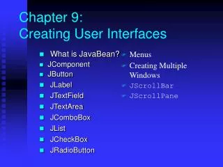
Chapter 13 Creating User Interfaces. What is JavaBeans? Component and JComponent JButton ImageIcon JLabel JTextField JTextArea JComboBox JList. JCheckBox JRadioButton Borders Menus Creating Multiple Windows JScrollBar JScrollPane. What is a JavaBean?.

E N D
Chapter 13Creating User Interfaces • What is JavaBeans? • Component and JComponent • JButton • ImageIcon • JLabel • JTextField • JTextArea • JComboBox • JList • JCheckBox • JRadioButton • Borders • Menus • Creating Multiple Windows • JScrollBar • JScrollPane
What is a JavaBean? A JavaBean component is just a Java class that meets the following requirements.
Why JavaBeans? The JavaBeans technology was developed to enable the programmers to rapidly build applications by assembling objects and test them during design time, thus making reuse of the software more productive.
Component Properties • font • background • foreground • preferredSize • minimumSize • maximumSize
JComponent Properties • toolTipText • doubleBuffered • border
JButton A button is a component that triggers an action event when clicked. The following are JButton non-default constructors: JButton(String text) JButton(String text, Icon icon) JButton(Icon icon)
JButton Properties • text • icon • mnemonic • horizontalAlignment • verticalAlignment • horizontalTextPosition • verticalTextPosition
Responding to JButton Events public void actionPerformed(ActionEvent e) { // Get the button label String actionCommand = e.getActionCommand(); // Make sure the event source is a button if (e.getSource() instanceof JButton) // Make sure it is the right button if ("My Button".equals(actionCommand) System.out.println ("Button pressed!"); }
JButton ButtonDemo Run
JLabel A label is a display area for a short text, an image, or both. The non-default constructors for labels are as follows: JLabel(String text, int horizontalAlignment) JLabel(String text) JLabel(Icon icon) JLabel(Icon icon, int horizontalAlignment) JLabel(String text, Icon icon, int horizontalAlignment)
JLabel Properties • text • icon • horizontalAlignment • verticalAlignment
Example 13.2: Using Labels This example gives a program that uses a label as an area for displaying images. There are fifty-two images in image files named L1.gif, L2.gif, ..., L52.gif stored in the image directory under c:\book. You can use two buttons, Prior and Next, to browse the images. LabelDemo Run
JTextField A text field is an input area where the usercan type in characters. Text fields are usefulin that they enable the user to enter in variable data (such as a name or a description).
JTextField Constructors • JTextField(int columns) Creates an empty text field with the specified number of columns. • JTextField(String text) Creates a text field initialized with the specified text. • JTextField(String text, int columns) Creates a text field initialized with thespecified text and the column size.
JTextField Properties • text • horizontalAlignment • editable • columns
JTextField Methods • getText() Returns the string from the text field. • setText(String text) Puts the given string in the text field. • setEditable(boolean editable) Enables or disables the text field to be edited. By default, editable is true. • setColumns(int) Sets the number of columns in this text field.The length of the text field is changeable.
Example 13.3: Using Text Fields This program converts Celsius and Fahrenheit temperatures. If you enter a value in the Celsius-degree text field and press the Enter key, the Fahrenheit temperature is displayed in the Fahrenheit text field. Likewise, if you enter a value in the Fahrenheit-degree text field, and press the Enter key, the corresponding Celsius degree is displayed in the Celsius text field. TextFieldDemo Run
JTextArea If you want to let the user enter multiple lines of text, you cannot use text fields unless you create several of them. The solution is to use JTextArea, which enables the user to enter multiple lines of text.
JTextArea Constructors • JTextArea(int rows, int columns) Creates a text area with the specified number of rows and columns. • JTextArea(String s, int rows, int columns) Creates a text area with the initial text andthe number of rows and columns specified.
JTextArea Properties • text • editable • columns • lineWrap • wrapStyleWord • rows • lineCount • tabSize
Example 13.4 Using Text Areas • This example gives a program that displays an image in a label, a title in a label, and a text in a text area.
Example 13.4, cont. TextAreaDemo Run
JComboBox A combo box is a simple list of items from which the user can choose. It performs basically the same function as a list, but can get only one value. To create a choice, use its default constructor: JComboBox()
JComboBox Methods To add an item to a JComboBox jcbo, use jcbo.addItem(Object item) To get an item from JComboBox jcbo, use jcbo.getItem()
Using theitemStateChanged Handler public void itemStateChanged(ItemEvent e) { // Make sure the source is a combo box if (e.getSource() instanceof JComboBox) String s = (String)e.getItem(); } When a choice is checked or unchecked, itemStateChanged() for ItemEvent is invoked as well as the actionPerformed() handler for ActionEvent.
Example 13.5: Using Combo Boxes This example lets users view an image and a description of a country's flag by selecting the country from a combo box. Figure 13.8 shows a sample run of the program. ComboBoxDemo Run
JList A list is a component that performs basically the same function as a combo box, but it enables the user to choose a single value or multiple values.
JList Constructors • JList() Creates an empty list. • JList(Object[] stringItems) Creates a new list initialized with items.
JList Properties • selectedIndexd • selectedIndices • selectedValue • selectedValues • selectionMode • visibleRowCount
Example 13.6: Using Lists This example gives a program that lets users select countries in a list and display the flags of the selected countries in the labels. ListDemo Run
JCheckBox A check box is a component that enables the user to toggle a choice on or off, like a light switch.
JCheckBox Constructors • JCheckBox() • JCheckBox(String text) • JCheckBox(String text, boolean selected) • JCheckBox(Icon icon) • JCheckBox(String text, Icon icon) • JCheckBox(String text, Icon icon, boolean selected)
JCheckBox Properties JCheckBox has all the properties in JButton. Additionally, JButton has the following property: selected
Example 13.7: Using Check Boxes This example gives a program that can dynamically change the font of a message to be displayed on a panel. The message can be displayed in bold and italic at the same time, or can be displayed in the center of the panel. You can select the font name or font size from combo boxes. CheckBoxDemo Run
JRadioButton Radio buttons are variations of check boxes. They are often used in the group, where only one button is checked at a time.
JRadioButton Radio buttons are variations of check boxes. They are often used in the group, where only one button is checked at a time.
JRadioButton Constructors • JRadioButton() • JRadioButton(String text) • JRadioButton(String text, boolean selected) • JRadioButton(Icon icon) • JRadioButton(String text, Icon icon) • JRadioButton(String text, Icon icon, boolean selected)
JRadioButton Properties JRadioButton has all the properties in JButton. Additionally, JRadioButton has the following property: selected
Grouping Radio Buttons ButtonGroup btg = new ButtonGroup(); btg.add(jrb1); btg.add(jrb2);
Example 13.8: Using Radio Buttons This example shows a program that simulates traffic lights. The program lets the user select one of three lights: red, yellow, or green. When a radio button is selected, the light is turned on, and only one light can be on at a time. No light is on when the program starts. RadioButtonDemo Run
Borders You can set a border on any object of the JComponent class, but often it is useful to set a titled border on a JPanel that groups a set of related user interface components.
Static Method for Creating Borders • createTitledBorder(String title) • createLoweredBevelBorder() • createRaisedBevelBorder() • createLineBorder(Color color) • createLineBorder(Color color, int thickness) • createEtchedBorder() • createEtchedBorder(Color highlight, Color shadow, boolean selected) • createEmptyBorder() • createMatteBorder(int top, int left, int bottom, int right, Icon tileIcon) • createCompoundBorder(Border outsideBorder, Border insideBorder)
Example 13.9: Using Borders This example gives a program that creates and displays various types of borders. You can select a border with a title or without a title. For a border without a title, you can choose a border style from Lowered Bevel, Raised Bevel, Etched, Line, Matte, or Empty. For a border with a title, you can specify the title position and justification. You can also embed another border into a titled border.
Example 13.9, cont. BorderDemo Run
JOptionPane Dialogs • A dialog is normally used as a temporary window to receive additional information from the user, or to provide notification that some event has occurred.
Message Dialogs A message dialog box simply displays a message to alert the user and waits for the user to click the OK button to close the dialog.
Message Types The messageType is one of the following constants: JOptionPane.ERROR_MESSAGE JOptionPane.INFORMATION_MESSAGE JOptionPane.PLAIN_MESSAGE JOptionPane.WARNING_MESSAGE JOptionPane.QUESTION_MESSAGE
Confirmation Dialogs A message dialog box displays a message and waits for the user to click the OK button to dismiss the dialog. The message dialog does not return any value. A confirmation dialog asks a question and requires the user to respond with an appropriate button. The confirmation dialog returns a value that corresponds to a selected button.
Input Dialogs An input dialog box is used to receive input from the user. The input can be entered from a text field or selected from a combo box or a list. Selectable values can be specified in an array, and a particular value can be designated as the initial selected value.