Download
1 / 1

E N D
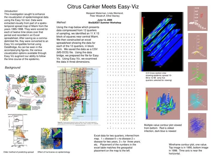
Citrus Canker Meets Easy-Viz Introduction This investigation sought to enhance the visualization of epidemiological data using the Easy Viz tool. Data were extracted visually from part of a spatio-temporal spread map of Miami from the years 1995-1998. They were scored for each of twelve time slices over that period and recorded in an Excel spreadsheet. After saving as a comma-delimited file, they were converted to an Easy Viz compatible format using DataBridge. As can be seen in the accompanying figures, the various visualization options available through Easy Viz augment our ability to follow the time course of the epidemic. Margaret Waterman, Linda Weinland, Peter Woodruff, Ethel Stanley June 12, 2006BioQUEST Summer Workshop Method: Using the map below which presents data compressed from 12 quarters of sampling, we identified an 11 X 15 block of squares near central Miami. We then constructed an excel spreadsheet showing the data for each of the 12 quarters, in block form. We saved the data as a CSV (MS-DOS) file. Using the data bridge, we prepared the file for Easy Viz. Using Easy Viz, we examined the data in three dimensions. Background 3-D Cross section view showing epidemic spread 10-95 to 12-98 (only five quarters selected for viewing) Multiple value contour plot viewed from bottom. Red is oldest infection, dark blue is newest Excel data for two quarters, inferred from map. 1 = disease 0 = no disease 2 = disease for two years, 3 = for three years, etc. Placement of the numbers in the excel table matches the geospatial placement on the map to the left. Wireframe contour plot, one value. Top image is in 1995, bottom image in 1998. Time axis is near the horizontal. Older method of predicting spreadEffect of hurricanes on epidemiology