Download

1 / 24
240 likes | 245 Vues
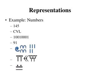
Graphical Representations. The greatest value of a picture is when it forces us to notice what we never expected to see. John Tukey Statistician. The aim of good data graphics is to display data accurately and clearly. Howard Wainer Research Scientist. Scales of Measurement.

E N D
The greatest value of a picture is when it forces us to notice what we never expected to see.John Tukey Statistician The aim of good data graphics is to display data accurately and clearly.Howard WainerResearch Scientist
Scales of Measurement • • Nominal: Named categories • - race, gender, religion • • Ordinal: Ordered categories • - race finish, grade level, SES, Likert • • Interval: Equal intervals • - temperature in ºF and ºC • • Ratio: Equal intervals with absolute zero • - height, weight, date/time, scores, income
Choosing the Right Tool for the Job • Use Tables When • • The document will be used to look up individual values. • • The document will be used to compare individual values. • • Precise values are required. • • The quantitative information involves more than one unit of measure. Use Graphs When • The message is contained in the shape of the values. • The document will be used to reveal relationships among multiple values.
Which graph makes it easier to determine whether Mid-Cap U.S. Stock or Small-Cap U.S. Stock has the greater share?
Only one of these graphs accurately encodes the values. The other skews the values in a misleading manner. Which graph presents the data accurately?
Rules for Creating Graphs • • Choose the right graph for your data • • Title or caption, label axes, and include units • – Use horizontal text wherever possible • – Title is largest, then labels, then units • • No color, shading/gradients, or 3D • – If you use color, use only one…or if you have to use color make sure it works when printed in monochrome. • • Be consistent from graph to graph • • The less ink, the better—keep it simple.
Bar Graph: Masters vs. Bachelors http://cardinalcareers.stanford.edu/surveys/0708/destination/salarystats/default.htm
Bar Graph: How Execs Find Jobs http://www.execunet.com/e_trends_survey.cfm
A Bar Graph of My Favorite Pies 100 75 % of Tastiness 50 25 o Apple Pumpkin Key Lime Berry Lemon Meringue Chess Thanks to How I Met Your Mother
A Pie Chart of My Favorite Bars (% of Awesomeness) Thanks to How I Met Your Mother