Download
1 / 56
580 likes | 731 Vues
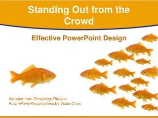
Standing Out from the Crowd. Effective PowerPoint Design. Adapted from Designing Effective PowerPoint Presentations by Victor Chen. Effective Presentations. Using Text Using Graphics Using Special Effects Introducing Subjects Gradually. Using Text Effectively. Make text. BIG.

E N D
Standing Out from the Crowd Effective PowerPoint Design Adapted from Designing Effective PowerPoint Presentations by Victor Chen
Effective Presentations • Using Text • Using Graphics • Using Special Effects • Introducing Subjects Gradually
Make text BIG
Make Text Big • This is Arial 12 • This is Arial 18 • This is Arial 24 • This is Arial 32 • This is Arial 36 • This is Arial 44 Too Small
How to Check Font Size • Look at slides from 6 – 7 feet away • If you can read it, you’re good-to-go Photo by Jeff Bettens Photo courtesy Stock.xchng
Headlines bigger than text • Headlines should be bigger than text • Headlines: 40-44 pt. • Text: 24-32 pt. Photo courtesy of Stock.xchng
Using Font Styles • Never use all caps • ALL CAPITAL LETTERS ARE DIFFICULT TO READ • Upper and lower case letters are easier • Use san serif fonts • Verdana • Arial • Helvetica
Make Fonts Clear T Sanserif font T Serif font Easy to read Hard to read
Use Easy-to-read Fonts • Serif fonts are difficult to read on screen • Sanserif fonts are clearer • Italics are difficult to read on screen • Normal or bold fonts are clearer • Underlining signifies hyperlinks • Instead, use colours to emphasize
Make Lists Clear Use numbers for lists with sequence For example: How do you put an elephant into a fridge? 1. Open the door of the fridge 2. Put the elephant in 3. Close the door From Chen, Victor. Effective PowerPoint Design.
Make Lists Clear How do you put a giraffe into a fridge? 1. Open the door of the fridge 2. Take out the elephant 3. Put the giraffe in 4. Close the door From Chen, Victor. Effective PowerPoint Design.
Use Bullets Effectively Use bullets to show a list without • Priority • Sequence • Hierarchy, ….. From Chen, Victor. Effective PowerPoint Design.
Keep Text Simple • Follow the 666 rule • No more than 6 lines per slide • No more than 6 words per line • No more than 6 text slides in a row • Avoid TOOmanycolors • Avoid TooManyFontsandStyles
Do Not Overdo Text Lindstrom (2000) states that each of the optic nerves uses 1,000,000 nerve fibers to send information simultaneously to the cerebral cortex of the brain. In contrast, each auditory nerve consists of only 30,000 fibers. In the brain’s cortex, about 30 percent of the nerve cells are devoted to visual processing, whereas touch accounts for eight percent and hearing only three percent. Humans experience the world visually, reading five times faster than the average person speaks and registering a full-color image, a megabyte of data in a mere fraction of a second. In addition, seeing photos often triggers emotional responses in individuals. Way too many details!
Use Bullets to Explain • Eyes have 1,000,000 fibers to brain. • Process visuals 60,000times faster than text. • Ears have 30,000 fibers to the brain. • Words processed sequentially. • Images processed simultaneously.. Much Simpler to follow
Keep Text Simple • The most elegant design • Uses same font throughout • Emphasizes differences using style • Bold, italic, bold italic, normal • Or headlines one font, text another: Headline Times New Roman • Text Arial
Use Contrasting Text • Use contrasting colours This is hard to read. This is easy to read.
Use Contrasting Text • Dark on light better than light on dark This is easy to read. This is even easier to read.
Use Differences • Differences draw attention • Differences may imply importance • Use surprises to attract not distract The check draws attention
Do Not Use Too Many • Differences draw attention • Differences may imply importance • Use surprises to attract not distract Too many differences distract
Different Colors for Focus • Differences draw attention • Differences may imply importance • Use surprises to attract not distract This implies importance
Too Much Color Distracts • Differences draw attention • Differences may imply importance • Use surprises to attract not distract Too many differences Distract
Do Not Overuse Graphics • Graphics may distract your audience • Artistry does not substitute for content
Be Consistent in Style • Graphics have different looks • Graphics and photos don’t mix well
Be Consistent in Style • Graphics have different “looks” • Use graphics that have similar styles This graphic doesn’t “fit”
Use Big Pictures • Big pictures imply importance • Big pictures are easier to see • Big pictures have greater impact Photo by Jason Hochman
Use Focal Points • Focal point directs attention To here… Photo from http://www.sxc.hu
Focal Points Emphasize • Focal point lead the eye Photo from http://www.sxc.hu Off the page…
Make Simple Charts RAM sales after Vista released Too much detail
RAM sales after Vista released Simple is Easier to Read Much easier to process
Make Simple Graphs RAM sales after Vista released Too much detail
Graphs Should Be Simple RAM sales after Vista released Much easier to process
Use Transitions Carefully • This transition is annoying, not enhancing • So is this • And this, too. • "Appear" and "Disappear" are better • Fade can be used (sparingly) • Zoom can be used more sparingly
Use Animations for Effect This is a photograph. Too distracting ! This is clipart Photograph by Randy Aryanto.
Keep Animation Simple This is a photograph. This is clipart Not distracting Photograph by Randy Aryanto.
Animated Gifs Distract • Surgery as a Career • Requires substantial school after baccalaureate • Allows you to work in hospital or private practice • Can specialize in surgical area • Pays well Distracting Animated gif from http://www.animationfactory.com
Focus is on Content • Surgery as a Career • Requires substantial school after baccalaureate • Allows you to work in hospital or private practice • Can specialize in surgical area • Pays well Not Distracting Photo from http://www.photos.com
Surprise Emphasizes • Differences draw attention • Differences may imply importance • Use surprises to attract not distract This surprise attracts
Do not Overdo “Surprise” • Differences draw attention • Differences may imply importance • Use surprises to attract not distract These distract
Use Sound Carefully • Sound effects may distract too • Narration or soft background music better
Advance Organizer data data data data data data Integrative Integrative Integrative Reconciliation Reconciliation Reconciliation Too much at once data data data data data data data IntegrativeReconciliation data data data data data data data data data data data data data data data data Slide courtesy of Dr. Howard Jones
Advance Organizer data data data data data data Integrative Integrative Integrative Reconciliation Reconciliation Reconciliation A bit easier to follow data data data data data data data IntegrativeReconciliation data Integrative Reconciliation data data data data data data data data data data data data data data data Slide courtesy of Dr. Howard Jones
G-E-O Triangle Teacher recalls a great lesson; observer recognizes a bad lesson Both teacher and observer recognize a bad lesson Goal competence satisfaction Experienced Observed realism Teacher recalls a rotten lesson; observer recognizes a pretty good one lesson Teacher recalls a great lesson; observer recognizes a bad lesson
G-E-O Triangle Goal satisfaction competence Experienced Observed realism
G-E-O Triangle Goal Both teacher and observer recognize a good lesson Experienced Observed
G-E-O Triangle Goal Both teacher and observer recognize a bad lesson Experienced Observed