Download
1 / 5
50 likes | 53 Vues
This evaluation discusses how the contents page of a magazine uses and challenges forms and conventions of real media products. It covers the font and layout choices, listings organization, use of images, color scheme, and both adhered-to and challenged conventions.

E N D
In what ways does your media product use, develop or challenge forms and conventions of real media products?
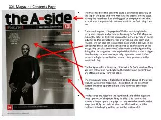
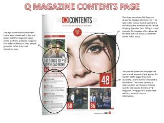
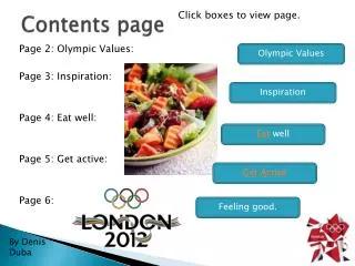
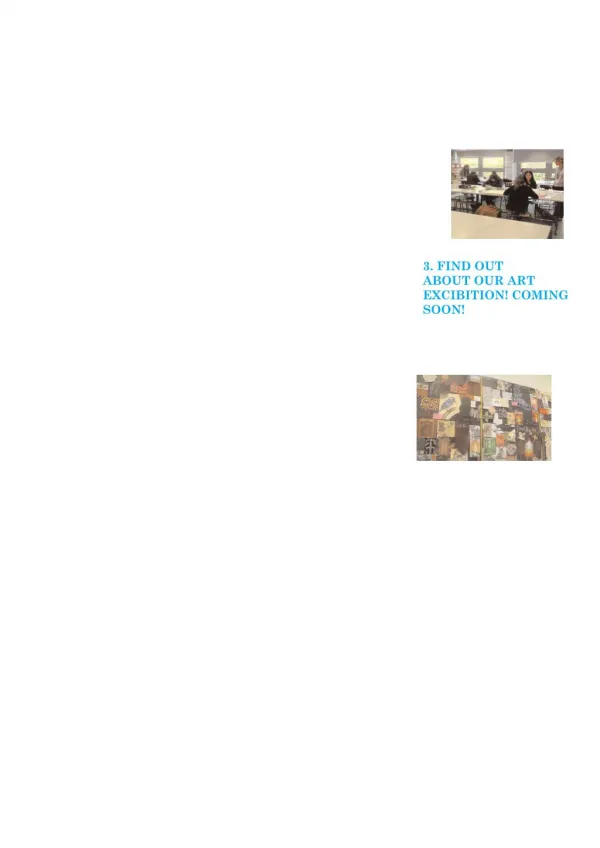
TITLE: The title of the contents page is in the same font as the title of the magazine featured on the front cover so that it will draw attention to the page when the reader turns to it. Although the font size is smaller, it still shows the ‘logo’ of the magazine. I haven’t stated that this page is the contents page as I feel that the audience of the magazine will be familiar with the sort of layout of the magazine and will recognise that it’s the contents page without it actually being stated as they are an older more intelligent reader. Although this doesn’t stick to media conventions I believe that it works well on the page. LISTINGS: Listings are a typical media convention on the contents page as they are always included on this page. I separated the listings into two separate categories, ‘News’ and ‘Features’ so then the reader will be able to go to which appeals to them the most as well as finding the article they may be looking for a lot easier rather than reading the whole list. A common convention is to have each listing numbered by each page they are on so that the reader can find the article a lot easier in the magazine, I have included this in my contents page. I have kept the listings in chronological order so that the reader can understand the layout a lot more simply as well as sticking to the typical layout of contents page. IMAGES: I have included three images on this page so that the reader is able to refer to the images that link to the text and recognise the artists in them persuading them to read the article. The images make the page a lot more friendlier as many contents pages do not included many images which results in the reader being out off by the amount of text to the lack of images. I made the image at the top black and white to make it look more ‘rocky’ as the original image looks to bright and colour for the genre of magazine. I have also placed an image next to the editors note on the page as this is a common convention on contents pages and make the article seem more personal by adding the editor’s picture. Two of the images I’ve used on this page are live images meaning that they are not posed, I believe this works on the page as it makes the page seem more relaxed and I feel as though this will appeal more successfully to my target audience. COLOUR SCHEME: I have stuck to the house style of the magazine on this page as I have again included the colours black, white and red. I got this colour scheme from the feedback in my questionnaire as the target audience believed that this colour scheme appealed to the as well as falling into the rock genre of the magazine. The red and black stands out extremely well against the white background on this page. Although there is still ‘white space’ on the page I feel as though if I used a coloured background the page wouldn’t stand out as successfully to the audience and the images and text would blend in with the background.
Typical magazine conventions used: • Listings • Images • Page numbers • Continuous house style
Magazine conventions challenged: • No real stating of the page being the ‘contents page’. • Main feature article not having an image on the page. • Use of acronym rather than full band names in order to make it short and snappy.