Download
1 / 27
270 likes | 359 Vues
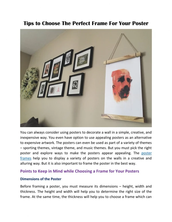
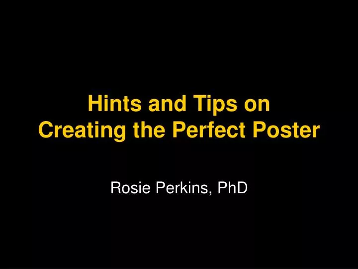
Hints and Tips on Creating the Perfect Poster. Rosie Perkins, PhD. What is a poster?. A large document to communicate your research at a scientific meeting Advertisement for your research Not a paper, not a talk. Where will it be viewed?. Attract people’s interest.

E N D
Hints and Tips on Creating the Perfect Poster Rosie Perkins, PhD
What is a poster? • A large document to communicate your research at a scientific meeting • Advertisement for your research • Not a paper, not a talk
Attract people’s interest • Self-explanatory graphics • Use 2-3 colours for emphasis
Attract people’s interest • Bullet points rather than blocks of text • A clear title Poster text is hard to read if you write in the same way as you would do in a manuscript. Use as few words as possible and remember that you would like the reader to ask questions. You want the reader to quickly grasp the message, so make sure that this is stated in the title. Clear graphics are much more important than lots of text.
Attention to audience • Well-thought out structure • Clear, concise and consistent message • Two types of reader • browser - brief look from a distance • ingestor - reads every word
Appeal to the browsers • Visually appealing • Clear graphics • Text easy to read, font size, contrast • Well-crafted title
Appeal to the ingestors • Attention to detail • Scientific accuracy • Logical structure • Solid conclusions
How to begin • Allow more time than you first think • Summarize your key message in one or two sentences • How big is the poster? • Decide what figures and tables to use • Plan a rough version of the whole poster
Design hints • Dark text on a pale background easiest to read for posters • Choose a poster template (eg PowerPoint) and adapt it to your needs • Provide cues to the reader to follow flow • White space makes it easier to read
Fonts to use • Use two fonts • sans serif font and colour for headings • serif font for body text • Font sizes • 72 pt title • 36 pt name and address • 18 pt body text • 16 pt figure legends
Don’t forget the message • Short title • Introduction to your burning question • Overview of your experimental approach • Key results • Insightful discussion
A title should summarize the key message • No longer than 2 lines • Not too technical • Avoid abbreviations • Encourages your audience to read the poster • San serif font, 72 pt, bold, not all caps
Limit your introduction to three bullet points • Background • Gaps in the knowledge • Aim of your study Introduction
Keep methods short • Be brief, and use diagrams • Remember, you want people to ask you questions • Could use paragraph text, not bullets, to save space • Include methods in figure legends
A diagram can help explain a complicated protocol Tracers 270 0 30 150 390 510 Insulin 1 mU/kg/min Variable rate of 20% glucose infusion Adiels et al. Diabetologia 2007
Present your results in the most attractive way • Use mostly figures • Not too complex and use colours • Brief text to guide the reader through the figures • Use informative subheadings • Separate figures with lots of white space
Keep text horizontal It is hard to read vertical text Or text at other strange angles
Figure axes 10 Height of sunflowers (cm) 8 Line width 1.5 pt 6 Horizontal y-axis label 4 Min. font size 18 pt Limit no. of tickmarks 2 0 Label axes and include units 0 2 4 6 8 10 Time (days)
Figure details 10 Height of sunflowers (cm) Water No water 8 6 Clear key Line width 1.5 pt 4 Axes don’t extend beyond range of data 2 Different symbols and colours 0 0 2 4 6 8 10 Time (days)
Figure details 10 Explain symbol Maximum height (cm) *P < 0.05 8 * 6 Consistent colour scheme Horizontal y-axis label 4 2 Line width 1.5 pt 0 Water No water Label bars
Table 1. Characteristics of the control and patient groups 1st *p<0.01 versus control
Conclusions are important • Position them in a prominent place • Logical position, not in the middle of results • What have you concluded from your results? • Refer back to the aim of your study • Ensure they state the key message
References • Not necessary • Don’t include more than two or three • Choose a consistent reference style • Use smaller font size • References • Nishimua S et al. Nat Med 2009; 15:914-920. • Bochukova EG et al. Nature 2010; 463: 666-670.
Further information • Acknowledge source of funding • e-mail address • URL to download a copy of your poster
Summary • Focus on one clear message (in title and conclusions) • Use graphics to tell the story • Minimum use of text • Clear, concise and consistent • Sensible order that the reader can follow • Ask other people to comment BUT only after you have revised it
Useful reading www.swarthmore.edu/NatSci/cpurrin1/ posteradvice.htm