Download
1 / 6
60 likes | 85 Vues
Color dominates a lot of unspoken rules when it comes to design color is used to convey the right emotions and get a message across. Here we have discussed the Importance of Color in Your Web Design.

E N D
The Importance of Color in Your Web Design • support@topcssgallery.com • www. topcssgallery.com
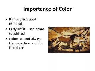
Color dominates a lot of unspoken rules when it comes to design. In more traditional forms of art, it’s already a given how important color is. But when it comes to modern expressions of art, particularly those of digital in nature, only the most detail-oriented pay off. Given that web design still falls under the realm of design, it’s best to utilize techniques found in other forms of art. Just as color is used to convey the right emotions and get a message across, the color should be utilized in web design and other digital art properly. Color DOES Matter How many times have we associated a blue ‘F’ with Facebook? Or even a multi-colored ‘G’ to Google? These are simple letters with attached colors, and yet our minds connect them to bigger concepts that mean simply more than a letter and a color. This is often called “color branding” and is extensively used by large companies to align their desired brand image to their logo. We all feel certain emotions regarding colors. We associate red to energetic brands, we think of black and gold as elegant, and hold blue as refreshing. • support@topcssgallery.com • www. topcssgallery.com
They don’t just have a ‘look’ but also a ‘sound’. As mentioned before, we associate colors with emotions, and these emotions can take the form of a feeling most commonly associated with sound. This is most evident when mixing different colors, as a random combination of ill-matching colors can be described as ‘noisy’ and a good mix of white and blues can be described as ‘quiet’. The sights and the sounds of the colors in your design are what solidifies the message. This is how companies and brand extend their message across; through the visual conveyance of their mission and vision. The ABCs of Color Theory The study of color theory is a wide and broad field of study. To fully grasp the idea, one needs to read more into the subject, but the most basic definition of it is how colors work together. This is what makes or breaks a design. How you integrate matching or opposing colors together is color theory, and while a single article won’t cover it, we’ll look at how you can utilize it in your web design. • support@topcssgallery.com • www. topcssgallery.com
Remember the Complementary Colors Keep in mind the color wheel and utilize it to its fullest. Two colors that are directly opposite to each other are called complementary colors, red and green being a popular example. The contrast between red and green is eye-catching and brings to it a strong association. Even from afar, we’re able to see red and green. Red and green are commonly reserved for Christmas- something you see in designs of all forms during December, a sign of strong cultural association. Look at the other ends of a color wheel too. Utilizing uncommonly seen contrasting colors make for an eye-catching and memorable design. Think of how colors compliment each other and incorporate this on your designs- especially ones that require importance, like a centerpiece or a title. Use Analogous Colors Too If you use too many complimentary colors, the design becomes loud and noisy. It can be overstimulating to look at, making people look away instead of drawing them in. Part of good design is knowing how to utilize complementary colors, and another interesting part of color theory: analogous colors. • support@topcssgallery.com • www. topcssgallery.com
Analogous colors are groups of colors beside each other on the color wheel, commonly comprised of three colors. A popular one is the yellow orange-orange-red triad, which is often used to denote the heat of something. Analogous colors come with their own common associations, so it’s best to familiarize yourself with them. They’re great for making background pieces with, as they can dictate the ‘feel’ of your website. Light hints of yellow analog colors can give a vibrant feel to your design, or blue analog colors for a calming effect. Looking at nature will show you a wide range of analogous colors; a leaf can go from blue-green from the stem, yellow-green on the base, and green on the leaf itself. Nature is rife with analogous colors like these, even observing the seasons pass is a great example of analog colors. A Mix of Both Using analog and complementary colors together makes for great, dynamic design. This is evident even in nature: we often see bright red flowers amidst green leaves of analogous variety. Mimicking this design idea is the key to creating a natural-feeling design. Gone are the days of white and grey websites designed in HTML. Utilizing an intelligent mix of colors is key to keep visitors on your website, and your clients happy. • support@topcssgallery.com • www. topcssgallery.com
Thanks ! Click here • support@topcssgallery.com • www. topcssgallery.com