Download
1 / 59
640 likes | 879 Vues
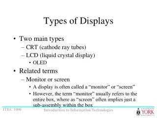
Types of Data Displays. Based on the 2008 AZ State Mathematics Standard. Pictograph (Grades 1 and 2). Pictograph (Grades 1 and 2) For Grade 1 : the pictures/icons in the pictograph represent a quantity of 1.

E N D
Types of Data Displays Based on the 2008 AZ State Mathematics Standard
Pictograph (Grades 1 and 2) For Grade 1: the pictures/icons in the pictograph represent a quantity of 1. For Grade 2: The pictures/icons in the pictograph represent more than 1 and a key is required to interpret the graph.
Frequency Table“Favorite Pets”(Grades 2 and 3) Note: A frequency table may or may not have a column for the tally marks.
Pictograph made from the previous tally chart and frequency table
Bar Graphs(Grades 2, 3, 4, 5) Grade 2: Single Bar Graph Grade 3: Single Bar Graph Grade 4: Double Bar Graph Grade 5: Multi-Bar Graph
Which Direction? Vertical Bar Graph Displays data better than horizontal bar graphs, and is preferred when possible. Horizontal Bar Graph Useful when category names are too long to fit at the foot of a column.
Line Graph(Grades 3, 4, 5) • Grade 3: Single Line Graph • Grade 4: Single Line Graph • Grade 5: Double Line Graph
Pie (circle) charts - more info • A way of summarizing a set of categorical data or displaying the different values of a given variable (e.g. percentage distribution). • A circle is divided into a series of segments. Each segment represents a particular category. • The area of each segment is the same proportion of a circle’s area as the category is of the total data set. • Quite popular. Circle provides a visual concept of the whole (100%).
Best used for displaying statistical information when there are no more than six components – otherwise, the resulting picture will be too complex to understand. Pie charts are not useful when the values of each component are similar because it is difficult to see the differences between slice sizes.
Graph paper is a good idea for it is crucial that each recorded X be uniform in size and placed exactly across from each other (one-to-one correspondence).Notice the cluster at 17 & 18 as well as the gap at 13 and 22. The mode is 18, the median is the second X from the bottom for number 18, and the mean is 17.68 or 18. Line Plot for the Number of M&M's™ in a Package
There are many more types of Data DisplaysHere are a few - - -
No CorrelationIf there is absolutely no correlation present, the value given is 0.
Perfect linear correlation:A perfect positive correlation is given the value of 1. A perfect negative correlation is given the value of -1.