Download
1 / 88
920 likes | 1.69k Vues
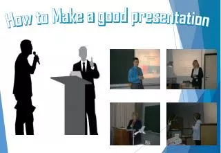
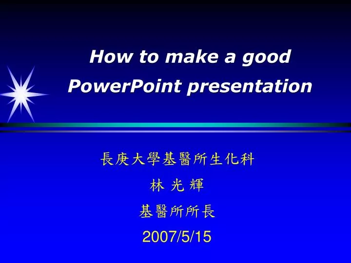
How to make a good PowerPoint presentation. 長庚大學基醫所生化科 林 光 輝 基醫所所長 2007/5/15. 前言. 有聲勝無聲之時代! 沈默是金 , 言多必失? 坐而言不如起而行 空談無益! 話不投機半句多? 一切盡在不言中 , 此時無聲勝有聲 . 巧言令色鮮矣仁! ( 孔子更看中 " 行 " ,鼓勵少說多做,做事積極,說話謹慎 ) 言教不如身教!. 演講家的特徵. 高度的思想修養 : 高尚的品格 , 和思想行為 廣博的才學知識 : 高超的語言表達能力 :.

E N D
How to make a good PowerPoint presentation 長庚大學基醫所生化科 林 光 輝 基醫所所長 2007/5/15
前言 • 有聲勝無聲之時代! • 沈默是金,言多必失? • 坐而言不如起而行 • 空談無益! • 話不投機半句多? • 一切盡在不言中, 此時無聲勝有聲. • 巧言令色鮮矣仁!(孔子更看中"行",鼓勵少說多做,做事積極,說話謹慎 ) • 言教不如身教!
演講家的特徵 • 高度的思想修養:高尚的品格,和思想行為 • 廣博的才學知識: • 高超的語言表達能力:
The Best Presentations... Are built on a clear message, supported by well-organized facts and enhanced by illustrations, charts and graphics.
Guidelines: Four steps process Plan Prepare Practice Present
Step 1: Plan Whois my audience? 見人說人話! Whatdo they need to know? Whydo they need to know this information? Howcan I most effectively present the information?
Know Your Audience Ask yourself these questions: 1. How much do they already know about my topic? 2. If I were part of the audience, what would I like to know? 3. What do I want my audience to do as a result of my presentation?
Design Your Objectives Recognize that audiences will listen to you for the first five minutes. If you have captured their attention they will listen for the remainder of the presentation.
A good objective should always have three components 1. What do I want my audience to know when I finish my presentation? (Purpose) 2. What do I want them to specifically learn after they have heard me? (Method) 3. What do I want them to do when my presentation is completed? (Results)
Step 2: Prepare Analyze your audience Design your objectives Outline your presentation Prepare your visuals Practice your presentation Present your presentation Evaluate your presentation
Step 3: Practice (rehearsal) Build your confidence and effectiveness Receive feedback and coaching (輔導)
Step 4(a): Present Establish a positive mind-set you are the expert you have done the work relax
Step 4(b): Present First impression establish eye-contact display poised, confident body language be well groomed be energetic relax.
Step 4(c): Present Style and skills of speaking direct and sincere speak slowly with good pace use simple sentences logical flow, good organization
Outline the Presentation 1. An outline gives a speaker the opportunity to organize thoughts effectively. 2. Many technical speakers organize presentations the way they organized research: problem...research...results.
Learn to Outline 1. Never try to memorize a presentation 2. Outlines the work and keep it simple
Your outline might look like this 1. There is a lot of information available a. Standard medical reference books b. Periodicals c. Web sites 2. What is good information? a. Source b. Timeliness c. Audience level 3. Cross check information….
Presentation Content When you have designed an outline, you need to decide what information is going into the body of the presentation.
Note cards On 3" x 5" note cards, write notes on what you want to cover. Keep cards and words to a minimum. Use only three or four key words per card rather than full sentences. These words will trigger your memory and keep you on track.
Written Speeches 1. One thing you should not do is write out your speech. What looks good on paper does not necessarily sound good when it is spoken. 2. The written script can be deadly.
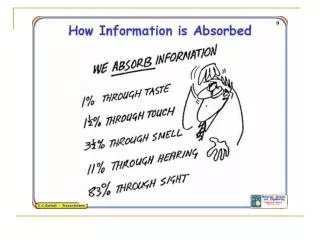
Visuals Aid (I) 1. According to a Bureau of Labor study, we learn 11 percent by HEARING and 83 percent by HEARINGand SEEING. 2. A speaker will increase audience understanding and enhance retention if a visual format is used.
Visuals Aid (II) 1. Flip Charts and Easels (黑板架) 2. Overhead Transparencies 3. The Slide or Computer Presentation
Flipcharts Make letters at least a 1/4” high Flipcharts with lines are much easier to write on
Aspect Ratios for Media Overhead Transparency4:5 Video3:4 35mm Transparency2:3
Define your jargon An insurance agent once began his speech talking about... "We in the CIA..." Everyone began to whisper to each other, wondering how he could be connected to the CIA. CIA: Central Intelligence Agency Consumer Information Association TR: TPA response element Thyroid hormone response element Td?
How many slides? For a short talk I find that one a minute is about right.
Basic Principles of Design Readability- legibility 易讀性 Content Consistency
Basic Principles of Design The focus of this session is going to be on: 1. How to make PPT presentations readable to the audience. 2. How to employ principles of good design in the development of PPT presentations. 3. How much content should go into the presentation.
Slide Design Process 4. Use consistent format Use multimedia-animation sparingly (謹慎的) Use consistent animation Use a title slide-attention getting Title each slide clearly
Use a Template 1. Use a set font and color scheme. 2. Different styles are disconcerting to the audience. 3. You want the audience to focus on what you present, not the way you present.
Fonts 1. Choose a clean font that is easy to read. 2. Roman typeface (字型) are easier to read thanOld English. 3. Stick with one or two types of fonts.
Bullets 1. Keep each bullet to one line, two at the most. 2. Limit the number of bullets in a screen to six, four if there is a large title, logo, picture, etc. 3. If you crowd too much text, the audience will not read it.
Bullets (cont.) 4. Too much text makes it look busy and is hard to read. 5. Why should they spend the energy reading it, when you are going to tell them what it says? 6. Our reading speed does not match our listening speed; hence, they confuse instead of reinforcing each other.
Each bullet point should consist of an intelligible phrase 1. Rather than merely a word or two that is meaningless on its own or 2. Conversely, a complete sentence that is better delivered orally.
Text Size Slide titles Make sure are big enough Use 40 points or larger Use WordArt to spice up Body slide text Use 32 points or larger
Text Size and Shape 1. A good rule-of-thumb is to use a 32 and 20 or 36 and 24 combination. 2. Don't be tempted to decrease your font size to cram information onto one slide.
What to Avoid in Text Avoid fancy fonts with narrow lines Use no more than 2 font styles Never use shadow Avoid italics Avoid underlines
Caps and Italics 1. Do not use all capital letters; Makes text hard to read (DO NOT USE ALL CAPITAL LETTERS…) 2. Italics Used for“quotes” Used tohighlightthoughts or ideas Used for book, journal, or magazinetitles
Color Design 1. Use high-contrast colors 2. Light text-- yellow or white 3. On dark background-- blue or black
Low-contrast 1. Use high-contrast colors 2. Light text-- yellow or white 3. On dark background-- blue or black
Colors 1. Reds and orangesare high-energy but can be difficult to stay focused on. 2. Greens, blues, and browns are mellower, but not as attention grabbing. 3. White on dark background should not be used if the audience is more than 20 feet away.
Clashing Colors 1. Colors that are directly opposite from one another are said to clash. 2. These provide readability- e.g. yellow on blue.
Background Color Design Best for projectors Blue and purple is easiest to read
Using Graphics 1. A good graphics is worth a thousand words. 2. Graphics can enhance learning and recall by up to 85%. But be careful, if used excessively they can overpower your message. 3. As a general rule, use only one graphic per slide to emphasize your main point.
Using Graphics (cont.) 4. Use only when needed, otherwise they become distracters instead of communicators 5. They should relate to the message and help make a point 6. Ask yourself if it makes the message clearer. Simple diagrams are great communicators