Download
1 / 29
290 likes | 311 Vues
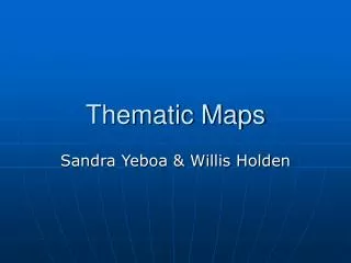
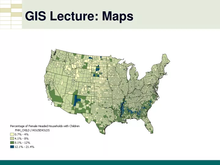
GIS Lecture: Maps. Summary. Thematic Maps (Choropleth) Use of Color Categorical Maps Graphical Hierarchy. Thematic vs. Categorical. Thematic maps – Quantity - different amounts Categorical maps – Quality - different types. Thematic Maps. Classification Intervals.

E N D
Summary • Thematic Maps (Choropleth) • Use of Color • Categorical Maps • Graphical Hierarchy
Thematic vs. Categorical • Thematic maps – Quantity - different amounts • Categorical maps – Quality - different types
Classification Intervals • Edit the classifications and layer properties
Original Map (Natural Breaks) Uninsured U.S. Population, 2005
Custom Map (Equal Intervals) Uninsured U.S. Population, 2005
Other Numeric Intervals Pittsburgh, PA: Neighborhood proportion under poverty and average BMI per neighborhood BMI 18.5 - 24.9 ! 25.0 - 29.9 30.0+ Percentage in Poverty 0 - 12.5% 12.51% - 19.99% 20.0% - 39.99% 40.0% - 70.10% Data Sources: BRFSS data, 2000;City of Pgh City Planning Dept., U.S. Census 2000
Color Overview • Colors have meaning • Cool colors calming, Warm colors exciting • Cool colors appear smaller than warm colors and they visually recede on the page, so red can visually overpower and stand out over blue even if used in equal amounts • Colors have political and cultural meanings
Color Overview • Hue is the basic color • Value is the amount of white or black in the color • Saturation refers to a color scale that ranges from a pure hue to gray or black
Color Overview • Monochromatic color scale is a series of colors of the same hue with color value varied from low to high
Customized ramps • Customize the Properties of a layer
Color Wheel Guidelines • Use opposite colors- those directly across from one another to differentiate graphic features • 3 or 4 colors equally spaced- good for differentiating graphic features • Use adjacent colors for harmony- such as blue, blue green, and green or red, red-orange, and orange
Dichromatic Color Scale • Two monochromatic scales joined together with a low color in the center, color increasing toward both ends • Natural middle-point, such as 0 for some quantities (profits and losses, increases and decreases)
Color Spots • White background allows color spot to be visualized
Categorical Map Example • - Light Pole Owner
Categorical Map Example • - Zoning
Categorical Map Example • - Street sweeping days
Graphic Hierarchy • Assign bright colors to the most important graphic elements • Such graphic elements are called “figure”
Graphic Hierarchy • Assign drab colors to the graphic elements that provide orientation or context, especially shades of gray • Such graphic elements are called “ground”
Graphic Hierarchy • Place a strong boundary, such as a heavy black line, around polygons that are important to increase figure • Use a coarse, heavy cross-hatch or pattern to make some polygons important, placing them in figure
Summary • Thematic Maps (Choropleth) • Use of Color • Categorical Maps • Graphical Hierarchy