Download
1 / 26
290 likes | 470 Vues
Typeface Basics. Glossary 1. Ascenders: Strokes of letters that rise above the mean line of type (b, d, f, h, k, l, t). Descenders: Strokes of letters that fall below the baseline (g, j, p, q, y)

E N D
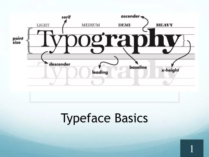
Glossary 1 Ascenders:Strokes of letters that rise above the mean line of type (b, d, f, h, k, l, t). Descenders: Strokes of letters that fall below the baseline (g, j, p, q, y) x-height:The height of the main body of the lowercase letters. Most sans serifs have large x-heights.
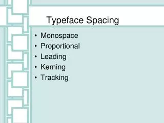
Glossary 2 Type families (sometimes referred to as font):Versatile faces such as Garamond, Franklin Gothic, Futura, etc. offer several variations of weight and posture in the same typeface. Display type:Point sizes 14 point and above. Width rule:When copy gets too wide, readability drops off. The rule is that copy should be no wider than an alphabet and a half or 39 characters.
Measuring Type • Type is measured in points. • 72 points = 1 inch, • 72-pt. type is 1 inch tall, measured from the top of the ascender to the bottom of the descender. • ½-inch = 36-pt. • ¼-inch = 18-pt. • No letter has both an ascender and a descender; however in any given typeface and size, the length of the ascender and descender are the same.
Type Anatomy • Ascender • Baseline • Cap Line • Counter • Descender • Mean Line • Serif • x-height
Tip #1. Pair personality to purpose. • Keep in mind the message you are trying to communicate with your type. • Sports, even women's sports, do not lend themselves to feminine script, for example. Getting down, dirty girls rugby gaining popularity Or Getting down, dirty girls rugby gaining popularity
Tip #2. When working with type, more type families are not better. • Limiting type to no more than three font family for the entire book is a growing trend. • When combining type for headlines, remember two’s company, three’s a crowd. • Limit spread designs to one distinct type supported by something simple. A family of fonts is composed of different styles.
Font #1: Reading pull-down information Font Family Myriad Pro • Styles of font in family • Light • Condensed • Bold • Format of font • TrueType • Postscript • Open Type (best)
Font #2:Classifications of font families 6 basic font classes • Serif • Old Style • Transitional • Modern • Slab Serif • Sans Serif (sans = without) • Script • Blackletter • Display / Decorative • Monospaced • Dingbat
Font #3:Serifs Serifsare in red • Serifsare easier to read than sans serifs. • Use a serif font forbody copy (text), as a general rule. • Baskerville • Bernhard Modern • Courier Standard • Garamond • Georgia • Minion Pro • Palatino • Times New Roman Examples Of Serif Fonts:
Font #4:Sans serifs Arial Arial Rounded MT Comic Sans MS Futura Helvetica Letter Gothic Std Lucia San Myriad Pro News Gothic MT Stone Sans ITC TT Verdana • These are less legible than serifs. • Use sans serif fonts for primary headlines or captions as a general rule. Examples of Sans Serif Font Families
Examples Of Script Font Families: Font #5: Script Scriptfontsare • harder to read. • used aslarge text only. • forspecial cases only. • Bickham Script Pro • Brush Script Std. • Caflisch Script Pro • Dickens Script SSK • Edwardian Script ITC • Handwriting — Dakota • Lucida Blackletter • Lucida Handwriting • Medici Script • Old English Text • Learning Curve • Snell Roundhand
Font #6: Display / Decorative Fonts • Displayfontsare: • harder to read • used aslarge text only • forspecial cases only • 1942 Report • AbecedarianZo • Attic • Bauhaus 93 • Big Apple • BonezDisplayCap • Copacabana • Cracked • Deco Card • EcentricStdG • Fashion Victim • Flower Child Caps • Flower Child SSK • Giddyup Std • Hobo Std Examples Of Display Families:
Font #6: Display / Decorative Fonts Examples Of Display Families: • Kidz Only Too SSK • Jellyka Castle’s Queen • My Stuff Caps • Toy Train • Quetzalcoatl • Racpmteir NF • Rain Dance SSK • Raindrop SSK — Bold • Salsa • Sand • Stencil Std • SNOWFLAKEk • Vintage Typewriter SSK • Voco Script SSK • Zapato SSK • Zapito SSK • Zorba
Font #7: Monospace Fonts Examples Of Monospace Families: Monospacefonts • Are also called "fixed pitch" fonts • Have characters that all have the same character width • Originally were designed for typewriters • Used with computer source code • Andale Mono • Courier New • Letter Gothic Std • Lucinda Console • Lucinda Sans Typewriter • Monaco • ORC A • Prestige Elite Std
Font #8: Dingbat Fonts • Also known as a "printer's ornament" or "printer's character.” • Describe fonts with symbols and shapes in the positions designated for alphabetical or numeric characters. • Dingbatfontsare:
Font #9: Dingbat Fonts • Glyphsare: An ornament, a character or spacer used in typesetting.
Font #10: Dingbat Fonts Typical Examples Of Display Families: • MT Extra abcdefg • MS Reference Specialty ABCDE • Webdingsabcdefg • Wingdings abcdefg • Wingdings3 abcdefg • Zapf Dingbats abcdefg
Font #11: Dingbat Fonts Fun Examples Of Display Families: • AmphibiPrint abcdefg • Carta abcdefg • Face it! Abcdefg • Face Off! Abcdefg • Mickey Mousebats ABCDEFGH • RoadSign abcdefg • RoadWarningSign abcdefg • WWFlakes abcdefghijklm
Font #12:Remember • The more unusual the type, the lower the readability. • Pick your fonts carefully.
Tip #3. Avoid using all capitals. • That doesn’t mean you can never use all caps. • Just realize all capital letters reduces readability. • Use all caps only when you have a specific design purpose in mind. • Especially avoid using all capitals in a script face. • Your readability dropsto about zero.
Tip #4. Pay attention to relationships when combining type. • If elements are not the same, they should be very different. • Remember, like the perfect marriage, types need to either be very similar or fairly opposite. • Contrast type in size, weight, form and structure. • The combinations you form should communicate, not confuse the reader. Examples: Verdana boldfor heads Georgia for text = good contrast Verdana bold for heads Trebuchet for text = not enough contrast
Tip #5. Some types just don’t mix. • Don't use two scripts or a script and an italic together. • They usually have the same form and so they conflict with each other rather than contrast. • Never use two types from the same category (for example: Script, Decorative) together. Don't Do Don't Do
Tip #6. Don’t abuse type through manipulation • Purpose is to communicate type helps do that. • Don’t manipulate type to fit your design by adjusting leading and width. • Instead, edit the copy or find a word that fits the headline space. • Once established within a section, type size, leading and width should remain consistent.
Tip #7. Complement your knowledge of fonts with your knowledge of design. • Use of effectively planned white space and color can enhance your use of type. • Place type on the page to create entry points for your reader.
Tip #8. Learn more from the experts. • Magazines like Before & After and Dynamic Graphics have information and advice. • Check out books like The Non-Designers Design Book by design experts like Robin Williams. • Many of these tips come from her. • For more technical information, check out her Non-Designers Type Book. • Browse the bookstores and stock up on magazines that use type effectively so you can build a library of ideas.