Download
1 / 32
330 likes | 500 Vues
Statistical Techniques for Analysing Quantitative Data. With statistics, we can summarise large bodies of data, make predictions about future trends, and determine when different experimental treatments have led to significantly different outcomes

E N D
Statistical Techniques for AnalysingQuantitative Data • With statistics, we can summariselarge bodies of data, make predictions about future trends, and determine when different experimental treatments have led to significantly different outcomes • Thus, statistics are among the most powerful tools in the researcher’s toolbox • Statistics can be thought of as a group of computational procedures that allow us to find patterns and meaning in numerical data • In reality, statistics are invaluable and often indispensable tools in research • They provide a means through which numerical data can be made more meaningful, so that the researcher may see their nature and better understand their interrelationships
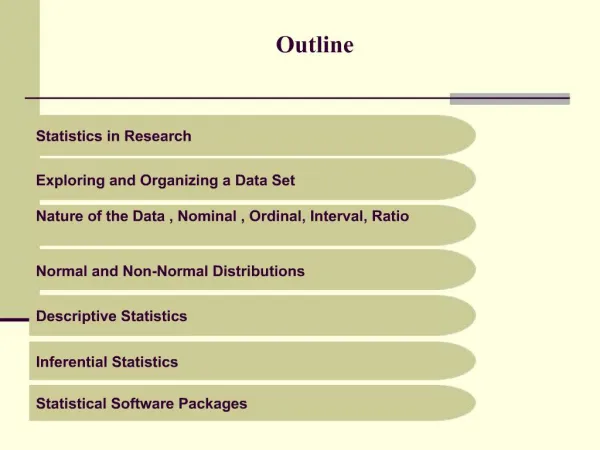
Exploring and Organising a Data Set • Before employing any statistical procedure, develop habit of looking closely at your data and exploring various ways of organising them – detect patterns • Example : reading test scores of 11 children. Ruth, 96; Robert, 60; Chuck, 68; Margaret, 88; Tom, 56; Mary, 92; Ralph, 64; Bill, 72; Alice, 80; Adam, 76; Kathy, 84 • What do you see? Arrange and look for patterns • Careful researchers discover everything possible about their data, whether the information is immediately useful or not
Arranging The Data • Alphabetical arrangement – look for meaning or pattern, no matter how trivial – refer to page 246 of the textbook • Observable fact – highest score was earned by a girl and that the lowest score was earned by a boy – although silly and meaningless, it’s an observable fact, and it may come in handy at a future time • Symmetrical pattern – same sex arrangement - refer to page 246 of the textbook • Separate girls from boys – refer to page 246 of the textbook • The graph shows dramatic trends – the girls’ scores increase as we proceed through the alphabet, and the boys’ scores decrease
Dramatic Trends • Not only is there a divergence of trends, the scores are equidistant from one another. Each score is 4 points either above or below the preceding one • May have no relevance to research but it represents dynamics within the data • The researcher should be aware of the dynamics, the phenomena, that are activewithin the data, whether those phenomena are important to the purpose of the research or not • The astute (clever at seeing quickly how to gain an advantage) researcher overlooks nothing • Another arrangement of the data would have probably made a different meaning more apparent
Fundamental Guideline for Looking at the Data • Whatever the researcher does with the data to prepare it for inspection or interpretation will affect the meaning that those data reveal • Therefore, every researcher should be able to provide a clear, logical rationale for the procedure used to arrange and organise the data • There is no rationale whatever for arranging the test scores according to the children’s first names • Had their last names being used, which would have been equally illogical, we would still have seen that the girls had higher scores than the boys, but we would not necessarily have seen the diverging trends depicted in Figure 11.2 on page 247 of the textbook
Drawing Conclusions from the Data • Questions from the example • Why were all the scores of the girls higher than those of the boys? • Why were the intervals between each of the scores equidistant for both boys and girls? • Knowledge springs from questions like these • But must be careful not to make snap judgments
Drawing Conclusions from the Data • Even the most thorough research can go astray at the point of drawing conclusions • The example – might conclude that girls read better than boys – not thinking carefully • Reading is a complex and multifaceted skill • The data do say that, on a particular day to 11 children, for this particular situation, limited to test performance in those reading skills, measured specifically by the test
Organising Data to Make Them Easier to Think About and Interpret • Another example: Joe’s daily grade at high school in the order they were earned – a simple linear sequence 92, 69, 91, 70, 90, 89, 72, 87, 73, 86, 85, 75, 84, 76, 83, 83, 77, 81, 78, 79 • Arrange the grades in a two-dimensional table – refer to page 248 of the textbook • Read vertically the grades on Monday, Wednesday, and Friday – they are considerably higher than those on Tuesday and Thursday • Look at successive scores in each column – they get progressively worse on Mondays, Wednesdays, and Fridays, but progressively better on Tuesdays and Thursdays • The researcher should explore the data further – it may have a cause for behaving that way
Simple Line Graph • Look at Figure 11.3 on page 249 of the textbook • We see phenomena that were not readily apparent in the two-dimensional table • 1) Wide disparity in grades during the first and second weeks • 2) The gradual leveling-out process in the third and fourth weeks • This profile should raise questions and instigate further exploration in an attempt to explain the erratic behaviour that the graph reflects
Choosing Appropriate Statistics • Use a statistic to take out the jagged irregularities of Joe’s academic daily performance • Take weekly average, mean – more commonly called an average • Refer to Figure 11.5 on page 252 of the textbook • Instead of zigzag performance of the graph, it shows very little change in Joe’s average level of achievement • The means presented in Figure 11.5 tell us nothing about how consistent or inconsistent Joe’s grades are in any given week – probably need a range or a standard deviation – to summarise the variability we see each week
Important Points • Looking at data in only one way yields an incomplete view of those data and, hence, provides only a small segment of the full meaning that those data contain • For that reason, there are many statistical techniques, each of which is suitable for a different purpose • Each technique extracts a somewhat different meaning from a particular set of data • Every time you apply a new statistical treatment to your data, you derive new insights and see more clearly the meaning of those data • We have hardly exhausted the techniques used to organise, summarise and better understand Joe’s grades
Functions of Statistics 1) Descriptive statistics – describe what the data look like – where their centre or midpoint is, how broadly they are spread, how closely the variables within the data are correlated with one another 2) Inferential statistics – make inferences about large populations by collecting data on relatively small samples, provide a way of helping us make reasonable guesses about a large, unknown population by examining a small sample that is known. In the process, they also allow us to test our hypotheses regarding what is true for that large population
Statistics as Estimates of Population Parameters • A parameter is a characteristic or quality of a population that, in concept, is a constant; however, its value is variable • Example – circle, radius is a characteristic. In concept, the radius is a constant: It is always the same for every circle – the distance from the centre of the circle to the perimeter. In value, it varies, depending on the size of the circle. The value is variable • A parameter is a particular characteristic (e.g., a mean or standard deviation) of the entire population – which is sometimes called a universe – about which we want to draw conclusions
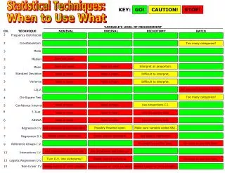
Considering the Nature of the Data • Must consider whether the data 1) Have been collected for single group or, instead for two or more groups 2) Involve continuous or discrete variables 3) Represent nominal, ordinal, interval, or ratio scales 4) Reflect a normal or non-normal distribution
Single-Group Versus Multi-Group Data • In some cases, a research project yields data about a single group of people or objects • In other cases, it may yield parallel sets of data about two or more groups • Analysing characteristics of a single group will often require different statistical techniques than making comparisons among two or more groups
Continuous Versus Discrete Variables • A continuous variable reflects an infinite number of possible values falling along a particular continuum • A simple example is chronological age • A discrete variable has a finite and small number of possible values • A simple example is a student’s primary school level
Nominal, Ordinal, Interval, and Ratio Data • Nominal data are those for which numbers are used only to identify different categories of people, objects, or other entities; they do not reflect a particular quantity or degree of something • Ordinal data are those for which the assigned numbers reflect a particular order or sequence. They tell us that people, objects, or other entities fall along a continuum in terms of a particular variable; they do not, however, tell us anything about how great the differences are between them • Interval data reflect standard and equal units of measurement. As is true for ordinal data, the numbers reflect differences in degree or quantity. But, in addition, differences between the numbers tell us how much difference exists in the characteristic being measured. The one limitation of interval data is that a value of zero (0) does not necessarily reflect a complete lack of the characteristic being measured • Ratio data are similar to interval data but have an additional feature: a true zero point. Not only do the numbers reflect equal intervals between values for the characteristic being measured, but in addition, a value of 0 tells us that there is a complete absence of that characteristic
Normal and Non-Normal Distributions • Theorists propose that many characteristics of human populations reflect a particular pattern (refer to the graph on page 255 of the textbook) • This pattern, commonly called the normal distribution or normal curve (also known as the bell curve), has several distinguishing characteristics: • It is horizontally symmetrical. One side is the mirror image of the other • Its highest point is at its midpoint. More people are located at the midpoint than at any other point along the curve. In statistical terms, three widely used measures of central tendency – the mode, the median, and the mean – are the same • Predictable percentages of the population lie within any given portion of the curve. If we divide the curve according to its standard deviation, we know that certain percentages of the population lie within each portion. Refer to Figure 11.6 on page 255 of the textbook
Choosing Between Parametric and Nonparametric Statistics • Parametric statistics are based on two assumptions: 1) The data reflect an interval or ratio scale 2) The data fall in a normal distribution • If any of these assumptions is violated, the statistical results one obtains may be suspect • Nonparametric statistics are not based on such assumptions – data can be ordinal rather than interval in nature and/or highly skewed in one direction or the other • Nonparametric statistics are, by and large, appropriate only for relatively simple analyses • For complex and powerful inferential statistical procedures are based on parametric statistics • However, some statistical procedures are robust with respect to certain assumptions; that is, they yield generally valid results even when an assumption is not met
Descriptive Statistics – Point of Central Tendency • Point of central tendency is a central point around which the data revolve, a middle point around which the data regarding a particular variable are equally distributed • MODE – the single number or score that occurs most frequently, limited value, not always appear in the middle, and not very stable from sample to sample – However the only appropriate measure of central tendency for nominal data • MEDIAN – the numerical centre of a set of data, with exactly as many scores above it as below the median point – appropriate for ordinal data, also for highly skewed data • MEAN – the fulcrum point for a set of data, balances the weights of all scores – Mathematically, the mean is the arithmetic average of the scores within the data set, most widely used, appropriate only for interval or ratio data
Curves Determine Means • Not all phenomena fit bell–shaped pattern. Growth follows the S curve – refer to Figure 11.9 on page 259 of the textbook • Growth is a function of geometric progression – so geometric mean, which is symbolised by Mg, Mg = (X1 )(X2 ) ... (XN ) • It is the way things grow • Refer to example on page 260 of the textbook N
Measures of Central Tendency as Predictors • Measure of central tendency predicts the meaning of data, where the data converge • When we speak of “the average citizen”, “the average student”, and “the average wage earner”, we are referring to those citizens, students, and wage earners who are huddled around the point of central tendency • In the broad spectrum of possibilities, we are betting on the average being the best guess as to what is most characteristic of the total population
Measures of Variability: Dispersion and Deviation • So far, we have been discussing the question, What is the best guess? • Now we turn to the opposite question: What are the worst odds? • The more that the data cluster around the point of central tendency, the greater the probability of making a correct guess about where any particular data point lies • The farther the data are dispersed from the central axis, the greater the margin of predictive error becomes • Refer to Figure 11.10 on page 261 of the textbook • The data are more uniform when they cluster about the mean • As specific data points recede farther from the mean, they lose more and more of the quality that makes them “average” • “Peaks and valleys” aid greatly in interpreting the data later on
How Great is the Spread? • The simplest measure of variability is the range • The range indicates the spread of the data from lowest to highest value: Range = Highest score – Lowest score • Although the range is easy to compute, it has limited usefulness as a measure of variability and may even be misleading if the extreme upper or lower limits are atypical (not typical, abnormal) of the other values in the series – e.g. 1, 3, 3, 3, 4, 4, 5, 5, 6, 15 (refer to example on page 262 of the textbook) • The interquartile range uses the median or mean as a starting point • Refer to example on page 262 of the textbook
How Great is the Spread? • The standard deviation (σ or s) is the standard measure of variability in most statistical procedures and the most accepted index of dispersion • The formula for a standard deviation is as follows: s = (X - M)2 N • The formula for variance, which is another measure of variability, is simply the standard deviation squared: s² = (X - M)2 N • Refer to Table 11.3 on page 263 of the textbook ¯¯¯
Keeping Central Tendency and Variability in Perspective • Statistics related to central tendency and variability provide us with a beginning point from which to view our data • The data must be examined first to observe their configuration and fundamental characteristics, and then second, through statistical means, we must analyse the data, seeing (through the eyes of statistical procedures) what the mass of data appears to be like • We should remind ourselves that statistical manipulation of the data is not research • Research goes one step further and demands interpretation of the data • In finding medians, means, interquartile ranges, or standard deviations, we have not interpreted the data, not extracted any meaning from them • We have merely described the centre and spread of the data • We have attempted only to see what the data look like • After learning their basic nature, we can then attempt to say what those data mean • That is, we can look for the conditions that are forcing the data to behave as they do
Measures of Relationship: Correlation • The statistics we have discussed so far – measures of central tendency and variability – relate to only a single variable • Oftentimes, however, we also want to know how two or more variables are interrelated • The statistical process by which we discover the nature of relationships among different variables is called correlation • The resulting statistic, called a correlation coefficient, is a number between –1 and +1; most correlation coefficients are decimals (either positive or negative) somewhere between these two extremes • A correlation coefficient for two variables simultaneously tells us two different things about the relationship between those variables:
Measures of Relationship: Correlation 1) Direction – The direction of the relationship is indicated by the sign of the correlation coefficient – in other words, by whether the number is a positive or negative one. A positive number indicates a positive correlation: As one variable increases, the other variable also increases. In contrast, a negative number indicates an inverse relationship, or negative correlation. As one variable increases, the other variable decreases. Refer to example on page 265
Measures of Relationship: Correlation 2) Strength – The strength of the relationship is indicated by the size of the correlation coefficient. A correlation of +1 or –1 indicates a perfect correlation: If we know the degree to which one characteristic is present, we know exactly how much of the other characteristic exists. A number close to either +1 or –1 (e.g., +0.89 or –0.76) indicates a strong correlation: The two variables are closely related, so knowing the level of one variable allows us to predict the level of the other variable with considerable accuracy. In contrast, a number close to 0 (e.g., +0.15 or –0.22) indicates a weak correlation: Knowing the level of one variable allows us to predict the level of the other variable, but we cannot predict with much accuracy. Correlations in the middle range (for example, those in the 0.40s and 0.50s, positive or negative) indicate a moderate correlation. Refer to example on page 265. Refer to Table 11.4 on page 266 of the textbook for examples of correlational statistics
A Reminder About Correlation • Whenever you find evidence of a correlation within your data, you must remember one important point: Correlation DOES NOT necessarily indicate causation • For example, if you find a correlation between motivation and classroom achievement, you cannot necessarily conclude that students’ motivation influences their achievement • Only experimental studies, such as those described in Chapter 10, allow you to draw definitive conclusions about the extent to which one thing causes or influences another • Finding a correlation in a data set is equivalent to discovering a signpost • That signpost points to the fact that two things are related, and it reveals the nature of the relationship (positive or negative, strong or weak) • It should then lead you to wonder, What is the underlying cause of the relationship? • But the statistics alone will not be able to answer that question
Interpreting the Data • Interpreting the data means several things. In particular, it means: 1) Relating the findings to the original research problem and to the specific research questions and hypotheses. Researchers must eventually come full circle to their starting point – why they conducted a research study in the first place and what they hoped to discover – and relate their results to their initial concerns and questions 2) Relating the findings to preexisting literature, concepts, theories, and research studies. To be useful, research findings must in some way be connected to the larger picture – to what people already know or believe about the topic in question. Perhaps the new findings confirm a current theoretical perspective, perhaps they cast doubt on common “knowledge”, or perhaps they simply raise new questions that must be addressed before we can truly understand the phenomenon in question
Interpreting the Data 3) Determining whether the findings have practical significance as well as statistical significance. Statistical significance is one thing; practical significance – whether findings are actually useful – is something else altogether. 4) Identifying limitations of the study. Finally, interpreting the data involves outlining the weaknesses of the study that yielded them. No research study can be perfect, and its imperfections inevitably cast at least a hint of doubt on its findings. Good researchers know – and they also report – the weaknesses along with the strengths of their research