Download
1 / 26
260 likes | 263 Vues
UMAF is a platform for upcoming artists in the movie industry to showcase their talents to a website jury and production/media houses. It provides global interaction, a forum for discussions, contests, and movie reviews.

E N D
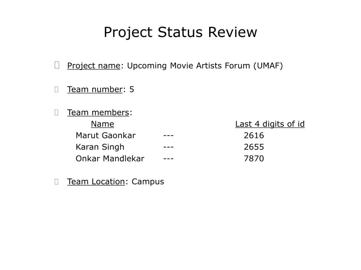
Project Status Review Project name: Upcoming Movie Artists Forum (UMAF) Team number: 5 Team members: NameLast 4 digits of id Marut Gaonkar --- 2616 Karan Singh --- 2655 Onkar Mandlekar --- 7870 Team Location: Campus
Topic Description UMAF is a website which provides a platform for the upcoming artists such as writers and actors to present their talents to the website jury and production/ media houses . The idea of the website is to give a fair opportunity to writers and actors around the world to present their talents. Global interaction of artists and the movie industry. Forum for anyone one who is interested in technicalities or the creative aspect of movie making Other features for users other than artists like forum, contests, movie reviews !
System Requirements The system shall allow… Users to register online on the site. The system shall identify and validate the user Users to upload/edit their profiles on the website. Writers to upload their written material to be assessed by the jury Actors to upload their photo profile and perform online auditions for the media houses An online forum where all users can discuss various issues of common interests pertaining to the movie industry.
User Analysis Discussion User Profile Psychological Characteristics An intuitive cognitive style, the user would have a positive attitude & high motivation for using the system. Knowledge and Experience Moderate typing skills,reading level, education, system and task experience Just another website, so use of other similar system could make it much easier. Needs to be computer literate Job And Task Characteristics No Primary training and other tools required. System use is discretionary. Task importance and structure are low to moderate. All job category users may be using this website Physical Characteristics
User Analysis Discussion Dialogue Styles The main dialogue style used is the menu. Makes navigation through the website easy and it encourages browsing. Fill in Forms used for registration and creation of profiles.Best way to get information which is structured, forms with appropriate help and information. Question & Answer used at selected places, but only if required and options for answers provided Browser and OS function keys will apply User attitude towards each analyzed in dialogue styles
User Analysis Discussion Task Analysis
User Analysis Discussion Environment and IO UMAF is a website. Now internet can be accessed through a lot of devices. PCs, PDA’s ,Laptops. Hence the website shall be designed to be compatible with all browsers. It will be designed on the default resolution, so that it appears same on all browsers Input devices are our PC keyboards and mice. Output devices are the monitors, screens of the PCs, Laptops There would be different types of keyboards and mice for PDA’s and other laptops and handheld devices . Also several types of screens as output devices
Visual Design Use of Colors There is a dark blue background and the the page is on the foreground. The foreground has a light background on which black text is used to improve readability The text everywhere on this site is black and the background is default white Each page has an identity in the sense with the title and an image. For e.g. Scriptwriters. Hence no excessive colors Use of minimum colors in order to not distract or tire the user but still maintain the attraction aspect.
Visual Design Symbols, fonts Font used for links,headings and main messages in Bank Gothic md BT The font looks sleek and goes with the the sites motive and concept For each section there is an image on the left which stays for each page within that section. Image indicative of the section
Home Page Design • In an attempt to let the user feel free and not to command him it gives a freedom to browse around without login. • You do not want a registered user searching for the login link, hence it is made prominent on the left bar menu and on the right top corner as asked in the modules • The readability is attempted to make as clear as possible by using contrasting colors for text and no images as background. White is the default background for the site and black is default for the color of text. • There is a search engine for the site on the top right which is a must for a website. So is the site map as mentioned in the recommended homepage design. • The site needs to be very clear with what it does, hence the gist of the main features that it offers is on the home page with the welcome message. • The search is also in a box • The URL is to be www.umaf.com which we would try to promote as its short and also can be pronounced as a word which makes it easier to remember as mentioned by Jakob Neilson in his article Top 10 mistakes of 2002 • The main items of the site are on the horizontal bar e.g. Scriptwriters. This tab will be of different color than the others once its clicked. So the user would know which major section he is under no matter how much he navigates inside these items. This makes navigation easier. • Private policy is a link at the bottom of the homepage which is a must as recommended by the professor. • About the site is also a link on the homepage at the bottom. • The logo is on the left top, the search is on the right top as recommended by the Home page recommendations on the den documents
Home Page Design cont… We tried to avoid… There are no splash pages. No auto music on the homepage. No animation that would distract or irritate the user while performing his tasks. There are no separate frames on the home page Too many clustered links together making it difficult to navigate Minimum vertical scrolling and no horizontal scrolling No not required pictures which would make the page take long to load. The text matter on the homepage would not be outdated
Home page design decisions Reasonsfor changing the look ! We tried to make the website more attractive by adding a background and using flash menu buttons. Also the new layout gives the screen space a more centered look We also wanted the UMAF icon on all the pages of the system. This was done using the new design style. Also the color scheme is repeated for all the pages of the system, instead of having a different color for the different pages.
Scriptwriters Design The Scriptwriters page is accessible only for the Registered user, providing a Login and Password, this ensures a secure environment for the user’s endeavors. The page contains the same menu as in the homepage, enabling easy navigation for the user. No images are used as the background, Black text is used on a light background for easy readability. Additionally the font used is selectively uppercase for most menu items and lower case for others making it appealing to the reader. As per Aaron Marcus’ 10 commandments of color the page contains less than five colors, the background colors used are light. The page contains a vertical menu consisting of “Upload Script” and “Requirements” distinguishing them from the main menu. There are no frames used in the page, as required by the professor. The page uses minimal graphics and overheads, reducing the time taken to load the page. As per Jakob Nielson the site does not contain any within page links. This page contains a description as to what all a scriptwriter can accomplish using this site. The logo is on the left top, the search is on the right top as recommended by the Home page recommendations on the den documents As the professor asked us every page has a title. The text as mentioned by Jakob Nielson is standstill. With respect to typography The pages have a repetition of the visual elements of the design Nothing in the page is arbitralily placed. Every element has a visual connection as mentioned in the modules
Design decisions and task Every major section(main menu option) has an image associated with it. This is an abstract picture which represents this section. The path followed in the screens shown, is to read the requirements for submitting the script. First upload the idea for which there are separate requirements and has a page for itself Instead of listing both script and idea requirements on the same page they are 2 links on the requirements page for making it easier to read Each page within scriptwriters will have the same image and sub-heading of scriptwriters. Site logo stays on each page
Grader Comments As the grader mentioned, all the user tasks are in Admin mode, i.e. the user cannot perform the tasks without logging in. Several of the system tasks are performed by a “different” user i.e. the users who are the administrators A more complete user profile analysis Homepage and Scriptwriters page was approved by the grader
Concluding… Each task initially thought of takes a lot more pages than anticipated Best option to make task easy is to make the system intuitive and reduce reading instructions for the user Practically every design aspect derived from the analysis of the user profile Users attention is as important as ease of use For the rest of the semester, other features of voice, actors, forum and the ADMIN MODE !
References Class notes Aaron Marcus’ 10 commandments of color Jakob Nielson Top10 mistakes of 2002 Den documents like the web site checklist, homepage design