Download
1 / 11
110 likes | 212 Vues
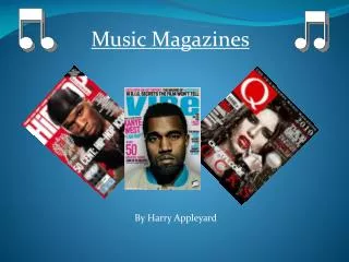
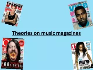
Research and Analysis of 3 Contrasting Music Magazines. By Thomas Brain. The 3 Magazines that I looked at….

E N D
Research and Analysis of 3 Contrasting Music Magazines By Thomas Brain
The 3 Magazines that I looked at… I chose ‘Vibe’ to research. The front cover of this magazine is very plain and simple with a main image of one person. The main colours used are grey, white and red, that contrast well against each other. I chose ‘NME’ to research. The title stands for ‘New Musical Express’. The main image on the cover is of a music person looking angry at something. The colours of the front cover are mainly red, white and yellow. I chose to research ‘Classical Music’, because it contrasts well against the other two magazines. The main image for the cover is a field, which contrasts against many others with an image of a person.
Vibe: Fonts and Choice of Colours The fonts used on the front cover of this magazine, are quite bold, this is so that the stand out of the page and point out the parts of the cover that the designers want to catch your eye with. The font used, however, is not a fancy/posh one, this is most likely because the main stereotype for rap and hip hop music is mainly people that are not very posh. Therefore, by using a posh font, it may distract the main audience of the magazine. Also, by using a famous musician such as “Eminem” you are likely to attract a larger audience. The colour of colours are really important of the front cover of a magazine. As this front cover is quite a simple one the colours are more so important. The simple colours of grey, white and red stand out and contrast well against each other. Reds are used for the main title and exclusive story, to show that they are the most important parts of the magazine. A white is used for the sub-title to stand out against the grey.
Vibe: Layout and Sell Lines The layout of the front cover of this magazine is very simple, with only necessary information put on there. The main image is of “Eminem”, and you can tell that he is serious and that the magazine is not targeted at a young audience. All of the information is placed around the face of “Eminem”. The title of the magazine is partly behind him as it is assumed that the audience will automatically recognise the magazine. The sell lines are quite large so that the target audience don’t need to look for them, and they just catch their eye line. The sell lines are put on the grey background in a white text, this is because it makes them stand out more and makes the reader intrigued as to what they say, making them more likely to end up purchasing the magazine.
Vibe: Language and Commercial Elements The language used is mainly formal English, however there are some parts of the magazine that use more street like language in the section “The Big Gay Debate”. If the language used for the front cover of this magazine was formal it probably would not use the word “gay”. The commercial elements on the front cover of this issue of ‘Vibe’ magazine, are a bar code in the bottom right of the cover. The background behind the bar code is black and white, so that the bar code doesn’t stand out too much and blends in with the rest of the magazine. On the right hand side of the page, it shows artists that are shown in the magazine, this will make fans of those artists want to purchase and read the magazine.
NME: Fonts and Choice of Colours • The fonts used on the front cover of this magazine, are bold in most areas, which matches with “Vibe”. This is used so that the more important areas of the magazine catch the eye of the reader and potential buyer of the magazine. The font used seems like just an ordinary one that doesn’t make anything stand out or look fancy, however it works well for this magazine because the magazine is not intended for a posh audience. Mainly all the writing on the page is put in capitals to make it stand out more. Also the main story is the largest of them all; “FOO FIGHTERS”. • The colour of colours are a major part of the chance of an issue of a magazine doing well and selling a lot, or not selling very many at all. The colours need to attract the target audience so the choice is important. With a rock magazine, the colours are generally right in your face because that is a stereotype of a rock star. So they use red, yellow and white on this issue because they all stand out well from each other.
NME: Layout and Sell Lines The layout of this issue of the NME magazine is quite crammed into the left hand edge of the front cover. This is because the main image, really large and put just to right of centre and takes up the whole length; top to bottom, of the cover. This layout is a good one to use because the reader doesn’t have to move the eyesight very much and can just look straight down the left hand side of page which means that the reader can get the information that the need as soon as possible. The sell lines on the magazine are mainly on the left of the left of the page. However there is a sticker effect near the bottom right of the page that makes the competition stand out from all the rest of the page. There are pictures with four of the sell lines so that if the readers are not sure, the images may give some more insight and then the audience is likely to purchase the magazine; therefore increasing sales.
NME: Language and Commercial Elements The language used on the front cover of this magazine is street like English. The majority of the text on the page is quite punchy, and doesn’t take long to read so that the potential audience doesn’t get bored and find it difficult to read the page. There aren’t any long words used on the cover, this is because the audience only want to find out what is going in the their music lives and they do not want to get stuck whilst reading. The commercial elements on this front cover are the placement of the bar code. The bar code is placed in the bottom right of the page. It is placed in its own little box, which contrasts against “Vibe” where the bar code matches well with the background. However, even with the box around it, it doesn’t stand out too much against the rest of the magazine.
Classical: Fonts and Choice of Colours The fonts used are very simplistic. I think this is because they want to portray the sense of a simplistic countryside and a non interrupted one, which is how classical music should be enjoyed; without interruptions. The title of the magazine is in a bold version of the font used to make it stand out against the rest of the page. The colours that have been chosen are mainly green, white and the blue of the sky. This is because they are generally colours associated with the countryside, and the main image on this front cover is of a section of the countryside. Greens are relaxing colours, and don’t stand out an awful lot, this is because classical music is seen as relaxing compared to some other genres such as rock and roll. The white portrays a sense of nothing getting in the way as it is a pure colour. The blue adds a contrast to the green and white colours on the cover.
Classical: Layout and Sell Lines The layout for this magazine, contrasts against the other two I have looked at. The main image of the front cover is very open, to represent what the countryside is supposed to be like. I think that this means the magazine designers are saying that classical music should not be disturbed by anything else and it is just like the countryside. The cover is mainly open other than text at the very top of the page, the bottom right, and the middle left of the magazine front cover. There are not many sell lines on this magazine compared to the other two magazines. I think this is because classical music is quite a niche music taste. By this I mean that they are unlikely to attract any extra audience from the sell lines that they put in. Only the frequent purchasers of the magazine are likely to buy the magazine again.
Classical: Language and Commercial Elements The language used on the front cover of this magazine is quite a posh and formal English. This contrasts against the other two magazines that use an element of street language on the front cover. This is because classical music is often enjoyed by the older generations and therefore, they have a broader vocabulary, and generally talk in a older English language than the teenagers of today. The commercial elements of this magazine are the bar code in the bottom right of the magazine. All of the magazines have put the bar code in the bottom right of the front cover. Although, on this magazine, the bar code takes over a section of the front cover, but because the rest of the cover, is not interrupted much at all, it doesn’t really affect the ambience of the front magazine cover.