Download
1 / 29
290 likes | 460 Vues
Making PowerPoint Slides. Avoiding the Pitfalls of Bad Slides. SEE-U 2005, rev TKittel Feb 08. Presentation Title & Outline Slide Structure Formatting - Fonts, Color, & Background Graphs Spelling & Grammar Conclusions and Ending Up References Oral Presentation. Tips to be Covered.

E N D
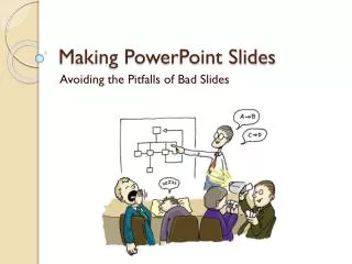
Making PowerPoint Slides Avoiding the Pitfalls of Bad Slides SEE-U 2005, rev TKittel Feb 08
Presentation Title & Outline Slide Structure Formatting - Fonts, Color, & Background Graphs Spelling & Grammar Conclusions and Ending Up References Oral Presentation Tips to be Covered
Title Slide • Your presentation’s title should tell your audience what your talk is about • Succinctly, what’s the comparison or issue, what organism(s), and generally where • Use a subtitle to add information if needed. • Include your name, course name, semester
Outline • Make your 1st or 2nd slide an outline of your presentation • Ex: 2nd slide in this PowerPoint • Follow the order of your outline for the rest of the presentation • Only place main points on the outline slide • Ex: Use the titles of each slide as main points
Slide Structure – Good • Use 1-2 slides per minute of your presentation • Write in point form, not complete sentences • Include 4-5 points per slide • Avoid wordiness: use key words and phrases only • Split information between slides to avoid crowding a slide
Slide Structure - Bad • This page contains too many words for a presentation slide. It is not written in point form, making it difficult both for your audience to read and for you to present each point. Although there are exactly the same number of points on this slide as the previous slide, it looks much more complicated. In short, your audience will spend too much time trying to read this paragraph instead of listening to you. And oh yeah, don’t crowd a slide up – split your information on a given topic over to a 2nd slide if it’s that important! Don’t overflow either.
Slide Structure – Good • Show one point at a time: • Will help audience concentrate on what you are saying • Will prevent audience from reading ahead • Will help you keep your presentation focused
Slide Structure – Good • Use the notes frame in the ‘Normal’ view to write up more complete information for each slide • Include details of each point you’re making • Cite sources here, or in small font on the slide proper such as: - Smith & Jones 2005
Slide Structure - Bad • Do not use distracting animation • Do not go overboard with the animation • Be consistent with the animation you use
Fonts - Good • Use at least an 18-point font • Use different size fonts for main points and secondary points • this font is 24-point, the main point font is 28-point, and the title font is 36-point • Use a standard font like Times New Roman or Arial
Fonts - Bad • If you use a small font, your audience won’t be able to read what you have written • CAPITALIZE ONLY WHEN NECESSARY. IT IS DIFFICULT TO READ • Don’t use a complicated font
Color - Good • Use a color of font that contrasts sharply with the background • Ex: blue font on white background • Use color to reinforce the logic of your structure • Ex: light blue title and dark blue text • Use color to emphasize a point • But only use this occasionally
Color - Bad • Using a font color that does not contrast with the background color is hard to read • Using color for decoration is distracting and annoying. • Using a different color for each point is unnecessary • Using a different color for secondary points is also unnecessary • Trying tobe creativecan alsobe bad
Background - Good • Use backgrounds such as this one that are attractive but simple • Photos can be interesting but often difficult for reading overlying text • Use the same background consistently throughout your presentation
Background - Good • Use backgrounds which are either: • Light, with dark (not black) lettering, as in the previous slides • Best for poorly shaded rooms • Strictly white can be too stark or blinding • Or
Background - Good • Or backgrounds which are: • Dark, with light lettering • Especially good for a very dark room • Classic look is deep blue with white or light yellow lettering
Background – Bad • Avoid backgrounds that are distracting or difficult to read from
Images - Good • Add images or simple graphs to text slides to illustrate your point • Adding a relevant photo can also provide visual relief • Images added for this purpose, need not be discussed Colorado Treeline – Google Earth
Graphs - Good • Use graphs rather than tables and words • Data in graphs are easier to comprehend & retain than raw data • Trends are easier to visualize in graph form
Graphs - Good Number of Items Sold
Graphs - Good • Formatting • Always title your graphs – so it’s clear what’s shown • Label axes • Unless meaning obvious (e.g., months) • Use a large enough font • This is a common issue for axis tick labels
Graphs - Bad • Minor gridlines are unnecessary • Font is too small • Colors are illogical • Title is missing • Shading is distracting
Spelling and Grammar • Proof your slides for: • speling mistakes • the use of of repeated words • grammatical errors you might have make • For example, “data are” not “data is” • If English is not your first language, please have someone else check your presentation!
Conclusion • Use an effective and strong closing • Your audience is likely to remember your last words • Use a conclusion slide to: • Summarize the main points of your presentation • Suggest future avenues of research
Questions?? • Ending your presentation: • End with an invitation for your audience to ask questions • End your slide show on your conclusions slide • This will allow your audience to consider your key points • Avoid ending a presentation abruptly
References • Include references on very last slide • Show only if asked a question re your sources • Use any common style found in journal articles – but be consistent in their formatting • Example for journal article Kane, D.L., Hinzman, L.D., and Zarling, J.P. 1991. Thermal response of the active layer to climatic warming in a permafrost environment. Cold Regions Science and Technology, 19: 111-122. • Example for chapter in a book Field, C. B., Raupach, M. R., and Victoria, R. 2004. The global carbon cycle: integrating humans, climate, and the natural world. In: C. B. Field and M. R. Raupach (eds.). The Global Carbon Cycle. Washington: Island Press. pp. 1-13.
Oral Presentation • Practice, practice, practice • Makes your presentation come off smoothly, dynamic • Helps tune your timing • Indentifies unnecessary & redundant information • Make a test run with the projector • Check that slides are clear given the room’s lighting • Slides too bright? Contrast poor? • Check slides are readable from the back of the room