Download
1 / 6
60 likes | 68 Vues
Responsive and adaptive web design, both are different terms for mobile-friendliness of a website and diversifies from each other with a little variation. Also, do contact us Xornor Technologies for Live classroom development.<br>

E N D
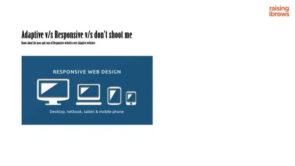
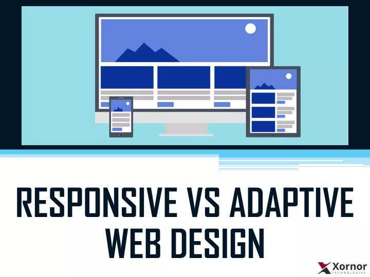
Responsive Web Design (RWD) • In simple terms, aResponsive web design ‘responds’ to the different browsers on the different screen sizes by adjusting its layout with the environment, at any given point. Responsive design is based on the following technical elements: • Fluid Grids • Flexible Images • Media Queries
Adaptive Web Design (AWD) • Adaptive web design though is similar to the responsive design and is also created to enhance the user experience it differs from the other with a slight difference. • The adaptive design as the name suggests adapts to the screen size, but of a pre-defined width. This type of web design has a limitation of adaption to the fixed screen width.
Advantages of AWD over RWD • AWD is suitable for the already designed websites, but not limited to that. You can use it for the new website as well. • On the other hand, RWD is always best for the websites that you need to create from scratch, as you will need to use and then re-use some specific classes to make the website fully responsive.
Advantages of RWD over AWD • RWD uses grids and has the fluid design, so it fits like water in a container to every screen size, whereas AWD is less flexible. Though RWD takes a lot of efforts in the coding process, it is better for the long run, as we do not need to put any extra CSS to make it compatible with new screen sizes. But for AWD, this is not the case. The web design will only be compatible with the screen sizes with the media queries.
THANK YOU Contact Xornor Technologies for Live online meeting Website Link: https://www.xornor.co/ Blog Link: https://www.xornor.co/responsive-adaptive-web-design/ Follow us on Social Media Platforms: Facebook: https://www.facebook.com/xornortech Twitter: https://twitter.com/xornortech LinkedIn: https://www.linkedin.com/company/xornor-software-technologies