Download
1 / 36
360 likes | 513 Vues
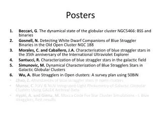
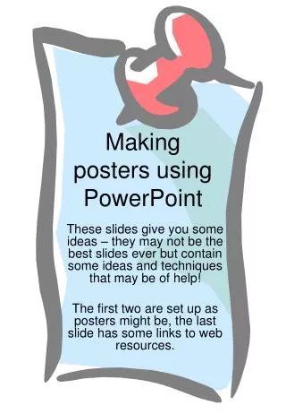
Powerpoint for Posters. Adella Edwards Cartography Centre SEES. Don’t bury the basics. Concise content logical order, good flow supported by illustrative graphics. how to use powerpoint. http://www-public.jcu.edu.au/libcomp/assist/training/JCUPRD_026014

E N D
Powerpoint for Posters Adella Edwards Cartography Centre SEES
Don’t bury the basics... • Concise content • logical order, good flow • supported by illustrative graphics
how to use powerpoint • http://www-public.jcu.edu.au/libcomp/assist/training/JCUPRD_026014 • http://www-public.jcu.edu.au/libcomp/assist/training/JCUPRD_044648 anybody can do a decent job using these basics
what you really need • basic understanding of design • fonts • colour • contrast • use of graphic elements • digital images • resolution for use • sources (and credits)
Fonts • serif fonts (like Times New Roman) have a serif added to the shape, which creates a visual line which is easier for the eye to follow, and so is used for blocks of text. • sans serif fonts (like Arial) have no serifs, and are usually used for titles and small amounts of text. • decorative fonts are fun, but can be very hard to read. Use for titles only, and with caution [C:\winnt\fonts] take fancy fonts with you!
Basic Graphic Design Principles • Colour • using colour well can enhance your message • poor choice of colour will obscure it! • It all comes down to CONTRAST
high contrast high contrast high contrast high contrast
low contrast low contrast Beware of low contrast design templates low contrast low contrast
Beyond just contrast are issues like colour blindness... Normal vision should read the number 29. Red-green deficiencies should read the number 70. Total colour blindness should not read any numeral
computer graphics • vector vs raster gif jpg ABC
Simple illustrations can be made in Powerpoint, and they will look a lot better than scanned ones... here stop
Keeping graphics vector • Copy/paste • Keep as picture • Seems to keep native format • Vista – who knows?
Sourcing images • Yes you can get low resolution images from the web • Right mouse click (pc) = save image • ‘print screen’ button captures screen image to clipboard • Free screen capture programs like Screenhunter
Sourcing images • Scanners for • Slides • Print images • Scans from books may create ‘checkerboard’ pattern • Can be removed by ‘descreening’
300 dpi 150 dpi 72 dpi With the images scaled according to the resolution, they print with the same clarity
Printed at the same size, the differences in clarity become very obvious 72 dpi 300 dpi 150 dpi Scanning at the dpi you need gives the best results for printing
useful generalisation: • scanning a print for a poster • same size = 300 dpi • much bigger 600 dpi • scanning a slide for a poster • minimum 600 dpi • check optical capacity of your scanner (1200+?)
Digital camera images • 3 megapixels gives you a quality A4 print (300 dpi) • 1.2 megapixel image will give you a good print at normal photo size
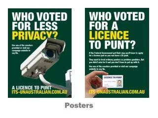
illustrations • can be very effective • don’t obscure the words! • choose a colour scheme that compliments your photos and graphics
Training research students in Program 2 (including associates) • undergraduate 30 + research assistants • honours 16 completed 2 current • Masters 6 completed 2 current • PhD 3 completed 17 current
Crediting images • Always give credit where credit is due Microsoft image
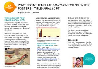
Designing Posters… • more than text on a page • layout considerations • flow of content • at a glance meaning • visual appeal
Title Z LayoutMentally impose the letter Z or a backwards S on the page. Place important items or those you want the reader to see first along the top of the Z. The eye normally follows the path of the Z, so place your "call to action" at the end of the Z.
Advertising layout Research indicates that readers typically look at: • Visual • Caption • Headline • Copy • Signature (Advertisers name, contact information) In that order
look for ideas • look critically at magazine advertisements • Look at research posters around the university • think about your audience • think about what you want your poster to achieve for you.
layout your poster • A0 is standard metric size for a poster • = 841 x 1189 mm • it is easiest to work at full size in powerpoint • file • page setup • custom • 84 x 119 cm or 33 x 46 inches
font sizes • titles BIG, but you don’t need to scream • main text at least 32 point • text on figures (eg: on a graph or map) can be much smaller (14 points)
Content of the POSTER • TARGET AUDIENCE • Be concise • Try for ‘meaning at a glance’ • Headings • Clear blocks of text • Supportive graphics
Google makes dynamic, interactive maps that are draggable — no clicking and waiting for graphics to reload each time you want to view the adjacent parts of a map. Since these maps are draggable, you can use your mouse or the directional arrows to pan left, right, up and down to see areas that are hidden offscreen. You can also use the slider to zoom in and zoom out. It's like having a huge map you can scroll around in. This, to some degree, solves the problem of designing for the limited size of a computer monitor. The maps in Google can be zoomed in and out, and dynamically bring up content that is appropriately generalized for the scale chosen. So you can get the big picture, zoom in for the detail, and then scroll around to see what you need. The technical magic in Google Maps is the way in which the image is served to the user, eliminating the wait time when you scroll. The map is broken up into a grid of 128x128 images. This is technology borrowed from old tile-based scrolling games, but with the addition of an absolute position for each of the tiles. The scrolling effect is achieved by using a hidden IFRAME and browser-based XSLT to grab XML and build maps on the fly. Of course, something like that has to have an acronym: AJAX, a.k.a. asynchronous JavaScript and XML. With Google Earth, something called KML was introduced. KML, or Keyhole Markup Language, is an XML grammar and file format for modeling and storing geographic features such as points, lines, images and polygons for display in the Google Earth Client. A KML file is processed by the Google Earth viewer in a similar way that HTML files are processed by web browsers. Like HTML, KML has a tag-based structure with names and attributes used for specific display purposes. Thus, the Google Earth viewer acts as a browser of KML files.
Google makes dynamic, interactive maps that are draggable — no clicking and waiting for graphics to reload each time you want to view the adjacent parts of a map. Since these maps are draggable, you can use your mouse or the directional arrows to pan left, right, up and down to see areas that are hidden offscreen. You can also use the slider to zoom in and zoom out. It's like having a huge map you can scroll around in. This, to some degree, solves the problem of designing for the limited size of a computer monitor. The maps in Google can be zoomed in and out, and dynamically bring up content that is appropriately generalized for the scale chosen. So you can get the big picture, zoom in for the detail, and then scroll around to see what you need. With Google Earth, something called KML was introduced. KML, or Keyhole Markup Language, is an XML grammar and file format for modeling and storing geographic features such as points, lines, images and polygons for display in the Google Earth Client. A KML file is processed by the Google Earth viewer in a similar way that HTML files are processed by web browsers. Like HTML, KML has a tag-based structure with names and attributes used for specific display purposes. Thus, the Google Earth viewer acts as a browser of KML files. The technical magic in Google Maps is the way in which the image is served to the user, eliminating the wait time when you scroll. The map is broken up into a grid of 128x128 images. This is technology borrowed from old tile-based scrolling games, but with the addition of an absolute position for each of the tiles. The scrolling effect is achieved by using a hidden IFRAME and browser-based XSLT to grab XML and build maps on the fly. Of course, something like that has to have an acronym: AJAX, a.k.a. asynchronous JavaScript and XML.
Hint… • Don’t hard format text in boxes, harder to read and the box sets the visual boundary anyway
Why scrolling maps are so keen Google makes dynamic, interactive maps that are draggable — no clicking and waiting for graphics to reload each time you want to view the adjacent parts of a map. Since these maps are draggable, you can use your mouse or the directional arrows to pan left, right, up and down to see areas that are hidden offscreen. You can also use the slider to zoom in and zoom out. It's like having a huge map you can scroll around in. This, to some degree, solves the problem of designing for the limited size of a computer monitor. The maps in Google can be zoomed in and out, and dynamically bring up content that is appropriately generalized for the scale chosen. So you can get the big picture, zoom in for the detail, and then scroll around to see what you need. With Google Earth, something called KML was introduced. KML, or Keyhole Markup Language, is an XML grammar and file format for modeling and storing geographic features such as points, lines, images and polygons for display in the Google Earth Client. A KML file is processed by the Google Earth viewer in a similar way that HTML files are processed by web browsers. Like HTML, KML has a tag-based structure with names and attributes used for specific display purposes. Thus, the Google Earth viewer acts as a browser of KML files. The technical magic in Google Maps is the way in which the image is served to the user, eliminating the wait time when you scroll. The map is broken up into a grid of 128x128 images. This is technology borrowed from old tile-based scrolling games, but with the addition of an absolute position for each of the tiles. The scrolling effect is achieved by using a hidden IFRAME and browser-based XSLT to grab XML and build maps on the fly. Of course, something like that has to have an acronym: AJAX, a.k.a. asynchronous JavaScript and XML. 1987: John Carmack devised a smooth, scrolling routine similar to that used for the background of Nintendo games but never before possible on the PC.
So you can see that • Good presentation isn’t really difficult • It just takes a bit of thought and preparation • It makes you look like a pro!
Questions anyone? Who wants to come up with files and we will put together a poster?