Download
1 / 17
170 likes | 238 Vues
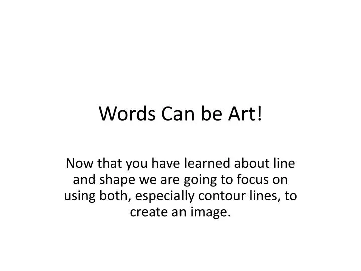
Words Can be Art!. Now that you have learned about line and shape we are going to focus on using both, especially contour lines, to create an image. Take your Favorite Poem or song lyrics.

E N D
Words Can be Art! Now that you have learned about line and shape we are going to focus on using both, especially contour lines, to create an image.
Take your Favorite Poem or song lyrics • If you want to use something you wrote yourself that is fine as long as it is a longer poem. If you choose something short you are going to get sick of those words. • We are literally going to take those words and manipulate the text to form a picture out of it. • This process of manipulating letters is called Typography
Typography • the study and process of typefaces; how to select, size, arrange, and use them in general.
Here are a few examples • The following pictures are examples of what your assignment will be. The biggest part you need to keep in mind is bending the letters to form Contour lines that will define the shape of your image. • I don’t want to see you just write letters on a line you drew on a line. The letters should form the lines.
Notice: • The letters form the image. There are no outlines, just letters. • The bigger and blacker the letters, the darker it appears, but also the more flat it looks if there are no contour lines.
The Main things to keep in mind: • Use the letters of your song or poem to build your image. • Make sure you use contour lines to make your image more 3 dimensional. You may use color if you would like to. • You can bend and twist the letters but Keep the letters somewhat recognizable. I would like to still be able to read it. I may have to struggle to read it but I will get there.
On the Course Website • You will see a tab that says typography rubric. You can refer to that for a more detailed description about grading. • Feel free to ask questions or go to office hours.