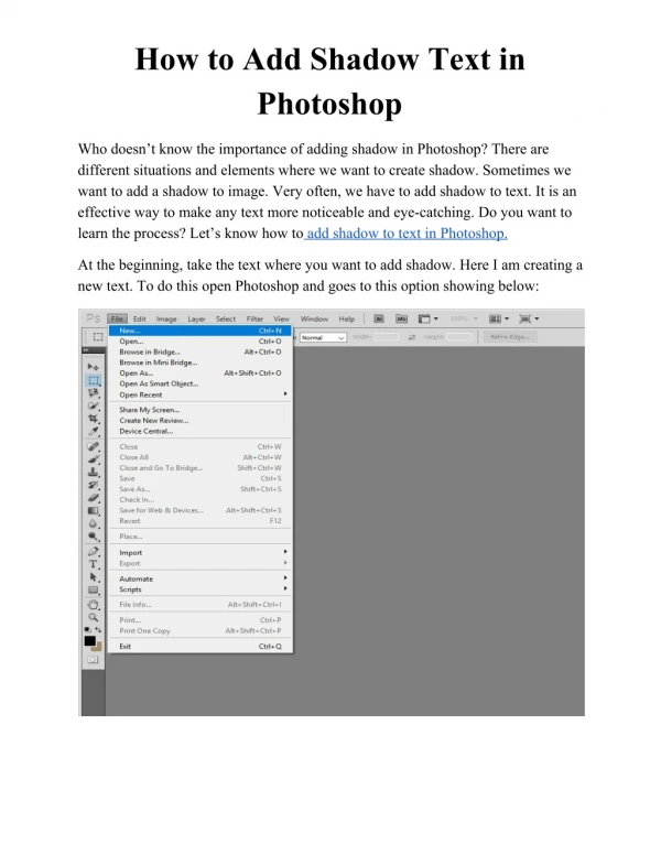
Download

1 / 0
0 likes | 322 Vues
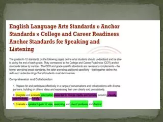
Title of Research Presentation Can Run Across the Page as One Line or Extend onto the Next Line. Left Justified or Centered text. Reversed out type in white or black. Author One, Author Two. Institution Name, Dept., City, State. Email address and web pages are sometimes listed here.

E N D