
Professional UI for a Website design
this presentation will gives you comprehensive overview of "how to creat a professional user interface website".


Professional UI for a Website design
E N D
Presentation Transcript
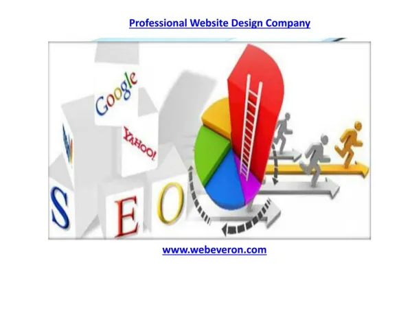
Tips to Create A Professional User Interface (UI) for a Website For Every Web Designer
What you are going to learn • What is User Interface Design? • User Interface Design Basics • Basic Guidelines to Use HTML • Semantic Markup • Rule of Third • Responsive Web Design and its Basics • Browser Support
What is User Interface Design? User Interface Design defines structure of Design or information that Communicates with users. This is the design of websites, computers appliances, mobile communication devices, and software applications with the focus on the user’s experience. • User Interface Design is the process of crafting a visual language and hierarchy that allows someone to use and engage an application. • User interface design is to make the user’s interaction as simple and efficient as possible, in terms of accomplishing user goals. • UI design is the process of taking the way a machine works and translating it into the way a user thinks.
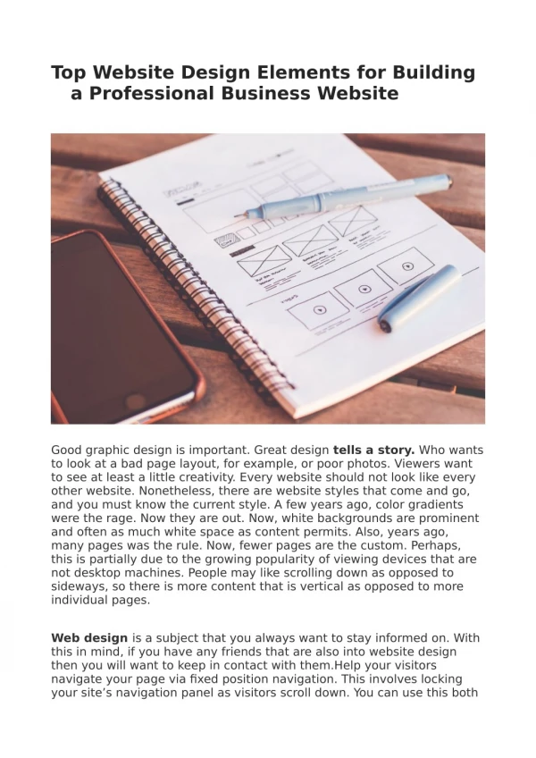
You should learn How to Code in • Semantic Mark-up • Form Enhancements • Audio/Video • Canvas • Content Editable • Drag & Drop • Persistent Data Storage • HTML – Data Structure • CSS – Presentation • JavaScript – Behaviour The whole purpose of this to help you get started with some basic guidelines working on your website. It helps you to understand design easily also makes you familiar with the code structure. HTML5 Features:
Semantic Markup Semantic markup is XHTML that has been written to define the context of the content enclosed in the markup. This means that headers would be defined by <h1> through <h6> elements, paragraphs with <p> elements, lists with <ol> and <ul> elements, and so on. Tags that only have a meaning referring to style, such as <b> and <i> should be avoided in favor of tags that provide a semantic meaning along with their standard styles, such as <strong> and <em>. Semantics are the implied meaning of a subject, like a word or sentence. It aids how humans interpret subject matter.
How to write Semantic Markup HTML Document Structure Html Document Structure (<head>, <body>, <div>, <span>) Text content Content Structure (headlines, paragraph text, lists, quotations) Visual presentation (css) to make content look a certain way Links to audiovisual content (gif, jpeg, or png graphics) Interactive behaviour (JavaScript, Ajax elements) HTML Document Structure Head (<head>...</head>) Body (<body>... </body>)
How to write Semantic Markup Content markup Heading Tag (<h1>,<h2>) Paragraph Tags (<p>…</p>) Strong Emphasis (<strong>… </strong>) Italic Emphasis (<em>… </em>) HTML also contains semantic elements such as classes, ids, divisions, spans, and meta tags. Many style sheet and programming techniques require careful semantic naming of page elements that will make content more easier to understand, use, visually style, programmatically control and universally accessible.
Rule of Third In its most simple form the rule of thirds refers to a 3 by 3 grid that fits on top of any image. There are no specific sizes to the blocks – only that they are equally shaped. The grid works horizontally or vertically and helps you determine how the eye follows an image or group of images (such as a website).
Responsive Web Design The Internet took off quicker than anyone would have predicted. The use of mobile devices to surf the web is growing at an astronomical pace, but unfortunately much of the web isn't optimized for those mobile devices. Mobile devices are often constrained by display size and require a Different approach to how content is laid out on screen.
Responsive Web Design Basics Responsive web design is the practice of building a website suitable to work on every device and every screen size, no matter how large or small, mobile or desktop. Responsive web design is focused around providing an intuitive and gratifying experience for everyone. Desktop computer and cell phone users alike all benefit from responsive websites. Responsive web designing is an entirely different version than traditional web designing. Responsive web design is broken down into three main components • Flexible Layouts • Media Queries • Flexible Media
Flexible Layouts Flexible layouts do not advocate the use of fixed measurement units, such as pixels or inches. Reason being, the viewport height and width continually change from device to device. Website layouts need to adapt to this change and fixed values have too many constraints.
Media Queries Media queries were built as an extension to media types commonly found when targeting and including styles. Media queries provide the ability to specify different styles for individual browser and device circumstances. Being able to apply uniquely targetedstyles leverage to responsive web design. Initializing Media Queries • HTML <link href="styles.css" rel="stylesheet" media="all and (max-width: 1024px)"> • CSS @media all and (max-width: 1024px) {...} @import url(styles.css) all and (max-width: 1024px) {...}
Flexible Media The final, equally important aspect to responsive web design involves flexible media. As viewports begin to change size media doesn’t always follow suit. Images, videos, and other media types need to be scalable, changing their size as the size of the viewport changes.
Check for Browser Support • BrowserStack • BrowserShots • SuperPreview • Lunascape • IETester • IE NetRenderer • Spoon • Browsera Throughout the process of building User Interface, it is necessary to test design and development work in multiple browsers. Due to the fact that browsers do not use a standard method for rendering a website, errors can occur in a site’s layout and functionality. If these issues are not taken care of during the development process, a visitor’s experience could be negatively impacted. Cross Browser Testing Tools
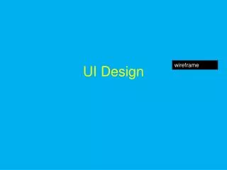
User Interface Design Basics
User Interface Elements Users have become familiar with interface elements acting in a certain way, so try to focus on anticipating what users might need to do and ensuring that the interface has elements that are easy to access, understand, and use to facilitate those actions. Interface elements Input Controls: buttons, text fields, checkboxes, radio buttons, dropdown lists, list boxes, toggles, date field. Navigational Components: breadcrumb, slider, search field, pagination, slider, tags, icons Informational Components: : tooltips, icons, progress bar, notifications, message boxes, modal windows Containers : accordion
User Interface Design Principles Know your user Keep Interface simple Pay attention to page layout Typography for visual hierarchy Create consistency Provide feedback Be Tolerable Empower user ease Think about the defaults Read user’s mind Keep moving forward
Know Your User User interface design requires a good understanding of user needs. Focus on user’s goals and requirements. Try to think as a user while working on design and start adapting user’s habits. Then, learn about your user’s skills and experience, and what they need. Find out what interfaces they like and sit down and watch how they use them. Do not get carried away trying to keep up with the competition by mimicking trendy design styles or adding new features. By focusing on your user first, you will be able to create an interface that lets them achieve their goals.
Keep Interface Simple Good user interface design facilitates finishing the task at hand without drawing unnecessary attention to itself. Interface should make simple, common tasks to do, communicating user’s own language. Provide good shortcuts which helps users to understand features and grab information. Try to avoid unnecessary elements and feature and content that are not related to the subject. People avoid and often ignore things they cannot understand — that’s basic human nature. Avoid designing interface elements that make people wonder what they do, because no one will bother finding out.
Pay Attention to Page Layout Users spend the majority of their time on interface, try to model that enhance the interface. Consider the spatial relationships between items on the page and structure the page based on importance. Careful placement of Items can help draw attention to the most important pieces of information and can aid scanning and readability. You can direct attention toward or redirect attention away from items using color, light, contrast, and texture to your advantage. Create user’s communication with interface by putting related thing together.
Typography for Visual Hierarchy Carefully consider how you use typeface. Different sizes, fonts, and arrangement of the text to help increase scanability, legibility and readability. Design your interface in a way that allows the user to focus on what is most important. The size, color, and placement of each element work together, creating a clear path to understanding your interface. A clear hierarchy will go great lengths in reducing the appearance of complexity . Typography can clearly communicate with user’s view through the organizing content and manipulating of words.
Create Consistency Your users need consistency. They need to know that once they learn to do something, they will be able to do it again. By using common elements in your UI, users feel more comfortable and are able to get things done more quickly. Language, layout, and design are just a few interface elements that need consistency. A consistent UI enables your users to have a better understanding of how things will work, increasing their efficiency. Once a user learns how to do something, they should be able to transfer that skill to other parts of the site.
Provide Feedback When the user is not able to control the direction, user guidance information should be displayed. Your interface should at all times speak to your user, when his/her actions are both right and wrong or misunderstood. Always inform your users of actions, changes in state and errors, or exceptions that occur. Visual cues or simple messaging can show the user whether his or her actions have led to the expected result. Prompts indicating, Feedback informing, Status information Indicating, Error management including. We can use these UI elements to communicate status and reduce frustration for your user.
Be Tolerable No matter how clear your design is, user can have some technical issues. Your UI should allow for and tolerate user error. Design should be flexible and tolerant, reducing the cost of mistake and misuse by allowing undoing and redoing. Design ways for users to undo actions, and be forgiving with varied inputs (no one likes to start over because he/she put in the wrong birth date format). Also, if the user does cause an error, usemessaging by showing what action was wrong, and ensure that she/he knows how to prevent the error from occurring again.
Empower User’s Ease The user will be more inclined to perform a complex action if it’s broken down into smaller steps. We all hate filling out long, complicated forms because they seem boring, overwhelming and hard to double-check. But if you split the form into several steps and show a progress bar, things become pretty manageable. Small tasks are not intimidating and give us a sense of accomplishment once we complete them. Once a user has become experienced with interface, reward them by providing more abstract ways, like keyboard shortcuts, to accomplish tasks will allow your design to get out of the way.
Think About the Defaults We don’t notice defaults, but they rule our world. So make sure all default values are useful— it’s safe to assume some people will never change them. By carefully thinking about and anticipating the goals people bring to your site, you can create defaults that reduce the burden on the user. This becomes particularly important when it comes to form design where you might have an opportunity to have some fields pre-chosen or filled out. The user will rarely change default settings. Strategically plan all the format of your interface design.
Read User’s Mind The user expects to see interface controls close to the object he wants to control. Users will always expect to see interface elements in the context of object they want to control. Keep things handy for users — if something can be edited, changed or otherwise controlled, place those controls right next to it. Keep things conversational, not sensational. Provide clear and concise labels for actions and keep your messaging simple. Your users will appreciate it, because they won’t hear you – they will hear themselves and/or their peers.
Keep Moving Forward While designing or developing UI you may fail to serve user properly but keep the weak point in mind and rework to resolve errors. You may make mistake while creating User Interface, errors will disturb you by spoiling user experience move forward to learn from your mistakes. It’s not necessary to touch all the aspects of user satisfaction once, try to learn by your user feedback on your interface. Just keep moving forward, and remember to keep your UI out of the way.
ADMEC Multimedia Institute For more info you can visit www.admecindia.co.inand www.web-development-institute.com For course related enquiry, ring us at: 9811-81-81-22, 011-3203-5055 • Content: Roshni Sharma • Formatting: ParulSabal • Guidance: Ravi Bhadauria www.admecindia.co.in Can send feedback at: @admecinstitute


