Using the “Pareto Creator v. 2.0”
70 likes | 428 Vues
Using the “Pareto Creator v. 2.0”. Step-by-Step instructions to using the Pareto Creator to develop and print Pareto charts. *These instructions assume that the user knows can access and open the Excel file “Pareto Creator v. 2.0 and knows some very basics regarding Excel spreadsheets.

Using the “Pareto Creator v. 2.0”
E N D
Presentation Transcript
Using the “Pareto Creator v. 2.0” Step-by-Step instructions to using the Pareto Creator to develop and print Pareto charts. *These instructions assume that the user knows can access and open the Excel file “Pareto Creator v. 2.0 and knows some very basics regarding Excel spreadsheets.
Pareto Charts • Pareto charts are useful in helping separate the “vital few” from the “trivial many” issues. Use Pareto charts when gaining a deeper understanding of root cause is important or discovering possible “high-leverage” points to begin to impact change.
Examples of Pareto Chart Use • Identifying the common convention errors in student writing and where to begin. • Viewing the technology needs of a staff or district. • Examining the number of children at various grade levels on a reading assessment. • Items missed on an exam or quiz.
This screen in the “Tallies” screen. This is where you will place your values and begin building your Pareto Chart. Only enter information into yellow shaded fields! Entering data into other fields may alter or erase the calculations. Note the “tabs” at the bottom of your screen- these allow you to navigate to the various charts in the program. Earlier versions of Excel do not provide tab colors- all your tabs may appear gray.
Steps to Building a Pareto: • Order the items from most-to-least. • Determine how many items you have: (4, 5, 6, 7, or 8-15.) • Select the appropriate Pareto Chart. (In this example we have selected the “4 Item Pareto Chart” since we have 4 items. • Enter the name of the highest value and its corresponding number. (In this example we have entered “< 1st Grade Fluency” and “11”) • Continue until all items are entered. • Make sure to hit the “Enter” key after entering your last number. 7. Click on the tab corresponding to the Pareto Chart you built to see your chart. (We click on the “4 Item Pareto” tab.)
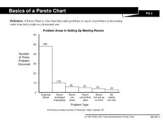
This line shows the cumulative percentage of responses. This helps you determine where the bulk of the issues lie. In this example, 87% of the children in this class are at or below a 2nd grade fluency level. The bars show the total number of items in that category. The final bar is a cumulative bar showing the total “N.” Note that the tab “4 Item Pareto” has been selected and is displaying the Pareto Chart.
To customize the title for the Pareto Chart, simply click the mouse on the existing title. A text box will appear like the one shown below. Click again to begin typing your title. Repeat for the caption. When finished, print the graph. It prints onto a full size 8 ½ by 11 sheet of paper. Finally, do a “File” and “Save As” to save the file under the name you desire if you wish to keep this information for later use.