5 Data Visualization techniques that you should start using now
While data visualization can make your data analytics more appealing for users, it is also important to choose the visualization technique that works for your users and purpose. This article outlines 5 basic techniques that can improve the overall effectiveness of your data visualization model.

5 Data Visualization techniques that you should start using now
E N D
Presentation Transcript
5 Data Visualization techniques that you should start using now
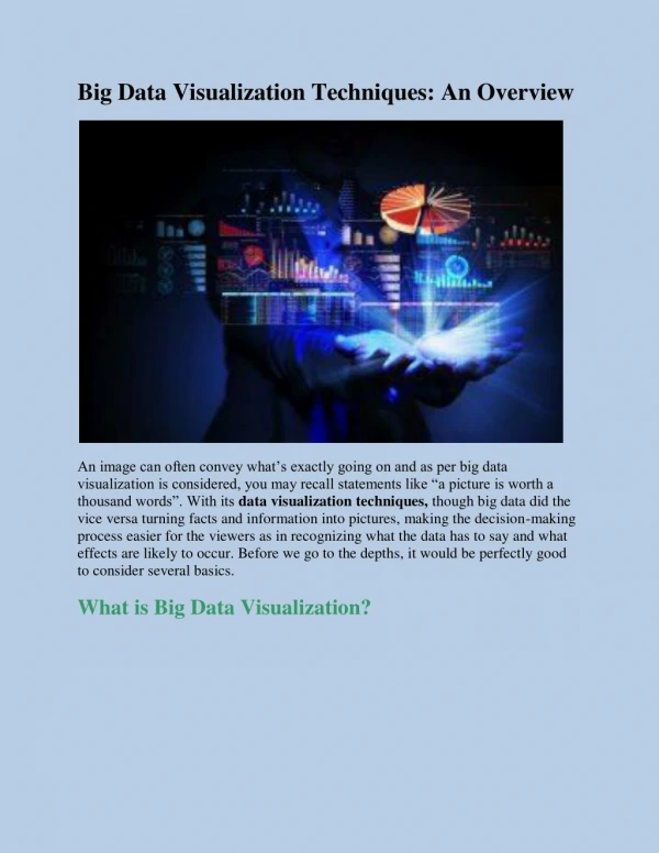
Used as a graphical representation of data and information, data visualization is an industry standard mode used in business intelligence (or BI) to present any business-related data or information.
In the digital age of big data, data visualization is a critical tool required to derive business insight from the billions and trillions of business data being generated daily
Here are 5 of the best techniques for data visualization in 2018 that you must use to make your business data more relevant and effective.
1. Know you audience Data visualization is not just about data but also about the audience or user who will be presented with the data. Does the visualized data cater to their needs and IT skills? Remember that many users, including business entrepreneurs, are unable to derive much meaningful insights just by looking at any chart or pie.
Make your dashboard presentation user-specific instead of catering to the needs of multiple stakeholders. For meaningful actions, include the KPIs that are the most strategic for your business (for example, a significant drop (or trend) in market share) in your visualized data.
2. Context is critical Define the context (or purpose) of your data visualization clearly before design. What is the purpose of the data visuals? What decision-making process can be influenced with this visualization? Data visualization must be designed to align your users (or audience) with a business objective (or goal) that can empower their decision making and propel them towards an action.
3. Use the right visuals After determining your right audience and purpose of visuals, it’s a good time to select the right visuals or chart types, depending on what you want to show visually.
4. Use the right colors Data visualization uses a mix of colors to display the difference between elements and to increase its overall effectiveness. Use of standard colors is recommended for easier distinguishing of individual elements. Color-shaded charts and maps are also useful in conveying information. However, do not use too many different colors (not more than 10) and also maintain consistency in the choice of your colors across your visualization model.
5. Interactive maps Interactive maps are an effective technique in data visualization that allows you to make your visual data more interactive with users. Interactive maps can enable users to drill down a specific element, get a 360-degree view of the information, and much more.
While data visualization can make your data analytics more appealing for users, it is also important to choose the visualization technique that works for your users and purpose. This article outlines 5 basic techniques that can improve the overall effectiveness of your data visualization model.