Download
1 / 10

E N D
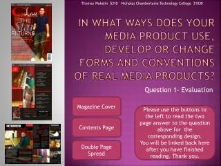
EVALUATION: QUESTION 1 In what ways does your media product use, develop or challenge forms and conventions of real media products?
For my A2 coursework, my main focus was on the music industry. I looked at different musical genres to make a music video on a chosen by me song. My final decision on the genre was something new and not popular in the United Kingdom. The song I choose is separated to two very radical and cultural genres such as PUNK and SKA. Once I finalize my decision on the song I started planning my three main products- digipak, poster and a music video.
The BeginningWhen I started my research and planning of the three products, I chose to have 5 main bands from which I will get an ideas of the construction of my products. This bands are DubiozaKolektiv, S.A.R.S., Gogol Bordello, Control and Hypodil. The first think I started to research was the poster. What I notice was that in every band has its own style of communicating with the audience. For instance, in DubiozaKolektiv are used many bright colors such as red, yellow, orange and black. Where in the Control posters the same colors are used, however, they are faded and darker compered to DubiozaKolektiv’s one. Another think that I notice was that some of the bands has its own logo. S.A.R.S., for instance, their logo is a chopped hand and Hypodil’s logo is a Thracian coin. Moreover, the posters of the bands always have their members on them. One of the posters of DubiozaKolektiv has all of the bands members dressed as a pirates and on Gogol Bordello’s poster can be seen again the members of the band where the lead singer is in the middle.
Creating My Poster! Such conventions were used in my poster as well. The first think I did was to make different photos of all the members of the band where there are dressed in a special working class people. The reason to do that was because the song I am using for my music video (U.S.A. by DubiozaKolektiv) focuses on idea of living the dream life in America. That is why my actors had to look poor, drunk and dirty. Another reason is the fact that this music is popular in the Eastern Europe, not in the Western Europe. That is why I used different stereotypes of the Eastern World created by the people living in the west. Once I chose the photo I wanted to use as my product, I started playing with the Photoshop. The first think I did was to crop to photo to look as a poster (Landscape). When I finish cropping the photo, I focused on editing/fixing the colors of the photos. The main colors I used were Red, Yellow and Blue. The final result looked as an old Polaroid Photo which was exactly what I wanted. Then my focus moved to the fonts and the Masthead. I looked at different fonts and the one I choose was the Collaged font. I added the name of the band (DubiozaKolektiv) and the name of the album (Balkanjada) and I made every letter have its own color. In the end it looked colorful and a little bit messy which are the conventions of the punk genre. And the final think was to create the Logo. The Logo I created was a red star with black shadow which symbolizes the time when many Balkan countries were under a Communist regime. Once I added the star my poster was ready to be posted, but before that I added some logos of the big musical companies such as Columbia Records and Songkick.
The DigipakAfter completing the poster, I moved to research and plan my Digipak. What I found interesting was how different the bands were in terms of styling their Digipak. Some of the bands were focusing on the dark colors, dark shadows where the audience could see only the shape of people’s body like S.A.R.S. first album cover. Others focused on animating their digipack, for example, Control’s digipak has a punk-man who is drawing graffiti on a wall. And others, focused on a sunny, colorful album covers like Gogol Bordello and DubiozaKolektiv. Again, most of the digipack has the members of the band on it with their logo.
Step by Step…Once I finish making my poster, the first think I started to considered was the styling the digipak. At the beginning I thought to use a children’s drawing as my cover but I changed my mind once I saw how it will look. The reason to change the cover was because it looked more as a modern Hip-Hop album cover. Therefore, I designed the background to be dark and the letters to be different colored. However, compared to the poster I used different letters cut from different magazines. It looked as something untraditional but original for the genre. Once I added the name of the band and the album cover, I created a polaroid photos of each of the members of the band. Under the photos I added their names to give idea to the audience that the band is Eastern European. The names Emil, Dimitar, Ilia, Konstantin and Milen are often used in Eastern European culture. When I add the photos, I placed the logo of the band in seven places with different colors so that the digipak looked colorful. Then I added 12 songs using the same font as the poster- Collaged. I used again different color for each letter and I added some shadow so that easier for the audience to understand what is written. The last think I added was some graffiti photos, a punk-man and a rock gesture with the hand photo. Then, I moved to the inside of the digipack where I added the photo I used for my poster. But on the left side I added the name of the band and the album, together with their logo in the middle.
EDITING MY MUSIC VIDEO!Once I finished making the digipak I started editing my music video. I did the filming part the day when I did the shooting of the poster. The idea of the story was build my focusing on the lyrics. Because, the song is singed with a strong eastern European accent, I made the video to help the audience to understand the song. The video concentrates on the members of the band who live in a small village in the Balkans and they dream to move and work in America where “Dreams come true”. However, once they get drunk, a ferry comes to one of the members and sends him in New York. Once he see how populated and busy is the city he dreams to return to his homeland. The idea of the video clip is to send a message to the audience that there is no better place than home.
When I started editing my video, I used Adobe Premiere Pro CC. I began my video by representing the beauty of the Eastern European nature and representing the members of the band. Moreover, I added the title of the song so that it could look more as a professional music video. The colors of the title are similar to the one I used to create the background of my poster. After that I notice that the beginning scene is shaking so I added an effect called warp stabilizer to fix that. It made the image look more stabilized and better looking. Then, I moved to the part where I had to synchronize all the music instruments with the music. In some places I had to change the speed duration so that it look professionally made. Once I finished constructing the beginning I focused on the scenes where my actors look as a traditional villagers who dream to leave their homeland and move to America. There, I added some special effects created in Adobe After Effects CC 2015. The effect I made is a simple speech bubble that looks like someone has been drawn. That contributed to the creation of the feeling that the music video is untraditional and therefore could be applied to the punk genre. Moreover, the use of ferry could be also linked to that. To make understandable for the audience that It’s a ferry I used a special wings as a prop and I have added special spotlight effect to make the image bright which will give a sense that the sleeping man is dreaming. The last focus was the scenes in New York where I used some images taken from YouTube. At this part the only effect I had to use was changing the colors of the screen. The reason to make them dark is to represent to the audience that something unusual has happened.
Conclusion Overall, my three products has used successfully generic conventions which could suggest what the genre is with the use of different signs and symbols (semiotics). Examples for that are the different fonts and colors of my product, the untraditional and messy digipak and others. Moreover, my products has been created with professional softwares such as Adobe Photoshop, Premiere CC and After Effect CC. With Photoshop I manage to form and construct my digipak and poster. Premier Pro help me edit my music video and After Effects contributed to the creation of few effects which were used in my music video.