page / screen design
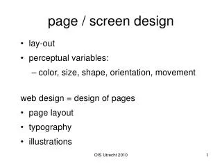
page / screen design lay-out perceptual variables: color, size, shape, orientation, movement web design = design of pages page layout typography illustrations page lay-out first 10 cm should be enogh to know if you want to read this, or to skip top: title / identification / identity;

page / screen design
E N D
Presentation Transcript
page / screen design • lay-out • perceptual variables: • color, size, shape, orientation, movement web design = design of pages • page layout • typography • illustrations OIS Utrecht 2010
page lay-out • first 10 cm should be enogh to know if you want to read this, or to skip • top: title / identification / identity; • main navigation • bottom: web master/author, date, site map, etc. OIS Utrecht 2010
Page layout: supports scanning and reading OIS Utrecht 2010
Layout in our western world we read from left to right and from top to bottom OIS Utrecht 2010
Layout in our western world we read from left to right and from top to bottom most important items top left reading: max. 40-60 char. per line • newspaper columns (8 cm) • longer lines enforce head movement OIS Utrecht 2010
Layout what screen size to expect? different browsers people use only part of screen for browser some options: • Cascading Style Sheets • image maps for text labels OIS Utrecht 2010
Cascading Style Sheets separation of text and layout OIS Utrecht 2010
text in image • designer is in full control • takes time to download • some people do not want pictures OIS Utrecht 2010
Image maps: controle of font and layout; multiple links OIS Utrecht 2010
design – crowded real estate • designers like “white space”, • real estate is expensive, so people use all (newspapers, Las Vegas, Times Square) • typografic rule of thumb: fill 70% max • Psychological rule fo thumb (Fitts’ Law): use simpel “grid” OIS Utrecht 2010
Typography • contrast between text and background • goal is readability OIS Utrecht 2010
reading is recognition of words, not characters: All Capitals spoils the word profiles: capitals have meaning for names and start of sentences: OIS Utrecht 2010
Fonts • fonts are graphical elements, aiming at meaning first, but, additionally, style • balance between resolution, space, tradition, uniqueness OIS Utrecht 2010
typographical variation in running text OIS Utrecht 2010
Consistency important characteristic of good design • recognizability • easy reading • carefull, style OIS Utrecht 2010
hints • line space not too low (> font size) • restrictred variation in font size (10-14) • maximum of 2 fonts • use of font variables (color) mainly for destinction of headers, not within text OIS Utrecht 2010
useit.com: usable information technology after 6 years .... Permanent Content Alertbox Jakob's column on Web usability Informational Articles Must Ask For the Order (Aug. 23) Unless you have explicit links to product pages from article content, users who visit articles directly from search engines might never realize that you sell related products. Search Engine Behavior (Aug. 16) Information Scent (Aug. 2) Card Sorting (July 19) All Alertbox columns from 1995 to 2004 useit.com: Jakob Nielsen's Website OIS Utrecht 2010
background contrast is of main importance: • dark text on light background or vice versa • no contrast within background OIS Utrecht 2010
color • supports organization of page • creates harmonic balance OIS Utrecht 2010
Colors can support understanding .... if conform to cultural or educational habits OIS Utrecht 2010
... or confuse, even if perceptual quality (including contrast) is identical OIS Utrecht 2010
Colour • Harmonious colour combination • Contrast • Legibility • Colour blindness • Culture / education OIS Utrecht 2010
Colour Contrast OIS Utrecht 2010
color contrast effects legibility OIS Utrecht 2010
Bitmaps of vector graphics bitmaps (raster graphics) • gif, jpeg • for photographs vector graphics • Postscript, Flash, VML (vector mark-up language) • line drawings, cartoons, fonts • resolution independent OIS Utrecht 2010
GIF: Graphic Interchange Format • bitmap • compressed without loss • transparency, animation OIS Utrecht 2010
JPEG - Joint Photographic Experts Group OIS Utrecht 2010
pictures • if relevant • restrict colors • test alternatives OIS Utrecht 2010
Role of images • Image and information • Image and emotion • Image and memory • Image and culture • Convicing viewers OIS Utrecht 2010
use graphics and images to ... • Show who • Show what (portrays, describes physical objects) • Show what’s inside • Show where • Show when (time) • Show how it works • Show how to do it (e.g steps in a task) • Show examples (instances of a general category or idea) • Show what can not been seen • Show comparison OIS Utrecht 2010
what’s inside who use visuals to show: OIS Utrecht 2010
where when use visuals to show: OIS Utrecht 2010
images can show how it works time as well as three dimensions on a flat surface: The solar system, William Pearson, 1820 OIS Utrecht 2010
... and words may be needed too: OIS Utrecht 2010
images support comparison OIS Utrecht 2010
useit.com: usable information technology Permanent Content Alertbox Jakob's column on Web usability Informational Articles Must Ask For the Order (Aug. 23) Unless you have explicit links to product pages from article content, users who visit articles directly from search engines might never realize that you sell related products. Search Engine Behavior (Aug. 16) Information Scent (Aug. 2) Card Sorting (July 19) All Alertbox columns from 1995 to 2004 useit.com: Jakob Nielsen's Website OIS Utrecht 2010

