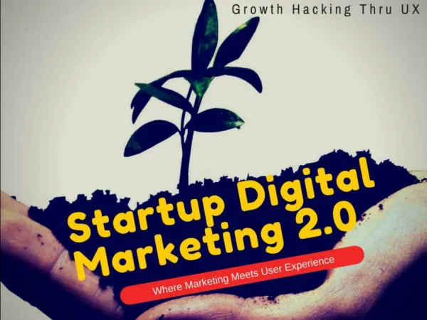
Growth Hacking meets UX - Workshop with Mac Jake
480 likes | 1.92k Vues
Slide deck from Growth Hacking Asia's 'Growth hacking meets UX' workshop on Saturday, May 16 in Kuala Lumpur. Slide deck prepared by Mac Jake - Founder of Reparkapp, UX/UI Designer and our workshop instructor.

Growth Hacking meets UX - Workshop with Mac Jake
E N D
Presentation Transcript
Mac Jake UIUX Designer, Pirate & Front end Developer macjake.net @macvhustle More at growthhackingasia.com bit.do/uxkl
Objectives Reduce tech support & training cost. Gain more sales return. Avoid user abandon purchases. Increases users & purchases. Every $1 invested in UX can have a return of up to $100 for your business
Actionable UX Tactics & Examples 1. Optimising Visitors Experience. 2. Customer Onboarding. 3. Product page selling tactics. 4. Activity overview introduction.
Less complicated captcha We want to onboard user, not scare them away
Captcha or other alternatives letterboxd - Uses famous movie quotes as their Captcha during sign up.
Your headline must grab attention in less than 1 second A 1-second response keeps users engaged with the content, thereby increasing the conversion rate and reducing abandonments.
Add propose selections Airbnb both is good, 87% of Fortune 500 companies have an easy to find search field on their homepage
Progressive Disclosure Dropbox - Enables form when clicked. Paypal - Shows the next hidden form
Minimize space Button Coda 2 - The submit button of the order form doubles as a progress bar.
Short paragraphs encourage reading Product Hunt
Illusion of content Pinterest - The background takes main color of photo that’s about to be displayed. Facebook
Don’t make visitors think too much Tumblr - A short list of random available usernames is shown to help get the user signed up right away.
Fewer form fields Airbnb
Use simple interaction to keep user filling the form Basecamp — When there is a form field error, the character on the left makes a surprising facial expression.
Autocorrect email to reduce wrong address Kickstarter - The email sign up field proposes related email provider is it thinks you may have mistyped your email.
Offer incentive for visitors to signup Mailchimp - Reduces your price if you use two-factor authentication.
Offer incentive for visitors to signup Apple Events - When adding Apple’s Live event to your calendar using their link, It saves you the best seat in the house.
Make it easy for user to sign in Trip Advisor - Users can automatically signed-in on promotional email
Optimised for mobile Mobile users are five times more likely to abandon the task if the site isn't optimized for mobile
Offer other alternatives Grand St. - when you unsubscribe from their newsletter, they invite you to follow them on social networks instead.
Quick feedback Co Founder Treating app- Asking the user straight away inside the app message
Little things matters Amazon - “Thank you page”
Demonstrate values You can create invoice directly Slimvoice - users able to use the product on the landing page
Reaffirming Freedom User feel the sense of control over when they can pay
Use Urgency Countdown create the urgency not to wait
Easy to reach Call to action User do not need to scroll or lookup for the buy button
Show how it works for specific target market Illustration shows examples of targeted users
Show benefits on Call to Action pancakeapp.com Reminding users why it’s worth it
Stirring curiosity Give free chapters to demonstrate values
Interactive Pricing Mailchimp - users able to insert any number of subscribers, therefore decrease call supports
Help buyers make decision Audible - The most expensive items are automatically preselected to be paid.
Give suggestion from past purchases Amazon - Displays other product compatibility with your purchased product from your Amazon purchase history.
Help buyers make decision even faster Amazon.com - Shows the most helpful favourable review and the most helpful critical review on top so user able to make decision faster
Design References uxarchive.com/animated reallygoodemails.com theuxnewsletter.com pttrns.com uxrecipe.github.io uxchecklist.github.io pttrns.com (iOS patterns) mobile-patterns.com androidpatterns.com mobileawesomeness.com lovelyui.com uiux.asia