Download
1 / 3
0 likes | 15 Vues
Lamp Media Tech offers top notch digital marketing packages in Dubai that are also budget friendly. Our services will help you get the best results for your business in a short period of time. We will help you increase the traffic of your website and drive sales for your company.

E N D
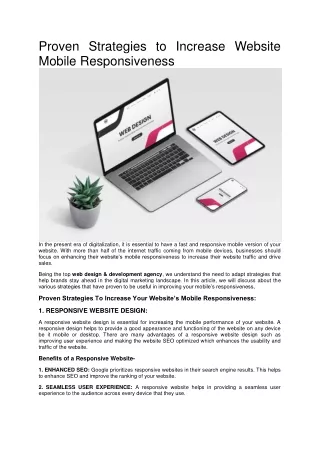
Proven Strategies to Increase Website Mobile Responsiveness In the present era of digitalization, it is essential to have a fast and responsive mobile version of your website. With more than half of the internet traffic coming from mobile devices, businesses should focus on enhancing their website’s mobile responsiveness to increase their website traffic and drive sales. Being the top web design & development agency, we understand the need to adapt strategies that help brands stay ahead in the digital marketing landscape. In this article, we will discuss about the various strategies that have proven to be useful in improving your mobile’s responsiveness, Proven Strategies To Increase Your Website’s Mobile Responsiveness: 1. RESPONSIVE WEBSITE DESIGN: A responsive website design is essential for increasing the mobile performance of your website. A responsive design helps to provide a good appearance and functioning of the website on any device be it mobile or desktop. There are many advantages of a responsive website design such as improving user experience and making the website SEO optimized which enhances the usability and traffic of the website. Benefits of a Responsive Website- 1. ENHANCED SEO: Google prioritizes responsive websites in their search engine results. This helps to enhance SEO and improve the ranking of your website. 2. SEAMLESS USER EXPERIENCE: A responsive website helps in providing a seamless user experience to the audience across every device that they use.
3. IMPROVED CONVERSION RATE: Responsive websites that are easy to use and navigate helps enhance the user experience of the customers and in turn improve the company’s conversion rates and drive sales. 4. INCREASE IN MOBILE TRAFFIC: With the help of an easily accessible website, your business can reach out to a wider mobile audience and improve the mobile traffic of the website. 2. EASY TO READ CONTENT: With the massive increase in the mobile traffic, it has become important to create easy to read content for mobile devices. Users tend to get frustrated with website content that is hard to read and requires constant zooming. Websites which are easily readable helps to improve the user engagement and provides organic lead generation. A mobile friendly website with good readability is more prone to get a higher ranking in search engine results, enhancing the traffic of your website. Effective Tips- 1. AVOID SMALL TEXT: You must avoid small texts which are difficult to read on a mobile screen. Instead, you should make use of larger texts which can be read easily by the audience. 2. MOBILE-FRIENDLY FONT SIZE: The default font size of mobile devices is 16px and you should use the mobile friendly font to present readable content that does not require zooming while reading! 3. MOBILE IMAGES OPTIMIZATION: You must optimize the size of images for your smaller mobile devices and make them look as good as they look on a larger desktop. 4. INCREASED LINE HEIGHT: It is advisable to increase the line height to provide adequate space between lines and make your text easily readable by the users. 3. MINIMUM LOAD TIME: A slow loading website is abandoned by the users and ends up losing organic traffic. The poor user experience of a slow website impacts your search engine ranking negatively. It is important to minimize the load time of your website and have a fast loading responsive website that provides seamless and efficient user experience across all the devices. We have discussed below some tips which are useful in minimizing the load time of a website and making it load faster. Effective Tips- 1. MINIMIZING HTTP REQUESTS: Minimizing the multiple HTTP requests will help in speeding up the load time of the website. 2. ENABLING BROWSER CACHE: While visiting a website, the browser stores certain elements in its cache. When you enable browser cache, these elements load faster on every visit to the site. 3. REDUCING IMAGE SIZE:Elements like larger images can slow down your website’s load time. You should use image compressor tools to reduce the size of the images. 4. USING CONTENT DELIVERY NETWORK (CDN): CDNs distribute the content of the website across multiple servers, thus helping to speed up the load time of the website. 4. OPTIMIZE FOR TOUCH-BASED NAVIGATION: 95% of the mobile devices are touch screen smartphones and tablets. The users have become extremely comfortable with the concept of touchscreens and they expect the website's navigation to be as smooth as their touchscreen devices. If your brand fails to optimize the website content for touch-based navigation, then you are prone to get a high bounce rate which impacts the traffic of your website and degrades the overall user experience and performance of the website. Effective Tips- 1. SIMPLE & EFFECTIVE NAVIGATION: The navigation should be simple and effective with clear labeling and hierarchy provided.
2. ADEQUATE SPACING: To avoid accidental taps, you must provide adequate spacing between the touch targets. 3. LARGE TOUCH TARGETS: The touch targets must always be large enough to avoid accidental tapping on any other elements. 4. AVOIDING HOVER EFFECTS: Hover effects must be avoided and if needed, they must be replaced with touch-friendly effects. Having a responsive website is a necessity in today’s competitive digital world. A responsive website will help improve the user experience and increase the traffic of your website organically. Lamp Media Tech is the leading website designing company that excels in developing easy to navigate and user friendly responsive websites that works efficiently across all the devices. Reach out to the team of experts at LMT and help us design a responsive website to grow your business!