Download
1 / 10
100 likes | 491 Vues
It is safest to use a single typographic family and vary its weight and size for display ... Rules of Typography.... For text type, use line spacing that easily ...

E N D
1. Typography and Space for Web Design Important Issues
From
Web Style Guide
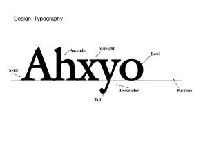
2. Legibility on screen Some typefaces are more legible than others on the screen. A traditional typeface such as Times Roman is considered to be one of the most legible on paper, but at screen resolution its size is too small and its shapes look irregular. Screen legibility is most influenced by the x-height (the height of a lowercase "x") and the overall size of the typeface.
3. Adapted traditional typefaces Times New Roman is a good example of a traditional typeface that has been adapted for use on computer screens. A serif typeface like Times New Roman (the default text face in most Web browsers) is about average in legibility on the computer screen, with a moderate x-height.
Times New Roman is a good font to use in text-heavy documents that will probably be printed by readers rather than read from the screen. The compact letter size of Times New Roman also makes it a good choice if you need to pack a lot of words into a small space.
4. Designed for the screen Typefaces such as Georgia and Verdana were designed specifically for legibility on the computer screen; they have exaggerated x-heights and are very large compared to more traditional typefaces in the same point size. These fonts offer excellent legibility for Web pages designed to be read directly from the screen. However, the exaggerated x-heights and heavy letterforms of these fonts look massive and clumsy when transferred to the high-resolution medium of paper.
5. Choosing typefaces The most conventional scheme for using typefaces is to use a serif face such as Times New Roman or Georgia for body text and a sans serif face such as Verdana or Arial as a contrast for headlines.
We generally set our text-laden Web pages in Times New Roman because it produces a reasonable balance between density of information and overall legibility. Most readers expect a serif font for long blocks of text and find Times New Roman comfortable to read off-screen from paper printouts. Various studies purport to show that serif type is more legible than sans serif type and vice versa.
6. Combining Fonts It is safest to use a single typographic family and vary its weight and size for display type and emphasis. If you choose to combine serif and sans serif faces, select fonts that are compatible and don't use more than two typefaces (one serif, one sans serif) on a page.
7. Rules of Typography For optimum legibility, choose classical, time-tested typefaces.
Be mindful not to use too many different typefaces at any one time.
Avoid combining typefaces that are too similar in appearance.
For text type use sizes that, according to legibility studies, prove most readable.�
Avoid using too many different type sizes and weights at the same time.
8. Rules of Typography�.cont.
Avoid typefaces appearing too heavy or too light. Text typefaces that are too light cannot easily be distinguished from their backgrounds.
Use typefaces of medium width.�Avoid typefaces that appear extremely wide or narrow in width. Rather than distorting text by stretching or squeezing the text width, use type families that include condensed and extended faces that fall within accepted proportional norms.
9. Rules of Typography�. For text type, use line spacing that easily carries the eye from one line to the next.�
For optimum readability, use a flush left, ragged right type alignment.
Strive for consistent, rhythmic rags. The purpose of effective rags is not only to achieve aesthetic beauty, but to enable readers to move gently and effortlessly down a text column. Effective rags consist of lines establishing an informal but consistent pattern of line endings.
10. Typography�.. Clearly indicate paragraphs, but be careful not to upset the integrity and visual consistency of the text.
Avoid widows and orphans whenever possible. A widow is a word or very short line at either the beginning or end of a paragraph. An orphan is a single syllable at the end of a paragraph.
Emphasize elements within text with discretion and without disturbing the flow of reading. You can use italics, underlined type, color type, different typeface, small capitals, capitals, bold type within light type, light type within bold type, larger type, and outline type to emphasize elements but never overdo it. Use minimum means for maximum results.