
Sample Slide – Font Size
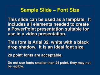
Sample Slide – Font Size . This slide can be used as a template. It includes all elements needed to create a PowerPoint presentation suitable for use in a video presentation. This font is Arial 32, white with a black drop shadow. It is an ideal font size. 28 point fonts are acceptable.

Sample Slide – Font Size
E N D
Presentation Transcript
Sample Slide – Font Size This slide can be used as a template. It includes all elements needed to create a PowerPoint presentation suitable for use in a video presentation. This font is Arial 32, white with a black drop shadow. It is an ideal font size. 28 point fonts are acceptable. Do not use fonts smaller than 24 point, they may not be legible.
Sample Slide – Text Guidelines • Avoid trying to place too much information on one slide • Avoid long sentences. Generally, 6 words per line (30 characters) • Not more than 8 - 10 lines per slide • Use upper and lower case • Avoid abbreviations
Backgrounds Light fonts on dark backgrounds are best suited for PowerPoint presentations for video application. The previous solid blue background is good, or this ramped black-to-blue background is suitable. Don’t use red as a font color, often it doesn’t show up very well…if at all.
The “Squint” Test When determining if your fonts will be legible in video format, squint at your slide. If you have trouble reading it while squinting, your audience will have trouble reading it in video format. That’s why it’s recommended you don’t use red as a font color, or use fontssmaller than 28 point - this is 24 point, notice it’s hard to read while squinting.
Charts & Graphs Make Charts & Graphs as largeand visual as possible
Sample Slide - Logo If you would like to include an M. D. Anderson logo, this logo is a good one to use. The white text on a dark background makes it easy to read.
The dotted red rectangle is to alert you that text extending beyond the red will be cut off when your slide is displayed on TV You need to remove this beforesaving your final presentationInstructions are continued on next slide Removing the Red Safe Area Marker
On menu go to View / Master select Slide Master Click on red rectangle, press delete key On menu go to View / Normal Save presentation as you normally would, i.e. - File / Save As Removing the Red Safe Area Marker
When all else fails… If it is not possible to adhere to the rules outlined in this presentation, • use the existing PowerPoint Slide Layout Templates, • use the provided font size, • stay within the text box limits.