Download
1 / 5
0 likes | 1 Vues
This guide highlights the importance of interactive data visualization in todayu2019s analytical workflows and shows how Power BI brings data to life. Youu2019ll discover how clickable visuals and interactive elements enable better decision-making and faster insights.More Info:https://www.knowledgeexcel.com/blogs/data-visualizations/interactive-data-visualization-power-bi?utm_source=google

E N D
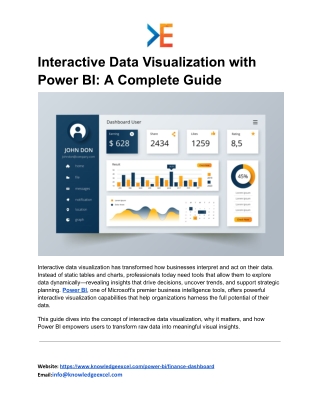
Interactive Data Visualization with Power BI: A Complete Guide Interactive data visualization has transformed how businesses interpret and act on their data. Instead of static tables and charts, professionals today need tools that allow them to explore data dynamically—revealing insights that drive decisions, uncover trends, and support strategic planning. Power BI, one of Microsoft’s premier business intelligence tools, offers powerful interactive visualization capabilities that help organizations harness the full potential of their data. This guide dives into the concept of interactive data visualization, why it matters, and how Power BI empowers users to transform raw data into meaningful visual insights. Website: https://www.knowledgeexcel.com/power-bi/finance-dashboard Email:info@knowledgeexcel.com
What Is Interactive Data Visualization? Interactive data visualization refers to the ability to manipulate and explore data visually in real time. Whether it’s filtering results, drilling down into specific segments, or adjusting time ranges, interactive visualization enables users to engage with data instead of just reading it. This dynamic approach makes complex information more accessible and fosters deeper understanding across teams. Unlike traditional reports or static charts, interactive dashboards let users explore at their own pace and from different angles. This means insights emerge naturally, supported by visuals that respond instantly to user actions. Why Interactive Visualization Matters Visualizing data interactively enhances comprehension and supports better decision-making for several reasons: ● Immediate Feedback: Users can instantly see how changes to filters or variables affect outcomes. ● Pattern Recognition: Interactive visuals make it easier to identify trends, outliers, and correlations. ● Focus on What Matters: By drilling into specifics, teams can focus on KPIs that drive real value. ● Enhanced Collaboration: Shared dashboards help teams work from a single source of truth, reducing miscommunication. Because of these benefits, interactive visualization plays a central role in data-driven organizations. Power BI’s Interactive Visualization Capabilities Microsoft Power BI stands out for its intuitive visual analytics and interactive dashboard features. Whether you’re an analyst, finance professional, marketer, or executive, Power BI adapts to your needs through: Website: https://www.knowledgeexcel.com/power-bi/finance-dashboard Email:info@knowledgeexcel.com
1. Responsive Dashboards Power BI dashboards react instantly to user interaction. Click or tap a visual and related elements update automatically—no manual refresh required. 2. Custom Visual Library Users can choose from built-in chart types or import custom visuals from Microsoft’s marketplace. This flexibility allows dashboards to communicate information in the best possible format. 3. Drill-Down Exploration Need more detail? Power BI lets users drill down into hierarchical data—like going from yearly revenue to quarter-by-quarter performance—without leaving the dashboard. 4. Dynamic Filtering & Slicers Filters and slicers help focus the analysis on specific segments such as date ranges, regions, or product lines. As selections change, visuals update instantly, giving users control over what data they see. 5. Seamless Data Integration Power BI connects to numerous data sources—spreadsheets, databases, cloud services, and more—bringing all relevant information together for unified analysis. Real-World Use Cases Interactive data visualization with Power BI can be applied across functions: Marketing Analytics Marketers can track campaign performance in real time, explore which channels deliver the best ROI, and adjust strategies based on interactive trends. Sales Performance Tracking Website: https://www.knowledgeexcel.com/power-bi/finance-dashboard Email:info@knowledgeexcel.com
Sales teams benefit from dashboards that segment leads, compare actuals against targets, and highlight opportunities for improvement. Financial Reporting Finance teams use interactive visuals to track cash flow, analyze expense categories, and monitor profitability across business units. Customer Insights Customer behavior trends become easier to spot with visual tools that update dynamically as you explore purchase patterns or engagement metrics. In each case, interactivity turns data into a living tool for insights rather than a series of static records. Best Practices for Effective Interactive Visualization To get the most out of Power BI interactive dashboards: ● Start with Clear Questions: Know what you want to explore before building visuals. ● Keep It Simple: Too many visuals can overwhelm users; focus on key indicators. ● Use Color Strategically: Color can highlight trends, but overuse can distract. ● Provide Context: Include labels, legends, and brief annotations to guide interpretation. ● Iterate Based on Feedback: Dashboards should evolve with user needs and context. Following these principles improves dashboard usefulness and clarity. Conclusion Interactive data visualization marks a significant shift in how organizations interpret and act on data. Power BI leads the way by providing robust, user-friendly tools that make exploration intuitive and insightful. By transforming raw data into interactive visuals, teams can identify patterns, monitor performance, and communicate findings more effectively. Website: https://www.knowledgeexcel.com/power-bi/finance-dashboard Email:info@knowledgeexcel.com
Whether you need to analyze sales performance, track financial health, or understand customer behavior, Power BI’s interactive dashboards help you unlock insights that matter. In a world where data grows increasingly complex, interactive visualization offers clarity, agility, and deeper understanding — empowering teams to move confidently from information to action. Website: https://www.knowledgeexcel.com/power-bi/finance-dashboard Email:info@knowledgeexcel.com