
Human–Machine System: Controls
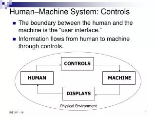
CONTROLS. HUMAN. MACHINE. DISPLAYS. Human–Machine System: Controls. The boundary between the human and the machine is the “user interface.” Information flows from human to machine through controls. . Physical Environment. G1: Select the proper type of control. Types of systems:

Human–Machine System: Controls
E N D
Presentation Transcript
CONTROLS HUMAN MACHINE DISPLAYS Human–Machine System: Controls • The boundary between the human and the machine is the “user interface.” • Information flows from human to machine through controls. Physical Environment
G1: Select the proper type of control • Types of systems: • Open-loop • Closed-loop • Discrete vs continuous • Select part of the body to implement mental command • Choose mechanical interface between human body and machine interior • Consider amount of human power required • Consider errors and speed
Force People variables: Muscles used User population Percentile designed for Control variables Control options Keys and pushbuttons Knobs Cranks Control variables: Purpose Design Hand wheels Foot/leg controls G2: Select the proper control characteristics
Control Options Keys and Pushbuttons • Keys should be non-round, concave on top, and consistently displaced. • Use key interlocks. • Feed back activation to operator. • Use shape to indicate function. • Avoid palm buttons. Knobs • Circular knobs depend on hand friction on circumference. • Knob shape can compensate for slippery grip. • Increasing diameter increases torque.
Control Options (cont.) Cranks • Provide high coefficient of friction. • Allow grip to rotate on crank. • Consider a sphere. Hand Wheels • For valve control, increase radius to reduce tangential force. • Use recommended heights. • Rim diameter should be 20–50 mm. • For vehicle control, follow diameter and orientation recommendations. • Consider permitting angle adjustment.
Control Options (cont.) Foot–Leg Controls • Provide greater force and free the hands. • May be switches or pedals. • Consider friction problems (shoe sole, dirt, debris). • For continuous control, bend the ankle by depressing the toe. • Consider knee switches.
G3: Prevent unintended activation • More severe consequences require greater precautions. • Consider that operators may bypass the guard if it makes operation difficult. • All equipment should have an emergency stop control. • Consider two reaction times: • Human (sensing, deciding, carrying out) • Machine
Methods of reducing accidental activation • Key or special tool activation (locks) • Interlocks • Barriers or covers • Recessing • Spacing • Resistance • Direction
G4: Prevent incorrect identification • Labeling • Color • Shape • Size • Mode of operation • Location
Labels should be: • Legible • Located properly • Understandable • Color • 8% of males, 0.4% of females have color perception problems • Use 8 or fewer colors. • Consider lighting requirements. • Consider color stereotypes. • Consider cultural differences in color stereotypes
Shape • Can be a visual signal. • Can be identified in the dark. • Use up to 9 different shapes. • Tactual shape coding is slower than color coding. • Tactile signals (e.g. pimple, ridges) can help.
Size • Only 2 or 3 different sizes can be differentiated. • Larger sizes give mechanical advantage. • Use larger sizes in cold environments. • Mode of Operation • Consider push/pull vs. rotate vs. slide. • Mode of operation may be a backup for identification methods. • Location can identify controls and groups of controls.
G5: Make accomplishments equal intentions • Require verification of critical commands. • Make complex sequences of actions user-friendly. • Use more care and testing for actions with multiple steps. • Check input for validity. • For continuous controls, consider control/response ratio. • Control positions often act as displays.
Population Stereotypes • Engineer’s habit patterns may not be the user’s habit patterns. • Stereotypes are often country-specific (light switches, water faucets, car blinkers). • See table 15.9, pg. 305 for US conventional control movements • Consider labeling.
G6: Properly locate and arrange controls • Arrangement of Controls • Group related controls and displays together. • Minimize layout complexity. • Have blank space on the panel. • Hand Controls • Keyboards • Manipulative controls • Knobs • Switches • Force controls • Foot Controls • Avoid foot controls for standing operators. • For continuous control, leg should fully extend at bottom of stroke. • For discrete control, use one leg. • Have straight line between pedal and back support. • Comfort may be more important than force capability. • Design to avoid fatigue.
CONTROLS HUMAN MACHINE DISPLAYS Human–Machine System: Displays • Displays include instruments, labels, and accompanying printed instructions and warnings. Physical Environment
Causes of Failure • Legibility or detectability • Understanding
Displaying Information Display Information
G1: Select legible characters • Font • Use printed characters • Avoid Roman numerals • Upper/lower case: • For short messages, use all caps • For text or longer messages, use mixed-case with large open spaces in letters • For VDT, use more pixels and lower dot pitch • Size • Character height = K × Distance from eye • K = 0.004, 0.006, 0.0017, 0.0073 radians • Visual angle should be 15–25 min of arc • 1 min of arc = 0.00029 rad
G2: Arrange characters & symbols Text – clear and legible • Print text in columns • 10 -11-point type minimum • Use space between number and unit • Use double-spacing • Do not justify right side • Use headings for organization
Guideline 2 (cont.) Codes – don’t rely on memory • Automate the code transfer • Make codes checkable • Use short codes • Make the code meaningful Abbreviations – use with caution • Use rules to form abbreviations • Rules best for encoding are not necessarily the best for decoding • Truncating works better than vowel deletion in testing, but best rule of thumb is to be consistent! • Do not include period
G3: Decide on type of display General Considerations • Task/job – what’s the purpose of the display? • User characteristics • language, education, culture, expectations, etc. • Standardization (see examples, next slide) Menus – lists of options • Deep vs Shallow • Structure according to how information is used • Minimize complexity / maximize understanding • Avoid multiple pages • Highlight options • Use blank space and grouping
Guideline 3 (cont.) Tables – make the information easy to find • Round data to 2 significant digits • Use explicit tables • Avoid matrix tables • Make the primary comparison down the column • Reduce row alignment errors and column selection errors Formulas – simplify calculations • Use to permit exact calculations • Present in units that the user will enter • Decide on significant digits necessary
Guideline 3 (cont.) Graphs – make relationships visible • Use to compare complex relationships • Use instead of tables when: • Displayed data have inherent structure • Structure is relevant to the task • Provide titles, labels, units • Place close to the text it illustrates • Guidelines for Good Graphs, for example • Make graphs wider than tall • Show scale subdivisions with tick marks • Avoid hatching • Use only a few curves on a single graph • Indicate data points with open symbols
Guideline 3 (cont.) Symbolic Messages – be sure they’re understood • Include shapes and colors, diagrams, pictographs • Use color to identify categories • makes navigation easier • but use ONLY as a redundant code • Use icons with care • Weigh benefits vs. costs Maps – locate in space and time • Can show data distributions and location relationships • May be scaled to distance or time • May be not to scale
G4: Project your message • Slides • 35 mm slides • Computer projection • Transparencies • Video
G5: Select the instrument display • Discrete: finite choice of options • Continuous: point on a scale • Analog • Digital • Representational: provide diagram or picture • Video
Warning messages • Type of failure: • False signals • Missing signals • Multiple signals • Should be both visual and aural • Should be within primary field of view • Should provide guidance information • Urgency / immediacy of warning should match severity of danger
G6: Locate/arrange the display Location • Locate to be seen easily • Provide appropriate lighting • Consider eye height and head orientation • Keep data within a 20º cone of line of sight • Angle should be about 30º below the Frankfurt Plane Arrangement • Determine what the operator is required to do • Maintain consistency on panel and within facility • Decide on grouping logic • Consider computer simulation