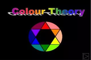
Colour Theory
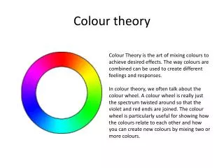
Colour Theory. Graphic Communication. Colour theory is needed for the Knowledge & Interpretation and the Presentation & Illustration Grades. This consists of a range of different aspects. Graphic Communication. You will need to know about the colour wheel. What colours are contrasting?

Colour Theory
E N D
Presentation Transcript
Graphic Communication • Colour theory is needed for the Knowledge & Interpretation and the Presentation & Illustration Grades. • This consists of a range of different aspects.
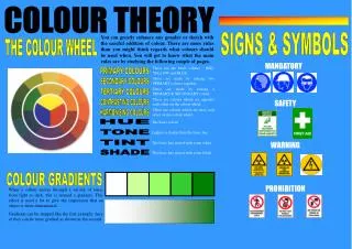
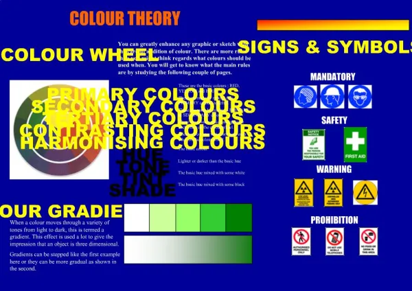
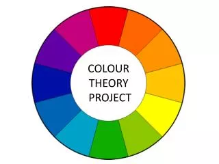
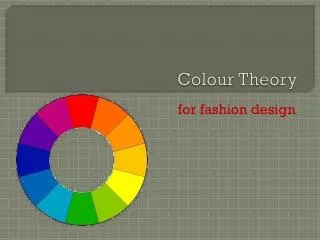
Graphic Communication • You will need to know about the colour wheel. • What colours are contrasting? • What colours are harmonious? • What colours are advancing? • What colours are rededing? • What colours are warm or cold? • What is tone and tints and shades?
Harmonising Colours • Harmonising colours are beside each other on the colour wheel. • The following colours are harmonious: • Yellow & Orange • Red & Violet • Blue & Green
Contrasting Colours • Contrasting colours are on opposite sides of the colour wheel. • The following colours are contrasting: • Yellow & Violet • Red & Green • Blue & Orange
Advancing Colours • Advancing colours appear to come towards you when you look at them. • Advancing colours are warm colours: • red • orange • yellow
Receding Colours • Receding colours appear to move into the background when you look at them. • Advancing colours are cold colours: • blue • green • violet
Warm Colours • These colours are used to give a feeling of warmth to a drawing. • They can also be used to show hot things as part of a symbol, like a red dot on a hot water tap. • red • yellow • orange
Cold Colours • These colours are used to give a feeling of coldness to a drawing. • They can also be used to show cold things as part of a symbol, like a blue dot on a cold water tap. • blue • green • violet
Tone • The tone of a colour is how strong or weak a colour is. • By applying more coats of a colour its tone can be made stronger. • This can be shown in the tonal bar.
Tint & Shade • Tints and shades are created by adding white or black to a colour. • White is added to a colour to give it a tint. Pale colours tend to be soft. • Black is added to a colour to give it a shade. Dark colours look as though they are heavy.
Red • Warm • Vibrant • Exciting • Active • Festive • Passion
Yellow • Warm • Sunny • Happy • Glowing • Easily seen
Blue • Cool • Elegant • Sophisticated • Formal • Classy
Green • Cool • restful • natural calm • soothing • fresh
Violet • Cool • Peaceful • Solitary
Orange • Warm • Happy • Cheerful • Energy • Refreshing
Neutral Colours • Elegant • Dignified • Reliable • Good • Greys • Natural • Restful • Calm • Browns • Natural • Earthly • Safe
Black & White • Dramatic • elegant • Opposing • contrasting • sophisticated