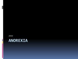
No to Anorexia: Awareness Campaign for a Healthy Lifestyle
130 likes | 159 Vues
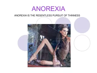
Unveiled during Milan Fashion Week in 2007, this ad by No-l-ita raises awareness about anorexia and promotes a healthy lifestyle among models, emphasizing the dangers of extreme thinness. Photographer Oliviero Toscani's controversial style conveys a powerful message against the pressure to be thin. Targeted at Fashion Week attendees and those in the fashion industry.

No to Anorexia: Awareness Campaign for a Healthy Lifestyle
E N D
Presentation Transcript
No to Anorexia Ashley Steenbergen First Period AP Language
Background Information This advertisement was part of an ad campaign for the Italian fashion brand No-l-ita. The campaign was unveiled during Fashion Week in Milan in 2007 to raise awareness for the disease, and to promote a healthy lifestyle among models. The pressure for those in the fashion industry to be thin is very powerful. The photographer, OlivieroToscani, is known for taking controversial photographs. He has photographed AIDS patients and death row inmates for other fashion advertisements.
Who is the audience of this advertisement? Everyone who attended Fashion Week in Milan, and everyone who is interested in fashion is the audience of this advertisement. Also, those who purchase No-l-ita clothing. The people who are at risk of succumbing to the pressure to be thin in the fashion world are also targeted by this ad.
What is juxtaposed in the advertisement? The word No-, the model’s face, and the word anorexia are juxtaposed to prove a point. It’s as if the ad is saying “no anorexia, or you’ll look like this.”
Why is the text important to the advertisement? The text is important to the advertisement because without it, there would just be a photo of a naked skinny woman with no significance. The words give the ad credibility, as well as the purpose of the ad.
What is the focus of the ad? The word anorexia and the woman’s body are the focus of the ad. Both are rigid and stand out against the black background and pink loopy letters of No- and No-l-ita. By making these the focus, the message of how awful anorexia can be sinks in to viewers.
Does the Lighting Seem Natural or Artificial? The lighting seems very artificial. Because she is cast in a gray, cold, light, the model looks almost corpse like. This makes anorexia seem even more dangerous.
What is the Point of View? The creator wants everyone to realize that anorexia is bad and dangerous. Most people agree with the creator’s point of view because it is a common belief that anorexia is unhealthy.
Ethos This advertisement is credible because Fashion Week in Milan is famous. It’s one of the most important events in the fashion industry. No-l-ita is a popular Italian clothing brand, so most Italians and Europeans will listen to what they have to say.
Logos Obviously, the model in the picture does not look healthy, or beautiful. Most humans want to be healthy and attractive, so when they see what anorexia can do to a person, they understand that they shouldn’t do it.
Pathos The advertisement makes viewers feel pain for the model, because she is so frail. It also invokes feelings of disgust, because the model’s bones are sticking out and she has sores on her body.
Works Cited • Moley, Jess Cartner. “Shock Anorexia Billboard Annoys Fashion Designers.” The Guardian. n.p. 25 September 2007. Web. 24 October 2011